


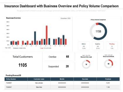
Insurance dashboard with business overview and policy volume comparison




Try Before you Buy Download Free Sample Product
 Impress Your
 Audience
 100%
100% Editable
 Save Hours
 of Time


Our Insurance Dashboard With Business Overview And Policy Volume Comparison are explicit and effective. They combine clarity and concise expression.
People who downloaded this PowerPoint presentation also viewed the following :
Content of this Powerpoint Presentation
Description:
The image is a PowerPoint slide titled "Insurance Value Chain- Recruitment Engagement And Servicing." The slide visually represents a value chain specifically tailored to the insurance industry, breaking down the process into six distinct stages:
1. Agent Recruitment:
Identifying and hiring insurance agents.
2. Manpower Development:
Training and developing the skills of the workforce.
3. Prospecting & Solution Generation:
Finding potential clients and creating insurance solutions.
4. Customer Engagement:
Interacting with customers to understand their needs.
5. Fulfillment:
Delivering the promised insurance services.
6. Servicing:
Providing ongoing support and service to the customers.
Each stage is numbered and features an icon that represents the function, such as a person for recruitment and a lightbulb for solution generation. Below each stage, there are two editable text fields labeled "Opportunity" and "Probable Solution" where specific details can be added to describe the opportunities at each stage and the potential solutions to be implemented.
Use Cases:
This structured approach to the insurance value chain can be adapted to various industries that involve a multi-step engagement and service delivery:
1. Healthcare:
Use: Managing patient recruitment and care delivery.
Presenter: Healthcare Administrator
Audience: Medical Staff, Hospital Management
2. Financial Services:
Use: Outlining client acquisition and financial product delivery.
Presenter: Financial Advisor
Audience: Clients, Sales Teams
3. Real Estate:
Use: Describing the process of agent recruitment, property listing, and client servicing.
Presenter: Real Estate Broker
Audience: Agents, Homebuyers
4. Education:
Use: Detailing student recruitment, curriculum development, and alumni engagement.
Presenter: Admissions Officer
Audience: Faculty, Prospective Students
5. Technology:
Use: Demonstrating the flow from talent acquisition to product development and customer support.
Presenter: HR Manager
Audience: Recruitment Teams, Technical Staff
6. Retail:
Use: Explaining the process from staff hiring to product stocking and customer service.
Presenter: Store Manager
Audience: Employees, Customers
7. Automotive:
Use: Mapping the dealership value chain from sales team recruitment to car servicing.
Presenter: Dealership Owner
Audience: Sales Personnel, Service Technicians
Insurance dashboard with business overview and policy volume comparison with all 2 slides:
Give your audience a fulfilling experience. They will find our Insurance Dashboard With Business Overview And Policy Volume Comparison elevating.
FAQs for Insurance dashboard with business overview and
Honestly, just pick the metrics that'll actually help you make decisions. Premium growth and loss ratios are obvious ones - gotta know if you're making money, right? Claims processing times matter too since customers hate waiting forever. I'd also track customer acquisition costs versus retention rates because keeping existing customers is so much easier than hunting for new ones. Oh, and don't sleep on operational stuff like how fast you're processing policies and whether your agents are being productive. But here's the thing - resist the urge to track everything. Six to eight metrics tops, otherwise you'll just end up with dashboard overload and nobody will look at them.
Dude, visualization tools literally save your life with data. Your clients can actually *see* their coverage gaps and claim trends instead of staring at endless spreadsheet rows. Charts and dashboards just click better than tables of numbers - it's like showing someone a map vs. giving them written directions. You'll spot opportunities way faster too. Plus explaining complex policies becomes so much easier when people can visualize what you're talking about. Just make sure whatever tool you pick updates in real-time, otherwise you're working with old info. Trust me, it makes presentations way less painful.
Dude, real-time data is such a huge shift from those old quarterly reports we used to rely on. Instead of stale info, you're getting current snapshots of what's actually happening. Underwriters can spot weird patterns right away - like if claims suddenly jump in one area or for certain policies. They adjust risk models immediately instead of waiting months to figure things out. Your team makes way better decisions because they're seeing fresh market conditions and customer trends as they happen. Just don't go overboard with the dashboards though - focus on metrics that actually matter for your portfolio or you'll get buried in useless data.
Honestly, dashboards are huge for customer satisfaction. People can check their policy details, claims status, payment history - all without calling and sitting on hold forever. Filing claims online is way smoother than the old paperwork mess. Real-time tracking keeps customers happy because they're not left wondering what's happening. The 24/7 access thing is clutch too. You can even set up automatic notifications for renewals and stuff. My advice? Look at what questions your customers ask most and build those features first. It's pretty much night and day compared to traditional insurance experiences.
Start with automated scoring models and loss history analytics - that's your bread and butter. Real-time feeds from credit bureaus and property databases are crucial too. Your dashboard needs solid portfolio performance metrics so trends don't sneak up on you. Exception reporting is honestly where the magic happens - good underwriters swear by it for flagging weird policies. Oh, and definitely include workflow management since you're probably drowning in applications anyway. These basics will get you rolling, then you can add the fancy stuff once everything's humming along smoothly.
So basically you'd embed ML models right into your dashboard widgets to predict stuff like claims risk, customer churn, fraud probability. Feed real-time data into algorithms that catch patterns - like flagging high-risk policies before they blow up. Some dashboards get super complex with this, but honestly? The simple approach works fine. Heat maps are great for showing which accounts need attention, plus you can set up automated alerts when risk scores cross certain thresholds. Oh and definitely start with just one predictive model first - don't overwhelm your team. Build from there once everyone's comfortable.
Talk to each group first - that's the key thing. Executives want the big picture stuff, KPIs and trends. Underwriters are all about risk details. Claims people need their processing volumes and how fast things move through. Build separate views for each role because honestly, nobody wants to dig through irrelevant data. Match how they actually work - claims teams prefer tables (they're kind of old school that way), while executives love their fancy charts. Consider who's tech-savvy and who isn't when you're designing. Don't assume what they need - just ask them how they spend their day.
Oh man, dashboards are a lifesaver for compliance stuff. You can track all those metrics regulators obsess over - capital ratios, claims processing, customer complaints, risk exposures. Real-time alerts save your butt when things get close to thresholds. Way better than drowning in Excel hell every quarter (been there!). Those compliance reports that used to take forever? Now it's literally a few clicks. Set it up to match whatever regulatory requirements you're dealing with. Trust me, future you will be so grateful you don't have to manually pull data anymore.
Definitely start with your internal stuff - claims data, policies, customer records, financial systems for premiums and regulatory reports. That's your foundation right there. External sources are honestly where it gets interesting though. Weather APIs, economic data, fraud databases can show you patterns you'd never see otherwise. Social media sentiment and third-party risk scores might be worth it depending on your setup. Oh, and don't try to do everything at once - that's a recipe for chaos. Get your internal data solid first, then add external sources as you figure out what you actually need them for.
So your dashboard basically takes all that messy insurance data and makes it visual - way easier to spot patterns. Like you'll see which coverage types are taking off, when claims spike seasonally, stuff like that. Way better than drowning in spreadsheets (seriously, the worst). The cool part is layering your portfolio against market data. Then boom - you see exactly where competitors are eating your lunch or where there's white space nobody's touched yet. Oh, and set up alerts for your key metrics so you catch trends early instead of being the last one to the party.
Honestly, data integration is gonna be your worst enemy - nothing talks to each other properly. Plus everyone and their manager wants their favorite metrics front and center. Performance gets ugly fast too when you're hitting claims, underwriting, and customer databases all at once. Users will bail if it takes forever to load. Oh, and insurance regs mean you need bulletproof audit trails for everything. Start small though - get the core stuff working first, then add features based on what people actually use. Way easier than building some massive thing nobody wants.
Honestly, people just expect to handle everything on their phones now - insurance included. Your app should let them submit claims with photos, look up policy info instantly, and get push notifications for updates. The coolest part? Location features that find nearby hospitals or repair shops during emergencies. Biometric login makes it super quick to get in securely. I mean, imagine being in a fender-bender and actually starting your claim right there instead of waiting until you're home. That's pretty clutch. Quick coverage checks, mobile dashboards - it's all about making their lives easier when they're stressed.
Honestly, feedback loops are where the magic happens with dashboards. Set up surveys and track your analytics to see what's actually working. Users will tell you exactly where they're getting confused or what they're completely ignoring - sometimes in brutal detail, but that's good! Watch which sections get the most clicks and where people bail out. Then just test small tweaks based on what you learn. I'd start simple though - add a few feedback buttons right in the interface first. Short sentences work. The data basically becomes your roadmap for what to fix next.
Put your most important stuff - policy status, claims - right at the top where people look first. Consistent colors are key, especially for status things (red for urgent, green for good). Don't cram everything together! White space actually helps people breathe when they're stressed about insurance crap. Keep fonts simple - maybe 2 font weights max. Make buttons look like actual buttons you can click. Honestly, sketch out what someone needs to see in those first 5 seconds. That's your starting point right there.
Honestly, dashboards are a game-changer for spotting problems before they blow up. You can see which claims are stuck in review and track how long different types take to process. Super helpful for figuring out if certain adjusters need backup too. Set up alerts when claims sit too long past your targets - trust me on this one. I'd start simple with maybe 3-4 metrics: cycle time, where claims are getting held up, and cost per claim. Settlement ratios are clutch too. Build from there once you get the hang of it. Oh, and they actually look pretty cool when your numbers are solid!
No Reviews