


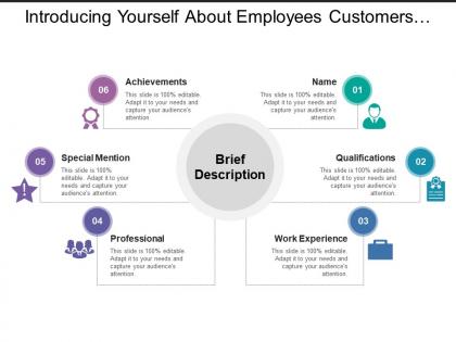
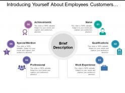
Introducing yourself about employees customers stakeholders




Try Before you Buy Download Free Sample Product
 Impress Your
 Audience
 100%
100% Editable
 Save Hours
 of Time


Add that extra with our Introducing Yourself About Employees Customers Stakeholders. Ensure your views get better coverage.
People who downloaded this PowerPoint presentation also viewed the following :
Introducing yourself about employees customers stakeholders with all 5 slides:
Honor scared beliefs with our Introducing Yourself About Employees Customers Stakeholders. Acquaint folks with their basic goodness.
FAQs for Introducing yourself about
Effective presentation templates include consistent visual hierarchy, professional color schemes, readable typography, strategic white space, and flexible layout structures. These elements streamline content creation by ensuring brand consistency, enhancing audience comprehension, and reducing design time, with many organizations finding that well-designed templates ultimately deliver more impactful presentations and stronger professional credibility.
Industries customize presentation templates by modifying color schemes, incorporating sector-specific imagery, adjusting data visualization formats, and tailoring content frameworks to match their unique requirements. Healthcare organizations might emphasize patient outcomes and regulatory compliance, while financial services focus on performance metrics and risk assessment, ultimately delivering presentations that resonate with stakeholder expectations and enhance professional credibility.
Color schemes significantly impact audience engagement by influencing attention, comprehension, and emotional response, with strategic combinations enhancing readability, creating visual hierarchy, and reinforcing brand messaging. Through carefully selected palettes, presenters streamline information processing, minimize cognitive load, and deliver more memorable experiences, with many organizations finding that consistent, purposeful color choices ultimately boost audience retention and presentation effectiveness.
Presentation templates enhance storytelling by providing structured narrative flows, consistent visual hierarchies, and strategic slide progressions that guide audiences through compelling storylines. These frameworks enable presenters to craft cohesive narratives with seamless transitions, strategic emphasis placement, and professional visual consistency, ultimately delivering more engaging experiences and memorable messaging that resonates with stakeholders across industries.
Pre-designed presentation templates offer significant time savings, professional design quality, consistent branding, cost-effectiveness, and reduced learning curve compared to building from scratch. These templates streamline workflow by providing proven layouts, color schemes, and typography choices, with many organizations finding that templates enable faster project turnaround, enhanced visual impact, and ultimately deliver competitive advantage through polished, professional presentations.
Presenters can ensure message-template alignment by selecting designs that match their content's tone, audience expectations, and communication objectives, while customizing color schemes, fonts, and visual elements to reinforce key themes. Strategic template selection involves evaluating whether the design supports data visualization needs, narrative flow, and brand consistency, with many successful presentations finding that cohesive visual-verbal integration significantly enhances audience engagement and message retention.
Typography and font choices significantly impact presentation effectiveness by enhancing readability, establishing visual hierarchy, reinforcing brand consistency, and guiding audience attention throughout slides. These design elements streamline information delivery by creating professional credibility, improving comprehension rates, and maintaining audience engagement, with many organizations finding that strategic font selections ultimately deliver clearer communication and stronger brand recognition across all presentation materials.
Multimedia elements can be effectively integrated into standard presentation templates through consistent visual hierarchies, strategic placement zones, and scalable design frameworks that accommodate videos, animations, and interactive content. These approaches streamline content creation by establishing clear multimedia guidelines, optimizing file formats for seamless playback, and ensuring responsive layouts, ultimately delivering more engaging presentations while maintaining brand consistency across organizational communications.
**INPUT**: What are the best practices for maintaining brand consistency when using templates? **OUTPUT**: Best practices include establishing comprehensive brand guidelines, creating standardized color palettes and typography systems, implementing locked design elements, and developing template libraries with pre-approved layouts. These approaches streamline content creation by ensuring visual cohesion across departments, reducing design errors, and accelerating campaign development, with many organizations finding that systematic template governance ultimately delivers stronger brand recognition and operational efficiency. [Word count: 59 words]
Presentation templates evolve with emerging design trends through regular updates incorporating contemporary color palettes, typography choices, layout structures, and visual elements like animations or interactive features. Design teams continuously analyze market preferences, user feedback, and aesthetic movements, ultimately delivering fresh template collections that help organizations maintain modern, professional appearances while staying competitive in increasingly visual business environments.
Accessibility considerations include high contrast color schemes, readable font sizes, alt text for images, screen reader compatibility, and keyboard navigation support. These design elements streamline content delivery by ensuring broader audience reach, regulatory compliance, and enhanced user experiences, with many organizations finding that accessible templates ultimately deliver improved engagement and reduced legal risks.
User feedback enhances presentation templates by identifying design flaws, content gaps, usability issues, and relevance concerns that developers might overlook. Through systematic collection of ratings, comments, and usage analytics, template providers can refine layouts, improve visual elements, and ensure templates meet diverse industry needs, ultimately delivering more effective solutions and better user experiences.
Smart features like data visualization can be incorporated through interactive charts, real-time data connections, automated graph updates, dynamic infographics, and customizable dashboard elements. These technologies streamline presentation creation by enabling seamless data integration, enhancing audience engagement, and delivering compelling visual narratives, with many organizations finding that strategic visualization ultimately accelerates decision-making processes.
Templates cater to different presentation formats through specialized design elements, content structures, visual hierarchies, and interactive features tailored to each audience's needs. Educational templates emphasize clarity and knowledge retention, corporate formats focus on professional branding and data visualization, while sales presentations prioritize persuasion and engagement, ultimately enabling presenters to deliver more targeted, effective communications.
**INPUT**: What tools and software are recommended for customizing presentation templates easily? **OUTPUT**: Recommended tools include PowerPoint, Google Slides, Canva, Keynote, and Prezi, each offering intuitive drag-and-drop interfaces, extensive design libraries, and collaborative features. These platforms streamline template customization by providing pre-built layouts, brand integration capabilities, and real-time editing, with many organizations finding that user-friendly interfaces significantly reduce design time while enhancing professional presentation quality.
-
Innovative and attractive designs.
-
Enough space for editing and adding your own content.