


Ireland powerpoint maps




Try Before you Buy Download Free Sample Product
 Impress Your
 Audience
 100%
100% Editable
 Save Hours
 of Time


Our Ireland Powerpoint Maps are ever ready for any gamble. Have the gumption to take a chance.
People who downloaded this PowerPoint presentation also viewed the following :
Ireland powerpoint maps with all 64 slides:
Even under pressure your presentations need to perform. Give them a short of confidence with flawless Ireland Powerpoint Maps designs.
-
Ireland powerpoint maps
-
Ireland powerpoint maps
-
Ireland powerpoint maps
-
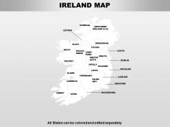
Ireland powerpoint maps
-

Ireland powerpoint maps
-
Ireland powerpoint maps
-
Ireland powerpoint maps
-
Ireland powerpoint maps
-
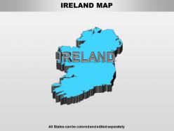
Ireland powerpoint maps
-
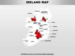
Ireland powerpoint maps
-

Ireland powerpoint maps
-
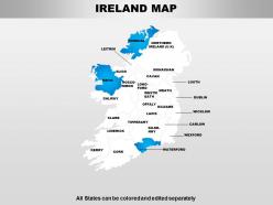
Ireland powerpoint maps
-
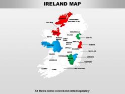
Ireland powerpoint maps
-
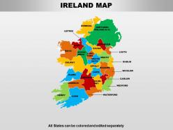
Ireland powerpoint maps
-
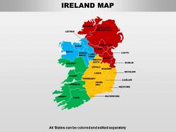
Ireland powerpoint maps
-
Ireland powerpoint maps
-
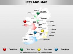
Ireland powerpoint maps
-
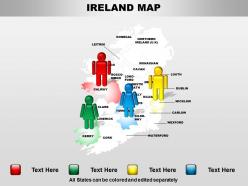
Ireland powerpoint maps
-
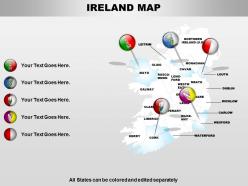
Ireland powerpoint maps
-
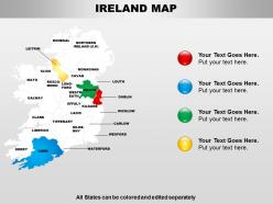
Ireland powerpoint maps
-
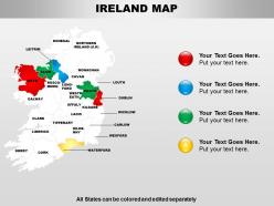
Ireland powerpoint maps
-
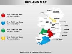
Ireland powerpoint maps
-
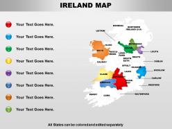
Ireland powerpoint maps
-
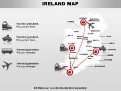
Ireland powerpoint maps
-
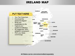
Ireland powerpoint maps
-
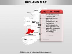
Ireland powerpoint maps
-
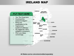
Ireland powerpoint maps
-
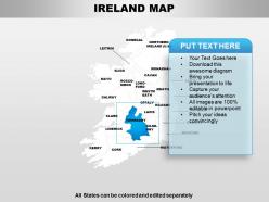
Ireland powerpoint maps
-
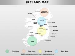
Ireland powerpoint maps
-
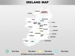
Ireland powerpoint maps
-
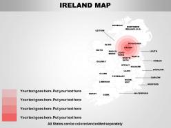
Ireland powerpoint maps
-
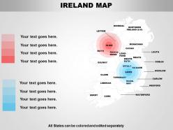
Ireland powerpoint maps
-
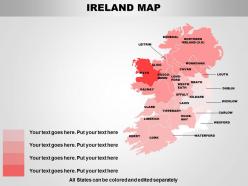
Ireland powerpoint maps
-
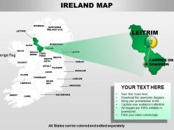
Ireland powerpoint maps
-
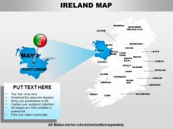
Ireland powerpoint maps
-
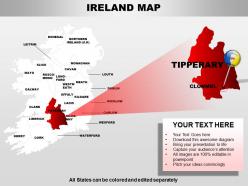
Ireland powerpoint maps
-
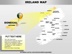
Ireland powerpoint maps
-
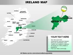
Ireland powerpoint maps
-
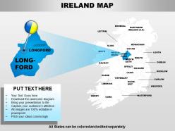
Ireland powerpoint maps
-
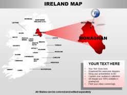
Ireland powerpoint maps
-
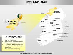
Ireland powerpoint maps
-
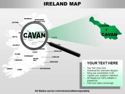
Ireland powerpoint maps
-
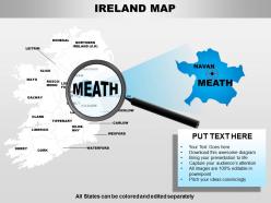
Ireland powerpoint maps
-
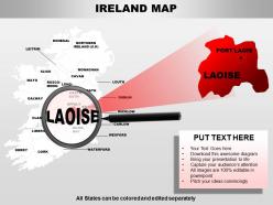
Ireland powerpoint maps
-
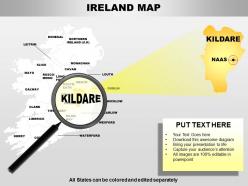
Ireland powerpoint maps
-
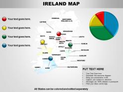
Ireland powerpoint maps
-
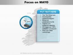
Ireland powerpoint maps
-
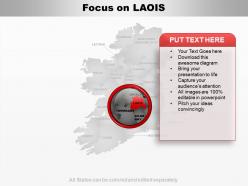
Ireland powerpoint maps
-
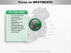
Ireland powerpoint maps
-
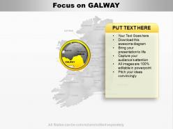
Ireland powerpoint maps
-
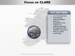
Ireland powerpoint maps
-
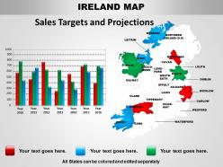
Ireland powerpoint maps
-
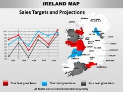
Ireland powerpoint maps
-
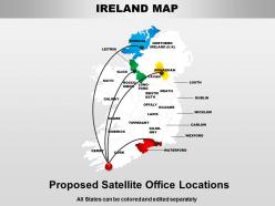
Ireland powerpoint maps
-
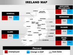
Ireland powerpoint maps
-
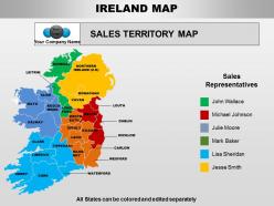
Ireland powerpoint maps
-
Ireland powerpoint maps
-
Ireland powerpoint maps
-
Ireland powerpoint maps
-
Ireland powerpoint maps
-
Ireland powerpoint maps
-
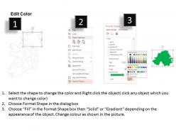
Ireland powerpoint maps
-
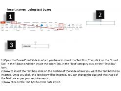
Ireland powerpoint maps
-
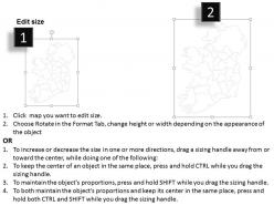
Ireland powerpoint maps
FAQs for
So Irish maps are basically a whole colonial drama in cartography form. The 1500s-1600s ones were British military surveys - they used them to carve up land for plantations. Then the massive Ordnance Survey hit in the 1840s, mapping literally every field and townland with crazy detail. During the Land War and partition fights, these maps became super important since they showed exactly who owned what. Here's the wild part though - Irish nationalists ended up using those same British maps to make their own territorial arguments. The OSI has this cool historical collection online if you want to see how borders and place names shifted over time.
Honestly, digital maps are a game-changer for Ireland trips. You'll find all those tucked-away spots in the countryside way easier now, plus get real-time directions when those narrow roads get confusing. Download an offline map app before you leave though - trust me on this one. Cell service gets pretty sketchy once you're out in rural areas, which happens more often than you'd think. The cool part is most apps now show user reviews and opening hours right there, so you won't drive an hour to find something's closed. Makes exploring way less stressful.
So old Irish maps are pretty fascinating once you know what to look for. Clan territories and boundaries were huge - mapmakers obsessed over who controlled what land. Coastlines got crazy detailed since shipping was everything back then. Religious spots like monasteries are all over these maps too, which makes sense given Ireland's history. Mountains, rivers, and bogs show up constantly because they literally shaped where people could live and travel. Oh, and the bog mappings are weirdly precise sometimes. Start with those features and you'll get a feel for what each cartographer thought mattered most.
So basically, topo maps show you all the physical stuff - mountains, valleys, rivers, elevation changes. Political maps are more about boundaries like counties and cities. With topographical ones, you get those contour lines (honestly still confuse me sometimes) that show terrain. Perfect if you're hiking the Wicklow Mountains or checking out Kerry's coastal elevations. Political maps highlight things like Cork, Dublin, county borders - the 32 counties and all that. Really depends what you need it for. Hiking? Go topographical. Planning a road trip between towns or figuring out jurisdictions? Political's your best bet.
Honestly, mapping tech is a total game-changer for ecology work here. Satellite data and GIS let you track habitat changes, study peatland restoration, monitor coastal erosion - all that stuff. The EPA has loads of free data available which is brilliant. You can spot invasive species spreading and follow wildlife corridors without actually hiking through every single bog (though where's the fun in that?). Remote sensing is perfect for biodiversity hotspots too. Start with the National Biodiversity Data Centre's mapping portal - it's seriously useful for research.
Oh man, maps are like time machines for Irish history! You can literally trace ancient ring forts and see where old Gaelic kingdoms used to be. The 1800s Ordnance Survey ones are incredible - they show townland names, archaeological sites, even ghost villages from the famine era. Honestly, I got completely lost browsing them for hours once. Settlement patterns tell you so much about colonization and migration too. The National Library has this cool digital collection where you can overlay historical maps with current ones. It's wild seeing how your area looked centuries ago vs now.
So basically, scientists compare old maps with current satellite images to track how Ireland's landscape has changed over time. They'll layer a 1950s map over a 2020 satellite photo - the differences are actually pretty crazy to see! Things like coastal erosion, cities expanding, forests shrinking or growing. LiDAR tech creates super detailed elevation maps that catch even tiny changes in the land. Oh, and they track bog degradation too, which is kind of depressing honestly. If you're curious about your area specifically, the OSI has tons of historical maps you can browse through online.
So Ireland's geology is actually pretty wild - you've got these ancient Precambrian rocks in the northwest that are like 1.7 billion years old, then tons of Carboniferous limestone covering the middle. The contrast is crazy when you compare somewhere rugged like Donegal to the flat limestone plains in the midlands. Two major mountain-building events (Caledonian and Variscan) basically carved up different parts of the country. Oh, and if you're doing any actual fieldwork, grab the Geological Survey Ireland 1:100,000 maps - they're ridiculously detailed and will save you so much time planning.
Maps basically built modern Ireland, no joke. Those old Ordnance Survey guys from the 1800s decided where roads and railways went - and we're still stuck with their choices when we're sitting in traffic. Dublin's Georgian squares, the Wild Atlantic Way route, even flood zone planning today all comes back to mapping data. Urban planners are obsessed with GIS now for figuring out where stuff should go. Honestly, if you want to understand Irish development patterns, just compare old OS maps with current satellite images. You'll see exactly how those surveying decisions from centuries ago still control everything we build.
Honestly, Ireland's coastline is a total pain - all those inlets and tiny islands everywhere. Then you've got Carrauntoohil and other mountains creating crazy elevation changes. Those little offshore rocks? Absolute nightmare to map accurately. I'd definitely use high-resolution satellite imagery plus actually checking the coastal areas in person if possible. The boglands and limestone karst stuff out west don't fit normal topographic symbols either. You'll need specialized markers for Ireland's weird geological features. Oh, and don't clutter it with every single coastal detail or it'll look like a mess.
Honestly, themed maps are a game changer for Irish history. Instead of just memorizing dates, you can see exactly where stuff went down - like which Dublin streets were part of the 1916 Rising or how the Famine hit different counties. Geography suddenly matters, you know? Plus you start noticing patterns, like how conflicts spread across regions. Way better than those boring textbooks we had to read in school. Migration routes and battle maps are perfect if you're trying to get someone hooked on the subject. Makes everything click together.
QGIS is your best bet - totally free and works great with Irish grid stuff. If your company's got ArcGIS Online already, that's pretty sweet for client sharing. I probably wasted half my weekend last month messing around with different options lol. Mapbox is decent for web stuff, or just use Google My Maps if you want something dead simple. Oh, and grab your boundary data from CSO or Ordnance Survey Ireland first - you'll need that. Start with QGIS and some free datasets to see what works.
Dude, interactive maps are so much better than those boring textbook ones. You can actually click around and zoom into different counties instead of just staring at a flat page. The layering thing is pretty cool too - like you can see population stuff, historical sites, climate zones all on the same map. Makes way more sense how geography actually affects culture and development. Start with just the county boundaries first, then add more layers as you get the hang of it. Way more fun than memorizing lists, trust me.
So Ireland's demographic maps show this crazy concentration around Dublin and the east coast - that's where everyone lives basically. Cork and Galway are decent sized too, but then the western counties? Almost nobody. Makes sense though when you think about where the jobs actually are. Coastal areas beat inland spots for population density pretty much everywhere. The urban-rural split is super obvious when you look at these maps. Really handy if you're doing market research or trying to figure out where people actually are versus where you assume they'd be.
Yeah, map projections totally mess with how Ireland actually looks compared to other countries. Mercator is the worst offender - makes it seem tiny next to Greenland, which is just weird. You want something like Irish Transverse Mercator or Lambert Conformal Conic instead. Those are built for mid-latitude areas so they don't warp Ireland's real shape and size. Honestly, if you're doing any serious work with Irish geography, ditch Mercator completely. It's fine for world maps but terrible for getting accurate proportions of individual countries.
-
Attractive design and informative presentation.
-
The content is very helpful from business point of view.