


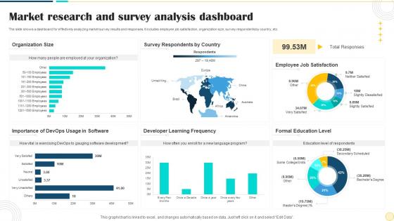
Market Research And Survey Analysis Dashboard




Try Before you Buy Download Free Sample Product
 Impress Your
 Audience
 100%
100% Editable
 Save Hours
 of Time


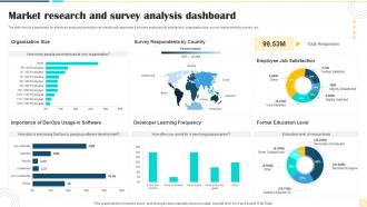
The slide shows a dashboard for effectively analyzing market survey results and responses. It includes employee job satisfaction, organization size, survey respondents by country, etc.
People who downloaded this PowerPoint presentation also viewed the following :
Market Research And Survey Analysis Dashboard with all 7 slides:
Use our Market Research And Survey Analysis Dashboard to effectively help you save your valuable time. They are readymade to fit into any presentation structure.





FAQs for Market Research And
Market size and growth rates are your starting point - plus competitive share analysis and customer acquisition costs. Conversion rates throughout your funnel matter big time, along with customer lifetime value and churn rates. These will literally save your ass in quarterly reviews. Pricing sensitivity and brand awareness help with positioning too, though I sometimes think brand metrics are overrated. Anyway, stick to maybe 6-8 key metrics tops. More than that and you'll just stare at dashboards all day without making decisions. Pick whatever actually drives results for your specific situation.
Honestly, charts are a game-changer for making sense of all that market data chaos. Your brain processes visuals way faster than scanning through endless rows of numbers - it's just how we're wired. Line charts work great for tracking growth, heat maps show geographic stuff really well, and bar charts are perfect for comparing different segments. The trick is matching the right chart type to whatever story your data's telling. Oh, and don't overcomplicate things at first. Just pick your most important metrics and create clean, simple charts that actually answer the questions you care about most.
Dude, real-time data is what separates useful dashboards from pretty wallpaper. You're driving blind with old reports - like trying to navigate rush hour traffic with yesterday's traffic app, if that makes sense. Live data lets you catch trends while they're actually happening instead of reading about them weeks later. Honestly, static monthly reports are already ancient history by the time you see them. Competitor doing something sketchy? You'll know immediately. Market shifting? You can pivot before everyone else catches on. Set up those automated feeds ASAP.
So user segmentation basically saves you from looking at useless averages that don't tell you anything. Like instead of "overall satisfaction is 7/10" you'll actually see millennials love you (9/10) while boomers hate you (5/10). Totally changes everything! You can break down your data by age, buying patterns, how much they engage - whatever makes sense for your business. Honestly, it's the difference between shooting blind and actually knowing who's driving your revenue. Oh, and which groups might be trending up or down. Start small though - pick maybe 2-3 segments that matter most to your goals.
Power BI and Tableau are your best bets if you need heavy-duty customization - though fair warning, they're not exactly intuitive at first. Google Data Studio is free and honestly pretty decent for web analytics stuff. I was surprised how good the dashboards looked when my coworker showed me theirs last month. Looker and Qlik Sense are worth checking out too if you want something more specialized. Start with Power BI's free trial or just dive into Data Studio to test your data first. Don't overthink it - you'll figure out what works once you start playing around.
Honestly, just grab the APIs from Facebook, Twitter, Instagram - they're way easier than they sound once you figure out the login stuff. Pull engagement rates, sentiment data, mentions, whatever you need straight into your dashboard. I'd start with just one platform though, don't go crazy right away. Test your charts and graphs first, then add more. Or if coding isn't your thing, tools like Hootsuite work too but they're kinda pricey. The real trick is picking which metrics actually matter for what you're researching instead of tracking everything.
Side-by-side layouts are your best friend here - makes it super easy to spot gaps. Color-code each competitor consistently (like Competitor A is always blue throughout). Radar charts are honestly my favorite for feature comparisons, but bar charts work well for market share stuff too. Here's the thing though - don't just dump data on them. If Competitor B has 30% market share, explain what that actually means for your positioning strategy. Oh, and always use your company as the baseline comparison. Keep labels clear and make it scannable since execs will probably just skim it anyway.
Honestly, weekly or monthly updates work best for most market research stuff. Daily is way too much unless you're watching something that changes fast - like ad campaigns or whatever. Tech industries move crazy quick compared to something like construction, so that matters too. I'd probably start with weekly and see how it feels? You can always dial it back if it's too much. Oh, and definitely set up those automated refreshes. Trust me, manually pulling data every week gets old real fast. The goal is staying current without driving everyone nuts with constant changes.
Don't cram everything onto one screen - that's the biggest mistake I see. Also, seriously, stop with the 8-slice pie charts. Nobody can read those things. Figure out what decisions people actually need to make first, then work backwards. Your audience probably doesn't need half the stuff you think they do. Make it obvious where to look first - create some kind of visual hierarchy. Oh, and just because you can make something interactive doesn't mean you should. Half the time it just confuses people more than it helps.
Dude, this totally fixes the whole "everyone working off different data" nightmare. Sales can finally see which customer segments are actually responding. Marketing tweaks campaigns based on the same numbers. Product dev spots trends early - you know how they usually lag behind everything else. Set up different views so teams aren't drowning in irrelevant metrics. The tricky part? Getting people to actually check it regularly instead of just bookmarking and forgetting. Maybe try those weekly cross-team reviews first. Once people see how much easier their job gets, they'll start using it naturally.
Real-time visualization is a must - nobody wants to wait around for data to refresh. You'll want customizable filters and trend analysis obviously. Demographic segmentation helps a ton, plus competitor tracking and automated alerts for your key metrics. Drill-down features are honestly game-changers because you can click into charts and see what's actually happening underneath. Export functions too since everyone always wants their Excel files for whatever reason. Oh, and annotation features so your team can explain why there was that weird spike last Tuesday. Makes the data actually mean something instead of just pretty charts.
Honestly, your audience is everything when laying out dashboards. C-suite folks need those big KPIs right up front - no time for hunting around. Analysts? They actually want all the messy details and filters to play with. Marketing teams love the visual story stuff, like campaign flows and customer journeys. I totally bombed this once by showing executives a crazy complex breakdown when they just wanted three numbers, lol. Short version: figure out what each group actually does with the data, then organize around that. Oh and put the most important stuff where their eyes hit first.
So you can show customer sentiment scores, word clouds from surveys, and themes from interviews. NPS comments work great when you break them down by topic. Journey mapping is solid too - shows where people get frustrated at each step. Honestly, sentiment trends over time are my favorite because the story just jumps out at you. Brand perception stuff, feature requests, competitive feedback - all good options. The trick is taking those messy text responses and sorting them into clean visual buckets. I'd start with your most common feedback patterns and build dashboards around those. Makes everything way clearer.
Throw some rating widgets right on each report section - super easy for people to click. When someone exports data or stares at a chart for a while, hit them with a quick automated survey since they're clearly engaged. Those moments are gold, honestly. Short feedback forms work great too, but seriously keep them tiny because long surveys are the worst. Oh, and here's the thing nobody talks about - you've gotta actually tell users what you changed based on their feedback. Otherwise they'll stop giving it. Make the whole thing feel natural, not like homework.
Definitely focus on mobile-first design since executives are always pulling up dashboards during meetings on their phones. Your charts need to be readable without squinting - trust me, tiny data points are useless. Go with simplified layouts and bigger tap targets for any filters or buttons. Think about which metrics actually matter most for mobile viewing too. I'd test it across different devices because screen sizes vary so much. The main thing is getting your key insights visible right away without making people scroll forever or pinch-to-zoom constantly. It's honestly frustrating when dashboards aren't optimized properly.
-
I faced no difficulty while searching for the slide I wanted. Honestly, the website’s interface is easy to use and can be navigated easily!
-
The PPT layout is great and it has an effective design that helps in presenting corporate presentations. It's easy to edit and the stunning visuals make it an absolute steal!