


Measure Sales Performance With Kpi Dashboard Complete Guide To Sales MKT SS V




Try Before you Buy Download Free Sample Product
 Impress Your
 Audience
 100%
100% Editable
 Save Hours
 of Time


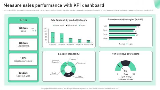
This slide provides glimpse about dashboard analysis that can help the business to track the performance of the sales team. It includes KPIs such as sales, sales target, target achievement, sales last year, sales by channel, etc.
People who downloaded this PowerPoint presentation also viewed the following :
Measure Sales Performance With Kpi Dashboard Complete Guide To Sales MKT SS V with all 7 slides:
Use our Measure Sales Performance With Kpi Dashboard Complete Guide To Sales MKT SS V to effectively help you save your valuable time. They are readymade to fit into any presentation structure.






FAQs for Measure Sales Performance With Kpi Dashboard Complete Guide To Sales
Essential components include clear visual hierarchy, real-time data integration, customizable metrics aligned with business objectives, interactive filtering capabilities, and mobile responsiveness. These elements work together by enabling stakeholders to quickly identify performance trends, drill down into specific data points, and make informed decisions, with many organizations finding that well-designed dashboards ultimately enhance operational efficiency and strategic alignment.
Visualizations enhance KPI understanding by transforming complex data into intuitive charts, graphs, and interactive displays that reveal patterns, trends, and outliers at a glance. Through dashboards featuring heat maps, gauge charts, and trend lines, organizations streamline decision-making, accelerate performance monitoring, and enable stakeholders to quickly identify areas requiring attention, ultimately delivering faster strategic responses.
Real-time data enables KPI dashboards to provide immediate insights for faster decision-making, proactive issue identification, and responsive performance management across organizations. Through continuous data streaming, businesses can monitor operational efficiency, track customer interactions, and adjust strategies instantly, with many financial services and manufacturing companies finding that real-time monitoring significantly enhances competitive advantage and reduces response times.
Businesses can tailor KPI dashboards by selecting department-specific metrics, customizing visualizations for each team's workflow, and adjusting data granularity to match decision-making levels. Sales teams might track conversion rates and pipeline velocity, while HR focuses on employee satisfaction and retention metrics, with manufacturing monitoring equipment efficiency and quality scores, ultimately enabling targeted performance optimization across all organizational functions.
Common pitfalls include overloading with irrelevant metrics, poor visual hierarchy, lack of real-time data integration, unclear stakeholder alignment, and inconsistent update frequencies. These design flaws often result from insufficient user research and technical planning, with many organizations finding that cluttered interfaces and misaligned KPIs ultimately hinder decision-making rather than streamline operational efficiency.
Organizations ensure KPI alignment with strategic goals by establishing clear cascading objectives, conducting regular strategic reviews, and mapping each KPI to specific business outcomes. Through structured alignment processes, companies like retail chains and financial services firms connect departmental metrics to overarching goals, ultimately delivering measurable progress tracking and enhanced strategic execution across all organizational levels.
Best practices for choosing the right KPIs include aligning metrics with strategic objectives, ensuring measurability and data availability, selecting leading and lagging indicators, and maintaining a balanced scorecard approach. These practices enable organizations to track performance effectively by focusing on actionable metrics, avoiding vanity measurements, and establishing clear benchmarks, ultimately delivering meaningful insights that drive strategic decision-making and operational improvements.
User feedback enhances KPI dashboard usability by identifying navigation pain points, clarifying confusing data visualizations, and revealing which metrics matter most to different user roles. Through surveys, user testing sessions, and analytics tracking, organizations streamline dashboard layouts, improve chart readability, and customize views for executives versus operational teams, ultimately delivering more intuitive interfaces and faster decision-making capabilities.
Effective KPI dashboard tools include Tableau, Power BI, Google Data Studio, Klipfolio, and Sisense, each offering unique visualization capabilities and integration options. These platforms streamline data aggregation, automate reporting processes, and enhance decision-making across organizations, with many businesses finding that cloud-based solutions deliver greater scalability and real-time insights.
Data accuracy significantly impacts KPI dashboard effectiveness by ensuring reliable decision-making, maintaining stakeholder trust, and preventing costly strategic errors. Inaccurate data leads to misguided resource allocation, flawed performance assessments, and reduced confidence in analytics, with many organizations finding that even small data inconsistencies can undermine entire business intelligence initiatives and competitive positioning.
Operational KPI dashboards focus on real-time metrics, daily performance tracking, and immediate tactical decisions, while strategic dashboards emphasize long-term trends, quarterly goals, and executive-level insights. Operational dashboards help managers monitor production efficiency, customer service levels, and resource allocation, whereas strategic versions enable leadership teams to assess market positioning, competitive advantage, and organizational growth trajectories.
Mobile compatibility enhances KPI dashboard accessibility by enabling real-time monitoring from anywhere, supporting touch-based navigation, and providing responsive layouts that adapt to smaller screens. This mobility empowers executives, field managers, and remote teams to make data-driven decisions instantly, ultimately delivering faster response times and improved operational efficiency across organizations.
E-commerce KPI dashboards should prioritize conversion rates, average order value, customer acquisition cost, customer lifetime value, cart abandonment rates, and monthly recurring revenue. These metrics enable retailers to streamline marketing spend, enhance customer experiences, and accelerate revenue growth, with many online businesses finding that tracking these core indicators ultimately delivers improved operational efficiency and competitive advantage.
Cultural differences significantly influence KPI selection through varying priorities like individual versus collective performance, short-term versus long-term focus, and hierarchical versus collaborative decision-making approaches. Organizations operating globally must consider these cultural nuances when designing dashboards, with many multinational companies finding that localized KPI frameworks enhance employee engagement and deliver more meaningful performance insights across diverse markets.
AI-powered analytics, real-time data visualization, mobile-first design, predictive insights, and interactive storytelling are revolutionizing KPI dashboard functionality. These innovations enable organizations to streamline decision-making, enhance user engagement, and deliver personalized experiences, with many companies finding that modern dashboards ultimately provide competitive advantage through faster insights and improved operational efficiency.
-
Great designs, Easily Editable.
-
The slides come with appealing color schemes and relevant content that helped me deliver a stunning presentation without any hassle!