


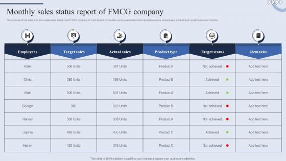
Monthly Sales Status Report Of Fmcg Company




Try Before you Buy Download Free Sample Product
 Impress Your
 Audience
 100%
100% Editable
 Save Hours
 of Time


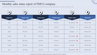
The purpose of this slide is to showcase sales status report FMCG company to track targets. It includes various parameters such as targets sales, actual sales, product type, target status and remarks.
People who downloaded this PowerPoint presentation also viewed the following :
Monthly Sales Status Report Of Fmcg Company with all 9 slides:
Use our Monthly Sales Status Report Of Fmcg Company to effectively help you save your valuable time. They are readymade to fit into any presentation structure.








FAQs for Monthly Sales Status Report
Start with the big three: total revenue, units sold, conversion rates. After that, slice it by product lines, channels, and your best sales reps. Leadership eats up those year-over-year trend comparisons, so definitely include those. Pipeline stuff matters too - new leads, deal velocity, all that future-looking data. Oh, and don't skip customer acquisition costs or average deal size. Those numbers always spark interesting conversations in my experience. I'd toss in a wins/challenges section at the end. Keep it under two pages though - nobody's got time to read a novel, especially executives. Short sentences work. People actually finish reading them.
Honestly, charts and graphs are a game changer for sales presentations. People's eyes just glaze over when you throw spreadsheets at them. Bar charts work great for comparing numbers, line graphs show trends - you know the drill. I'd stick with maybe 2-3 key metrics max though, otherwise it gets overwhelming. Oh and color coding helps too, especially for highlighting your big wins. The fancy animations might look cool but they're usually distracting. Keep it clean and your audience will actually remember what you showed them instead of zoning out halfway through.
Honestly, just track three main things when you're comparing those monthly reports. Revenue patterns are huge - growth, seasonal drops, random spikes, whatever. Also watch your conversion rates and how many new customers you're pulling in each month. Product performance is the third one - which stuff's flying off the shelves vs. collecting dust. Don't stress about small month-to-month weirdness though. Sometimes January's just slow because everyone's broke from the holidays, you know? Real trends show up over 3-6 months. Throw everything into a basic spreadsheet so you can actually see what's happening consistently.
Yeah, seasonal stuff totally screws with your monthly data. Retail always dies in February then goes crazy during holiday season - meanwhile B2B gets weird in summer when half your contacts are at the beach or whatever. I'd skip month-to-month comparisons entirely. Compare February this year to last February instead. Way more useful. Short months are brutal too, honestly. Try looking at quarterly averages - smooths out all that seasonal weirdness so you can actually see if you're growing or just riding the usual ups and downs.
Honestly, client feedback is gold for your monthly sales analysis. It shows you the "why" behind those numbers you're staring at. Like, you'll notice patterns - maybe complaints spike right before sales tank, or customers keep raving about one feature that drives repeat buys. I'm always comparing feedback themes with revenue because sometimes everything looks good on paper but clients are secretly annoyed about something. Trust me, that'll come back to haunt you later. Just make sure you categorize their comments the same way each month so you can actually track how sentiment changes with your sales trends.
Your sales report is basically your strategy's health check. Honestly, the conversion and pipeline data tell you everything - where prospects bail out, which activities actually lead to wins, that kind of thing. Check which products are bombing and what territories need help. I'd compare your forecasts to what actually happened too. The biggest gaps should be your starting point. From there you can shift resources around or try different tactics. It's pretty straightforward once you know what you're looking for.
Honestly, just think storytelling over data dumping. Clean charts beat messy tables every single time - nobody wants to squint at spreadsheets during a presentation. I always go big picture first (revenue, major wins) then get into the weeds with product performance and regional stuff. Oh, and definitely add a "so what does this mean" section because executives love knowing implications for next quarter. Keep slides super clean, but prep for random questions about weird dips in the data. Your whole job is making complicated numbers actually make sense so they can decide stuff without their brains melting.
So I'd grab your last 12-24 months of sales data and plot it out first. You'll start seeing seasonal patterns and which products are actually picking up steam vs dying out. Compare year-over-year instead of just month-to-month though - that smooths out the random ups and downs. Honestly, this saved my butt last quarter when I spotted a trend we would've totally missed otherwise. Once you see the patterns, you can project them forward. Makes setting realistic targets way easier. Customer behavior shifts show up pretty clearly too if you know what to look for.
So if you're just starting out, Excel or Google Sheets work fine for basic stuff. Tableau and Power BI are where it gets interesting if you want those slick dashboards everyone's obsessed with. I used to spend forever making Excel look pretty - total time sink, but whatever. Your CRM probably has decent reporting already built in. Salesforce is solid, HubSpot's super easy to figure out. Google Data Studio's free and connects to pretty much anything. Looker's cool but might be overkill. Honestly? Just start with what you've got and see what's missing.
Start with the big stuff - customer type, product categories, geography, and sales channels. Those will show you the most. Weekly trends are solid too, plus customer size breakdowns. Honestly? I've watched people segment themselves into a corner where they can't make any decisions. Stick to segments that are at least 5-10% of your business - chasing the tiny stuff is usually a waste of time. Build from there. Short sentences work. If something jumps out as weird, then you can dig deeper into more specific cuts.
Seasonal stuff will mess with your head – like, don't freak out when pool supply sales tank in December, you know? I'd look at 3-6 month trends instead of obsessing over single months. Holidays, campaigns, weird economic stuff can throw everything off too. One thing that drives me crazy is when people compare data from different sources or date ranges – total waste of time. Oh, and definitely break down your numbers by product or region rather than just staring at totals. That's honestly where you'll spot the good stuff.
Your sales data is gold for figuring out what's actually working. Check your best-selling products and which customer groups are buying most - that's where you throw your marketing budget. I'm obsessed with looking at seasonal patterns too, helps you time campaigns better. Target audiences similar to your biggest spenders, that's usually a safe bet. Oh, and those products that aren't selling? Sometimes they just need better copy, not a complete overhaul. Pull your last few months of data and see which marketing channels are giving you the best bang for your buck.
Oh definitely do this! Your sales numbers mean nothing without context - like, did you tank or did the whole market crash? Track 2-3 competitors monthly (pricing, big announcements, that sort of thing). Honestly, executives eat this stuff up because they're obsessed with beating the competition. You'll catch trends early and can actually explain why your numbers look the way they do. Makes budget requests way easier too. I learned this the hard way after presenting declining sales with zero context - awkward meeting. Start simple though, don't overcomplicate it.
Honestly? Check them every few days if you can swing it. Weekly at the very least though - monthly is way too slow and you'll miss stuff. We learned that lesson when a huge Q3 spike flew right past us because we only checked end-of-month numbers like idiots. Quick reviews help you catch patterns early and pivot fast when something's working (or isn't). Just throw a recurring reminder on your calendar and actually stick to it. Doesn't have to be perfect, but being consistent about it makes all the difference.
Oh yeah, ditch all the granular stuff that doesn't support your main point. Individual transactions, every SKU breakdown, super detailed methodology - nobody cares. I sat through a 40-slide nightmare once and could literally see people checking out. Focus on metrics that actually drive decisions. Skip the internal process junk and outdated comparisons too. Honestly? If data contradicts your story but doesn't add real value, cut it. Your deck should tell one clear story, not dump everything you've ever analyzed. Short and punchy wins every time.
-
I was mind-blown by the services that SlideTeam provided me. Thanks a ton!
-
Great experience, I would definitely use your services further.