


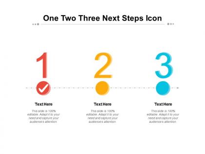
One two three next steps icon





Try Before you Buy Download Free Sample Product
 Impress Your
 Audience
 100%
100% Editable
 Save Hours
 of Time


Giving a world class presentation can help take your presentation to the next level. Our carefully crafted One Two Three Next Steps Icon are ready to help you get there.
People who downloaded this PowerPoint presentation also viewed the following :
One two three next steps icon with all 2 slides:
Go farther in your next presentation. Our One Two Three Next Steps Icon are ready to help you go the extra mile.
FAQs for One two three
Best practices for preparing a presentation include customizing content to match your audience's needs, maintaining consistent branding throughout, organizing information with clear flow, incorporating compelling visuals, and practicing delivery timing. These approaches streamline presentation development by ensuring message clarity, professional appearance, and audience engagement, with many organizations finding that strategic template customization ultimately delivers more impactful communications and stronger business outcomes.
Tailoring presentation templates involves customizing content hierarchy, visual elements, messaging tone, and data presentation formats to match your audience's expertise level, industry context, and decision-making priorities. Analyze your audience's familiarity with technical concepts, preferred communication styles, and key pain points, then adjust slide layouts, terminology, examples, and call-to-action messaging accordingly, ensuring maximum engagement and relevance.
Focus on consistent color schemes that align with your brand, readable typography with appropriate font sizes, clean layouts with adequate white space, and high-quality visuals that support your message. These elements work together to enhance audience engagement, reinforce brand identity, and ensure professional presentation delivery, with many organizations finding that cohesive design significantly improves message retention and stakeholder buy-in.
Effectively incorporating data involves selecting relevant metrics that support your key messages, using clear visual hierarchies with charts and infographics, and ensuring statistics are contextualized with explanatory text. Strategic placement throughout your template, combined with consistent formatting and compelling data storytelling, helps audiences grasp complex information quickly, ultimately delivering more persuasive presentations and stronger stakeholder engagement.
Common pitfalls include over-relying on default layouts without customization, cramming excessive text onto slides, ignoring brand consistency, using low-quality images, and failing to adapt content for your specific audience. These mistakes often result from treating templates as final products rather than starting points, with many organizations finding that strategic customization and thoughtful content adaptation ultimately delivers more engaging presentations and stronger audience connection.
Storytelling enhances template presentations by creating emotional connections, improving audience retention, and transforming data into compelling narratives that resonate with viewers. Through strategic narrative arcs, presenters can guide audiences through complex information more effectively, while incorporating real-world examples and case studies that make abstract concepts tangible, ultimately delivering more persuasive and memorable business communications.
Ensuring presentation accessibility requires implementing multiple design principles, including high contrast color schemes, readable fonts, alternative text for images, consistent navigation structures, and screen reader compatibility. Through these strategic approaches, organizations enhance viewer engagement across diverse audiences, minimize communication barriers, and ultimately deliver more inclusive experiences, with many finding that accessible templates also improve overall design clarity and professional impact.
Maintaining brand consistency with pre-designed templates involves customizing colors, fonts, and imagery to match your brand guidelines, replacing placeholder content with your messaging, and ensuring your logo appears consistently throughout. Strategic template selection that aligns with your brand personality, combined with careful customization of key visual elements, enables professional presentations while preserving brand identity and delivering cohesive customer experiences.
**INPUT**: What techniques can I use to make my slides more engaging when starting from a template? **OUTPUT**: Effective engagement techniques include customizing visuals with brand-specific colors and fonts, incorporating interactive elements like polls or clickable navigation, adding relevant data visualizations, and using strategic white space for focus. These approaches transform standard templates by enhancing visual hierarchy, streamlining information flow, and creating memorable audience experiences, with many presenters finding that personalized storytelling elements ultimately deliver stronger engagement and message retention. [Word count: 60 words]
Integrating multimedia elements involves embedding videos directly into slides, incorporating animated GIFs or motion graphics, adding audio narration, and utilizing interactive buttons or hyperlinks. These elements enhance audience engagement and message retention, with many organizations finding that strategic multimedia integration reduces presentation time while delivering more impactful communications, ultimately creating competitive advantage through dynamic storytelling.
Effective template-based presentation strategies include thorough content customization, multiple practice runs with timing, audience-specific messaging adaptation, and seamless visual integration rehearsals. Through structured preparation sessions, presenters can master slide transitions, refine key talking points, and build confident delivery momentum, with many organizations finding that template familiarity enables smoother presentations and enhanced audience engagement.
Effective template balance combines concise, scannable text with supporting visuals that reinforce key messages, using the 60-40 rule where visuals dominate space while text drives clarity. Strategic placement involves headers, bullet points, and white space to guide attention, with many organizations finding that templates emphasizing visual storytelling through charts, icons, and infographics ultimately deliver stronger engagement and message retention.
When selecting a presentation template for a corporate audience, consider professional design aesthetics, brand alignment, content hierarchy, readability across devices, and audience expectations. Templates should streamline your message delivery while enhancing credibility, with many organizations finding that clean layouts, consistent typography, and strategic use of corporate colors ultimately deliver stronger engagement and more persuasive business outcomes.
Gather feedback through post-presentation surveys, direct audience conversations, and analytics from digital platforms tracking engagement metrics. Combine qualitative insights about content clarity and visual appeal with quantitative data on slide performance, ultimately creating a comprehensive improvement framework that enhances future template selection and customization strategies.
Tools that complement presentation templates include interactive polling platforms like Mentimeter, collaborative whiteboards such as Miro, audience response systems, live Q&A tools, and gamification platforms. These technologies enhance engagement by enabling real-time feedback, collaborative brainstorming, and dynamic participation, with many organizations finding that strategic integration of multiple tools creates more memorable experiences and drives better audience retention.
No Reviews