


Operational performance summary dashboard presentation design




Try Before you Buy Download Free Sample Product
 Impress Your
 Audience
 100%
100% Editable
 Save Hours
 of Time


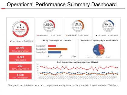
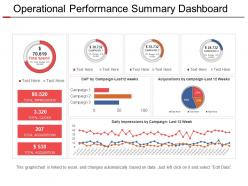
Help your business to stay in control and showcase most important data, metrics and KPIs with our operational performance summary dashboard presentation design. Our operational performance summary presentation slide design can aid you in presenting operational performance and control production processes for maximum resource. Use this performance dashboard PPT slide to differentiate between strategic, analytical, operational and tactical dashboards. This project management dashboard presentation layout can be used to track and monitor the health of an organization or department by reporting on KPIs, business metrics, and analytics. Download this PowerPoint dashboard PPT slide to show the value of reporting dashboard is in its ability to change behavior and drive incremental, continuous improvements. This executive dashboard operational performance presentation design help you promote a culture of continuous improvement and to show performance analysis. Download this data driven template and review orders, inventory, and the efficiency of your processes. Go far above and beyond expectations with our Operational Performance Summary Dashboard Presentation Design. You will achieve great heights.
People who downloaded this PowerPoint presentation also viewed the following :
Operational performance summary dashboard presentation design with all 5 slides:
Your ascent is guaranteed to be impressive due to our Operational Performance Summary Dashboard Presentation Design. You will graduate to the highest echelons.
FAQs for Operational performance summary
User-friendly dashboard design requires clear visual hierarchy, intuitive navigation, relevant data visualization, responsive layout, and consistent branding elements. These components work together by minimizing cognitive load, enabling quick decision-making, and ensuring seamless user experiences across devices, with many organizations finding that well-designed dashboards significantly enhance operational efficiency and user adoption rates.
Color psychology significantly influences dashboard effectiveness by enhancing user comprehension, emotional response, and decision-making speed through strategic color choices, visual hierarchy, and intuitive associations. Organizations utilizing psychological color principles find that red for alerts, green for positive metrics, and blue for neutral data creates faster interpretation, reduces cognitive load, and improves user engagement, ultimately delivering more actionable insights.
Data visualization transforms complex datasets into intuitive charts, graphs, heatmaps, and infographics that enable users to quickly identify patterns, trends, and anomalies. Through strategic visual elements, organizations streamline decision-making processes, reduce analysis time, and enhance stakeholder engagement across departments, with many executives finding that well-designed visualizations ultimately deliver faster insights and improved operational efficiency.
Dashboards can cater to different user roles through customizable interfaces, role-based access controls, hierarchical data filtering, personalized widgets, and granular permission settings. By implementing these features, executives can view high-level strategic metrics while operational staff access detailed performance data, ultimately enabling each user to focus on relevant information that drives their specific responsibilities and decision-making processes.
Dashboard widget arrangement should follow logical grouping by function or priority, maintain visual hierarchy through size and positioning, ensure adequate white space, and place critical metrics prominently in top-left areas. Through strategic layout design, organizations streamline decision-making processes, reduce cognitive load for users, and enhance data interpretation speed, with many financial services and healthcare institutions finding that well-organized dashboards significantly improve operational response times.
Interactivity enhances dashboard user experience by enabling drill-down capabilities, real-time filtering, customizable views, and dynamic data exploration that allows users to uncover deeper insights. Through interactive elements like clickable charts and dropdown menus, organizations streamline decision-making processes, reduce time-to-insight, and empower users to personalize their analytical workflows, ultimately delivering more engaging and actionable business intelligence.
Sales dashboards should prioritize revenue metrics, conversion rates, pipeline velocity, individual performance, and target achievement, while operational dashboards focus on efficiency metrics, resource utilization, process bottlenecks, quality indicators, and cost management. These distinct approaches enable sales teams to drive revenue growth and operational teams to streamline processes, ultimately delivering improved performance and competitive advantage.
Mobile responsiveness in dashboard design involves flexible grid layouts, scalable typography, touch-friendly interface elements, progressive disclosure of information, and adaptive visualizations that resize automatically. These techniques enable dashboards to maintain functionality across devices, with many financial services and healthcare organizations finding that responsive designs significantly improve user adoption rates and decision-making efficiency.
Common dashboard pitfalls include cluttered layouts, irrelevant metrics, poor visual hierarchy, inconsistent formatting, and lack of user context. These issues overwhelm users with information overload, making data interpretation difficult and reducing decision-making efficiency, with many organizations finding that streamlined, purpose-driven dashboards significantly enhance operational insights and strategic planning.
User feedback can be effectively integrated through regular surveys, user testing sessions, analytics tracking, feedback widgets, and direct stakeholder interviews. These methods enable organizations to identify pain points, optimize layouts, and enhance functionality based on actual usage patterns, with many companies finding that systematic feedback loops deliver improved user adoption and more intuitive dashboard experiences.
**Dashboard usability testing tools include user testing platforms like UserTesting and Lookback, analytics software such as Hotjar and Crazy Egg, A/B testing frameworks, and prototype testing through Figma or InVision. These technologies streamline feedback collection by tracking user interactions, measuring task completion rates, and identifying navigation bottlenecks, with many organizations finding that comprehensive pre-launch testing ultimately delivers more intuitive interfaces and enhanced user adoption.**
Data accuracy in dashboard reporting requires implementing automated data validation checks, establishing clear data governance protocols, maintaining consistent update schedules, and creating audit trails for all information sources. Through real-time monitoring systems and standardized data collection processes, organizations across sectors like healthcare and finance can minimize errors, enhance decision-making confidence, and ultimately deliver more reliable insights that drive strategic business outcomes.
Scalability in dashboard design ensures systems can handle growing data volumes, increasing users, and expanding business requirements without performance degradation or architectural overhaul. It enables organizations to maintain consistent user experiences while accommodating future growth, with many enterprises finding that scalable dashboards reduce long-term costs and support strategic expansion across departments.
Storytelling techniques enhance dashboard layouts by creating logical narrative flows, establishing clear visual hierarchies, and guiding users through data journeys from overview to detail. Through strategic placement, progressive disclosure, and contextual annotations, dashboards become compelling narratives that reveal insights sequentially, with many organizations finding that story-driven designs significantly improve user engagement and decision-making speed.
Typography significantly impacts dashboard effectiveness by influencing visual hierarchy, data comprehension speed, and overall user experience through font selection, sizing, and spacing decisions. Well-chosen typography enhances readability across different screen sizes, reduces cognitive load during data analysis, and maintains user focus on critical metrics, while poor choices can overwhelm users and diminish engagement, ultimately affecting decision-making efficiency in business environments.
-
Great designs, really helpful.
-
Wonderful templates design to use in business meetings.