


Our approach to designing and execution
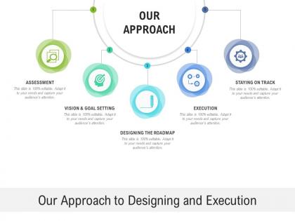




Try Before you Buy Download Free Sample Product
 Impress Your
 Audience
 100%
100% Editable
 Save Hours
 of Time


Our Our Approach To Designing And Execution generate ingenious ideas. You will experience flashes of brilliance.
People who downloaded this PowerPoint presentation also viewed the following :
Our approach to designing and execution with all 2 slides:
Experience flashes of brilliance with our Our Approach To Designing And Execution. It generates ingenious ideas.
FAQs for Our approach to
Key design principles for presentation templates include visual hierarchy, consistent branding, readable typography, strategic white space, and color harmony that supports content clarity. These principles work together by guiding audience attention, reinforcing brand identity, and ensuring scalability across different presentation types, with many organizations finding that well-designed templates significantly reduce preparation time while enhancing professional impact.
Color psychology significantly influences audience perception by triggering emotional responses, enhancing comprehension, and reinforcing brand messaging through strategic hue selection. Blue conveys trust and professionalism for financial presentations, while red creates urgency in sales pitches, with many organizations finding that consistent color schemes increase audience retention by up to 80% and streamline message delivery.
Cohesive visual themes require consistent color palettes, typography, layouts, spacing standards, and visual elements throughout presentations. These practices enhance professional credibility by establishing brand recognition, improving audience comprehension, and reducing cognitive load, with many organizations finding that standardized design systems ultimately deliver stronger stakeholder engagement and more persuasive communication outcomes.
Typography choices significantly impact readability and engagement by affecting comprehension speed, visual hierarchy, and audience attention span through font selection, sizing, and spacing decisions. Strategic typography enhances message clarity, reduces cognitive load, and maintains viewer focus, with many organizations finding that consistent, well-chosen fonts improve information retention and professional credibility across presentations.
Whitespace enhances visual clarity, improves content hierarchy, reduces cognitive load, and creates professional aesthetic appeal in presentations. Strategic whitespace placement guides audience attention to key messages, prevents overwhelming slide density, and enables better information processing, with many organizations finding that well-balanced layouts significantly improve message retention and audience engagement.
User feedback transforms presentation templates through surveys, usability testing, analytics review, focus groups, and iterative design sessions that identify pain points and enhancement opportunities. By systematically collecting insights from diverse user segments, organizations can streamline template functionality, enhance visual appeal, and improve content organization, ultimately delivering more intuitive presentation tools that accelerate workflow efficiency and user adoption.
**INPUT**: What techniques can be used to ensure that presentation templates are accessible to all audiences? **OUTPUT**: Accessible presentation techniques include high contrast color schemes, readable font sizes, alternative text for images, consistent navigation structures, and screen reader compatibility. These approaches streamline content delivery by enhancing visual clarity, supporting assistive technologies, and accommodating diverse learning preferences, with many organizations finding that accessible design ultimately delivers broader audience engagement and regulatory compliance.
Storytelling elements can be integrated through narrative flow structures, character-focused layouts, conflict-resolution frameworks, and emotional arc progressions that guide audience engagement. These design approaches enhance presentations by creating visual hierarchies that mirror story beats, incorporating testimonial spaces for protagonist examples, and establishing clear beginning-middle-end template sections, ultimately delivering more compelling and memorable business communications.
Infographics within presentation slides enhance audience engagement, simplify complex data visualization, improve information retention, accelerate comprehension, and create professional visual impact. These design elements streamline communication by transforming dense statistics into digestible formats, with many organizations finding that strategic infographic integration delivers faster decision-making processes and more persuasive stakeholder presentations.
Cultural differences significantly affect international presentation design through color symbolism, text density preferences, visual hierarchy expectations, and communication styles. While Western audiences often favor minimalist designs with bold visuals, Asian markets frequently prefer detailed information and formal layouts, with many global organizations finding that culturally adapted presentations enhance audience engagement and business outcomes.
**INPUT**: What tools or software are best for designing effective presentation templates? **OUTPUT**: Effective presentation template design tools include PowerPoint, Keynote, Canva, Adobe Creative Suite, and Google Slides, each offering unique strengths for different organizational needs. Professional designers often combine PowerPoint's business integration with Canva's intuitive interface and Adobe's advanced capabilities, while many organizations find that strategic tool selection based on team expertise, budget constraints, and collaboration requirements ultimately delivers more consistent, scalable template systems across departments.
Motion graphics enhance presentations by directing attention, illustrating complex concepts, and maintaining audience engagement, while creating memorable visual narratives that support key messages. However, excessive or poorly-timed animations can overwhelm content, distract viewers, and appear unprofessional, with many presenters finding that strategic, purposeful motion graphics ultimately deliver stronger audience retention and clearer communication than static slides alone.
**INPUT**: What strategies can be employed to create templates that are easily customizable? **OUTPUT**: Effective customization strategies include modular design structures, consistent style guides, flexible color schemes, editable text placeholders, and standardized formatting elements. These approaches streamline personalization by enabling quick content swaps, brand alignment, and layout modifications, with many organizations finding that well-structured templates reduce design time while maintaining professional consistency across teams. [Word count: 54 words]
Data visualization can be effectively incorporated through strategic chart selection, consistent color schemes, clear hierarchical layouts, and audience-appropriate complexity levels. These design principles enhance comprehension by simplifying complex information, highlighting key insights, and creating visual narratives, with many organizations finding that well-designed data presentations significantly improve stakeholder engagement and decision-making speed.
Presentations should avoid excessive text blocks, competing fonts, inconsistent color schemes, unnecessary animations, and overcrowded slides with multiple unrelated elements. These distractions undermine message clarity and audience engagement, with many organizations finding that streamlined designs featuring consistent branding, strategic white space, and focused content per slide ultimately deliver stronger communication outcomes and enhanced professional credibility.
No Reviews