

Performance chart powerpoint icon c
You must be logged in to download this presentation.




Try Before you Buy Download Free Sample Product
 Impress Your
 Audience
 100%
100% Editable
 Save Hours
 of Time


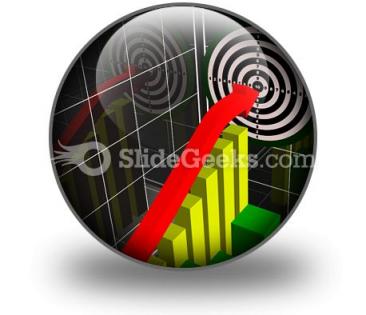
SlideTeam presents to you its Performance Chart PowerPoint Icon C. If you download this PPT icon and use it as bullet points, you can represent the growth rate, performance rate, success rate, achievement rate, etc. of your business. This business icon consists of arrow hitting the target and passing through a staircase, which means the various difficulties that are faced by an individual to accomplish the set goals of an organization. You can use this PowerPoint icon which is designed by business experts to show case the targets be triumphed. This colorful performance chart PowerPoint icon C is best for business professionals like you who want to depict to their employees how they can increase their work efficiency. This pre-designed PPT icon by specialists is appropriate for professionals like you who do not have time to design it. So just download it. To succeed you have to be able to sell your ideas to others and what better way to that than through our PT an S. These are created to have the right impact on the right audience.
People who downloaded this PowerPoint presentation also viewed the following :
Performance chart powerpoint icon c with all 1 slides:
With a near limitless selection, our Performance Chart PowerPoint Icon C are suited for every presentation need. Add color to your next presentation.
FAQs for Performance chart
Performance chart PowerPoint icons should include clear visual elements like ascending bar graphs, upward trending arrows, vibrant color gradients, recognizable chart symbols, and balanced proportions for optimal clarity. These design components work together by enhancing readability, conveying progress effectively, and maintaining professional aesthetics, with many organizations finding that well-designed icons significantly improve audience engagement and presentation impact.
Performance chart icons enhance presentation effectiveness by improving visual comprehension, reducing cognitive load, and creating professional consistency throughout slides. These visual elements streamline complex data interpretation, accelerate audience understanding, and maintain engagement during lengthy presentations, with many organizations finding that strategic icon usage ultimately delivers clearer messaging and more persuasive business communications.
Blue, green, and orange are most effective for performance chart icons, as blue conveys trust and stability, green represents growth and positive outcomes, while orange creates urgency and draws attention to key metrics. These colors strategically impact audience perception by triggering psychological associations that enhance data comprehension, with many organizations finding that consistent color coding across financial reports, sales dashboards, and executive presentations ultimately delivers clearer communication and faster decision-making processes.
**INPUT**: Which types of performance charts are best suited for different industries, and what icons represent them? **OUTPUT**: Performance charts vary by industry needs, with line charts for financial services tracking stock performance, bar charts for manufacturing measuring production metrics, pie charts for retail analyzing market share, and dashboard gauges for healthcare monitoring patient outcomes. These visual representations use icons like trending arrows, column symbols, circular segments, and speedometer graphics respectively, enabling organizations to communicate complex data efficiently while enhancing stakeholder understanding and strategic decision-making.
Performance chart icons simplify complex data by transforming numerical information into visual symbols, color-coded indicators, and intuitive graphics that require minimal interpretation. These visual elements enable non-technical audiences to quickly grasp trends, comparisons, and key metrics without analyzing raw data, with many organizations finding that icon-based presentations significantly enhance stakeholder comprehension and decision-making speed.
**INPUT**: What design trends in performance chart icons should presenters be aware of in 2023? **OUTPUT**: Key 2023 performance chart icon trends include minimalist designs, gradient color schemes, interactive hover effects, mobile-responsive sizing, and data storytelling elements. These modern approaches enhance audience engagement by streamlining visual complexity, improving readability across devices, and delivering more intuitive data interpretation, with many organizations finding that simplified iconography ultimately increases presentation impact and comprehension rates.
Animated performance chart icons significantly enhance audience engagement by capturing visual attention, simplifying complex data interpretation, and maintaining focus throughout presentations. These dynamic elements help presenters communicate trends, progress, and outcomes more effectively than static charts, with many organizations finding that animated visuals increase information retention, encourage interactive discussions, and ultimately deliver more persuasive, memorable presentations.
2D performance chart icons offer clean, professional aesthetics with faster loading times and universal compatibility, while 3D icons provide visual depth, enhanced engagement, and modern appeal that captures audience attention. While 2D charts excel in formal business presentations and data-heavy reports, 3D versions work exceptionally well for marketing presentations, executive summaries, and client-facing materials, ultimately delivering greater visual impact and memorable communication experiences.
Customizing performance chart icons involves modifying colors, fonts, shapes, sizing, and visual elements to match your brand's style guide and corporate identity. Through PowerPoint's formatting tools, organizations can adjust icon transparency, apply brand color palettes, incorporate company logos, and ensure consistent visual hierarchy, ultimately delivering professional presentations that reinforce brand recognition and credibility.
**INPUT**: What software tools are recommended for creating custom performance chart icons in PowerPoint? **OUTPUT**: Recommended tools include Adobe Illustrator, Canva Pro, PowerPoint's built-in SmartArt designer, Figma, and specialized icon libraries like Flaticon or Icons8. These platforms streamline custom icon creation by offering scalable vector formats, business-focused templates, and seamless PowerPoint integration, with many organizations finding that professional visual elements enhance presentation impact and audience engagement. [Word count: 56 words]
Cultural differences significantly impact performance chart icon interpretation through varying color symbolisms, directional reading patterns, numerical formats, and symbolic meanings across global audiences. While red indicates danger in Western cultures but prosperity in Chinese contexts, and arrow directions follow different cultural reading flows, many international organizations find that adopting culturally neutral designs with universal symbols enhances cross-cultural communication and data comprehension.
Common mistakes include using inconsistent icon styles, overcrowding slides with too many chart icons, choosing icons that don't match your data type, and using poor color contrast that reduces visibility. These design errors can confuse audiences and diminish your message's impact, with many presenters finding that maintaining visual consistency, selecting appropriate chart representations, and ensuring clear readability ultimately delivers more professional presentations and better audience engagement.
Icons enhance storytelling by creating visual anchors that connect abstract performance data to concrete business concepts, making complex metrics more memorable and accessible to stakeholders. Through strategic icon placement, presenters transform numerical charts into compelling narratives that highlight trends, achievements, and opportunities, ultimately delivering clearer insights and faster decision-making across diverse stakeholder groups.
Performance chart icons integrate seamlessly with infographics by serving as visual anchors for data sections, transition elements between metrics, and hierarchical indicators that guide viewer attention through complex information flows. In video presentations, these icons function as animated overlays, progress markers, and consistent branding elements, with many organizations finding that strategic icon placement enhances comprehension rates and creates cohesive storytelling across multiple media formats.
Accessibility ensures performance chart icons are usable by audiences with visual impairments, cognitive differences, and varying technical literacy through high contrast ratios, alternative text descriptions, and intuitive design elements. Organizations implementing accessible icon design find enhanced user engagement, broader audience reach, and improved compliance with digital standards, while ultimately delivering more inclusive presentations that communicate performance data effectively across diverse stakeholder groups.
-
Informative design.
-
Enough space for editing and adding your own content.