


Computer Desktop Full Set Monotone Icon




Try Before you Buy Download Free Sample Product
 Impress Your
 Audience
 100%
100% Editable
 Save Hours
 of Time


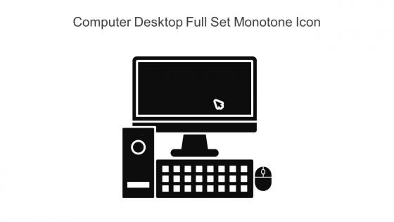
This is the perfect icon Computer Desktop Full Set Monotone Icon for your next project. A simple yet stylish design, this 100 percent editable Powerpoint template that can be customized with any color or texture you want.
People who downloaded this PowerPoint presentation also viewed the following :
Computer Desktop Full Set Monotone Icon with all 6 slides:
Use our Computer Desktop Full Set Monotone Icon to effectively help you save your valuable time. They are readymade to fit into any presentation structure.





FAQs for Computer Desktop Full
Monotone icons offer visual consistency, enhanced readability, reduced cognitive load, seamless brand integration, and improved focus on content rather than decorative elements. These streamlined design elements enhance audience comprehension by eliminating color distractions, creating professional cohesion across slides, and enabling faster information processing, ultimately delivering clearer communication and stronger presentation impact.
Monotone icons create a professional, cohesive visual experience that enhances audience focus on content rather than decorative elements, establishing credibility through consistent design language. This streamlined approach reduces visual distractions while conveying sophistication, with many business presentations finding that monotone iconography strengthens brand consistency and messaging clarity, ultimately delivering more impactful communication outcomes.
Color selection enhances monotone icons by improving visual hierarchy, ensuring accessibility compliance, reinforcing brand identity, and creating emotional connections with users. Strategic color choices enable designers to guide attention, differentiate categories, and maintain consistency across platforms, with many organizations finding that thoughtful monotone palettes ultimately deliver clearer communication and stronger user engagement.
Industries that prioritize clear, professional communication benefit most from monotone icons, including financial services, healthcare, consulting, technology, and corporate training sectors. These industries find that monotone icons enhance presentation clarity, maintain audience focus on content rather than decorative elements, and deliver consistent visual messaging across complex data, ultimately supporting credibility and professional authority.
Monotone icons maintain visual hierarchy through strategic size variation, consistent spacing, and deliberate placement within information architecture, while leveraging weight differences and contextual grouping. These design principles enable clearer user navigation, reduced cognitive load, and enhanced interface readability, with many digital platforms finding that monotone consistency ultimately delivers stronger brand cohesion and improved user experiences.
Effective pairing includes maintaining consistent visual weight between icons and text, ensuring adequate spacing for readability, aligning elements properly, and using complementary sizing ratios. These design principles streamline communication by creating visual hierarchy, reducing cognitive load, and enhancing user comprehension, with many organizations finding that strategic icon-text combinations ultimately deliver clearer messaging and improved audience engagement across presentations.
Monotone icons contribute to cohesive branding by establishing consistent visual language, reinforcing brand colors, simplifying recognition across platforms, and creating scalable design systems that work seamlessly across digital and print materials. Through strategic implementation, organizations streamline their visual communications, enhance brand memorability, and deliver unified customer experiences, with many companies finding that monotone approaches reduce design complexity while strengthening overall brand identity.
Monotone icons create cleaner, more focused user experiences by reducing visual distractions and cognitive load, while colorful icons enhance memorability, emotional engagement, and visual hierarchy through color associations. Through strategic monotone implementation, organizations in banking, healthcare, and enterprise software streamline user interfaces, improve accessibility, and maintain professional aesthetics, with many finding that balanced approaches ultimately deliver both clarity and user satisfaction.
Monotone icons can be culturally adapted by incorporating region-specific symbols, adjusting visual metaphors to match local interpretations, and considering cultural color associations even within monochromatic schemes. Through strategic localization, organizations can enhance user comprehension across diverse markets, with companies in retail, finance, and healthcare finding that culturally-aware iconography significantly improves customer engagement and reduces confusion in global applications.
Common mistakes include using icons that lack visual hierarchy, choosing overly complex designs that lose clarity at small sizes, inconsistent sizing and spacing, poor contrast against backgrounds, and mixing different icon styles within the same interface. These errors create confusing user experiences, especially in digital applications and presentations, with many designers finding that maintaining consistent stroke weights, adequate whitespace, and clear visual relationships ultimately delivers better usability and professional polish.
Different shapes of monotone icons convey varied messages through psychological associations and visual principles, with circles suggesting harmony and completeness, squares representing stability and trust, triangles indicating direction and energy, and organic shapes conveying creativity. These shape-based communications enhance user interface effectiveness by creating intuitive navigation experiences, with many digital platforms finding that strategic shape selection significantly improves user engagement and brand recognition.
Tools for creating custom monotone icons include Adobe Illustrator, Figma, Sketch, Canva, and specialized platforms like Iconfinder and Flaticon. These design solutions streamline icon development by offering vector editing capabilities, extensive template libraries, and collaborative features, enabling organizations to maintain brand consistency while reducing design costs and accelerating project timelines.
Monotone icons improve accessibility by providing clear visual contrast, reducing cognitive load for viewers with visual processing differences, and ensuring consistent readability across different display conditions. These simplified designs enhance comprehension for audiences with dyslexia or attention disorders, while delivering universal recognition patterns that transcend language barriers, ultimately creating more inclusive presentation experiences for diverse professional audiences.
Current monotone icon trends include simplified geometric shapes, increased line weight variations, subtle texture integration, adaptive sizing systems, and enhanced accessibility features. These design approaches streamline visual communication by reducing cognitive load, improving scalability across devices, and ensuring consistent brand identity, with many organizations finding that modern monotone systems deliver faster user recognition and cleaner interface aesthetics.
Repetition of monotone icons creates visual consistency and reinforces key themes, while strategic variation in size, spacing, and context guides audience attention through narrative progression. This approach enables presenters to build cohesive storylines across slides, with many organizations finding that consistent iconography enhances message retention and creates more professional, memorable presentations that ultimately deliver stronger audience engagement.
-
Professional and unique presentations.
-
SlideTeam is the best in the business. Their templates are engaging and customizable. You can rely on them.