

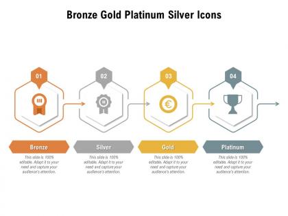
Bronze gold platinum silver icons




Try Before you Buy Download Free Sample Product
 Impress Your
 Audience
 100%
100% Editable
 Save Hours
 of Time


Our Bronze Gold Platinum Silver Icons are topically designed to provide an attractive backdrop to any subject. Use them to look like a presentation pro.
People who downloaded this PowerPoint presentation also viewed the following :
Bronze gold platinum silver icons with all 2 slides:
Use our Bronze Gold Platinum Silver Icons to effectively help you save your valuable time. They are readymade to fit into any presentation structure.
FAQs for Bronze gold
Contrast and depth are everything for metallic icons - without them you're toast. Strong highlights paired with deep shadows will mimic how light actually bounces off metal. Stick to grays, silvers, or golds with subtle gradients. I swear, the biggest mistake I see is people going crazy with shine effects. It looks so tacky. Keep your edges super crisp and maybe add some subtle surface texture or reflections. Oh, and test at different sizes early because metallic effects turn to mush when you scale down. Trust me on that one.
Oh totally, the texture makes a huge difference! Chrome and polished silver scream "fancy tech feature" - you see it on settings and premium stuff all the time. Brushed metal? Way more industrial, perfect for tools. Gold's obviously the "pay extra for this" vibe lol. Copper and bronze feel friendlier though, more creative. You definitely don't want your fun feature looking all serious with dark steel textures. I'd honestly just test a few different finishes with real users - they'll tell you pretty quick which one actually makes sense for what you're building.
Apple and Chrome are perfect examples - they nail that sleek metallic look. Car brands like Mercedes and BMW are obsessed with it too. Luxury goods, banks, jewelry companies... pretty much anywhere you want to scream "premium quality." Gaming companies jumped on this trend hard because gamers apparently love shiny things lol. Honestly, metal just makes stuff look more expensive and trustworthy. If you're designing for industries where quality matters, metallic icons can bump up how valuable people think your brand is. Just don't slap chrome on everything - it's gotta match your vibe first.
Dude, metallic colors totally change how people interact with your stuff! Gold hits different than silver - one feels fancy and exciting, the other's more clean and trustworthy. I've watched this happen in so many UI tests (honestly gets nerdy but it works). Different metals guide your eye around the screen in unique ways. You can literally boost clicks by 15-30% just switching up the finish. Try A/B testing copper vs platinum on your main buttons. Sounds weird but your audience will surprise you with what they actually prefer over what looks "obviously" better.
Oh man, lighting is everything for those metallic icons! Without it they just look like boring flat gray blobs. You gotta think about where your light source is hitting - that's what creates the highlights along edges and contours. Then add shadows in the right spots for depth. I usually mess around with different light angles until something clicks, you know? Keep it consistent across all your icons though, or they'll look weird together. Honestly the highlight placement is what sells the whole metal effect - that's where the magic happens.
Stick with neutral backgrounds - whites, grays, maybe some deep colors that won't fight with the shine. I learned this the hard way when I went overboard once and everything looked super tacky! Mix in matte textures so it's not all shiny. Clean typography works best, and give those metallic bits some breathing room. Honestly, less is more here. One metallic finish per design max, and use them as accents, not the star of the show. Oh, and definitely check how they look on different screens since they can render weird sometimes.
Illustrator's probably your best choice here - those gradient tools are perfect for getting that chrome/steel vibe down. Photoshop's great too if you want more control over lighting and reflections. Figma's surprisingly decent now (and free, which is nice). On Mac? Sketch works well. The real trick is nailing gradients, drop shadows, and inner glows - that's what makes it actually look metallic instead of just... gray. I'd start with basic shapes first though, don't jump into complex stuff right away. Once you get the hang of it, you'll be cranking these out pretty quickly.
Brushed aluminum and chrome are huge right now - they just work with that clean, minimal look everyone's doing. Copper and bronze gradients are everywhere too, especially if you want that high-end vibe. Steel blue's another safe bet, plus gunmetal gray (honestly, everything pairs with dark mode these days). Embossed effects are coming back but keep them super subtle. Nobody needs flashbacks to those crazy 2010s buttons, you know? I'd probably go with brushed metal textures since they don't look dated and scale well on different screens.
Oh man, metallic icons are tricky across different cultures! Gold feels super luxe in Western markets, but honestly? It can come off as gaudy in parts of Asia depending on what you're designing for. Silver works well for tech stuff here, though copper tones... that's where things get weird regionally. I'd definitely test a few versions with local groups first - saved my butt on a project last year. Don't just assume what works in one market translates everywhere. Research the cultural context before you commit to anything shiny.
Go SVG if you can - they scale perfectly and keep all those shiny details intact. But if you're stuck with raster, make 1x, 2x, 3x versions instead of letting browsers resize them. I made that mistake once and my chrome icons looked terrible on retina screens. Gradients are everything for metallic stuff, so don't skimp there. Also weird tip - test at real sizes, not zoomed out in Figma or whatever. Those cool reflections you spent forever on? They'll vanish at 16px. Sometimes you need dumbed-down versions for tiny icons, which is annoying but necessary.
Honestly, metallic icons are a game changer for presentations. They create this premium vibe that makes everything look more polished - way better than flat icons that just sit there doing nothing. Your audience will naturally focus on the shiny stuff first, which is perfect for guiding them where you want. The depth and light reflection actually makes buttons feel more clickable too. Plus they look great in photos if people snap pics of your slides. I learned this the hard way after using boring flat icons for way too long! Just don't go crazy with them - save the metallic treatment for your main CTAs and navigation.
So metallic icons don't actually hurt the environment since they're just pixels, but here's the thing - those shiny effects make your files way bigger. Bigger files = more data when people load your site, which eats up energy. Users get annoyed with slow loading and start refreshing like crazy (honestly the worst). Try using SVGs instead of heavy image files when you can. For mobile, maybe go with simpler versions since people's data is limited anyway. The main thing is keeping those file sizes reasonable so everything loads fast.
Yeah, it totally depends on what's trendy at the time. Back when skeuomorphism was huge, everything had those crazy detailed chrome and gold effects - like early iOS apps that literally looked like metal objects. Then flat design came along and basically murdered all of that overnight (RIP shiny buttons lol). Dark mode's actually been great for metallic icons though - they really pop without being too in-your-face. Better screens help too since you can pull off subtle gradients that actually improve usability instead of just looking tacky. Oh, and definitely check what your platforms can handle before going overboard with effects.
Ugh, metallic icons are such a pain for accessibility. The shiny gradients look cool but create awful contrast ratios - people with visual impairments can barely read them. Color-blind users struggle too since those subtle metallic color shifts just disappear for them. And honestly? All that glossy texture becomes visual clutter that's super distracting for anyone with cognitive issues. It's weird how the "fancier" they get, the worse they work. Definitely run yours through WCAG contrast checkers, and maybe throw in a high-contrast mode as backup.
Honestly, those animated metallic icons are pretty solid for presentations. They look expensive and professional - like you actually put effort in, you know? Our brains just naturally track movement, so people will actually focus on what you're trying to show them. Keep the animations subtle though. Nothing crazy flashy. I use them mostly for transitions or when I want everyone looking at a specific point. The metallic finish gives everything this polished vibe that makes your whole deck feel more premium. Just don't spam them everywhere or people get annoyed fast.
-
Commendable slides with attractive designs. Extremely pleased with the fact that they are easy to modify. Great work!