Brand identity powerpoint presentation slides
Try Before you Buy Download Free Sample Product
Audience
Editable
of Time
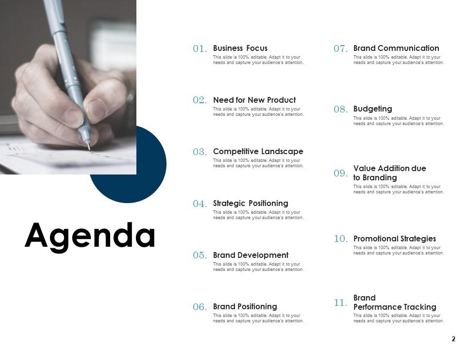
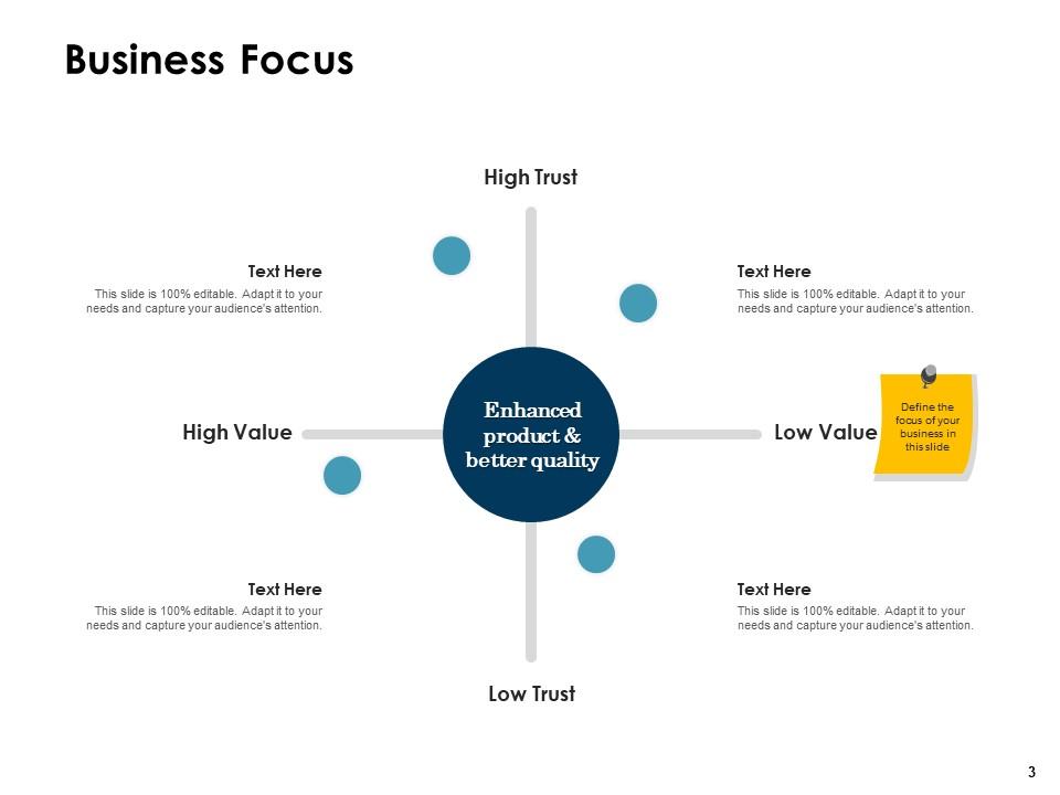
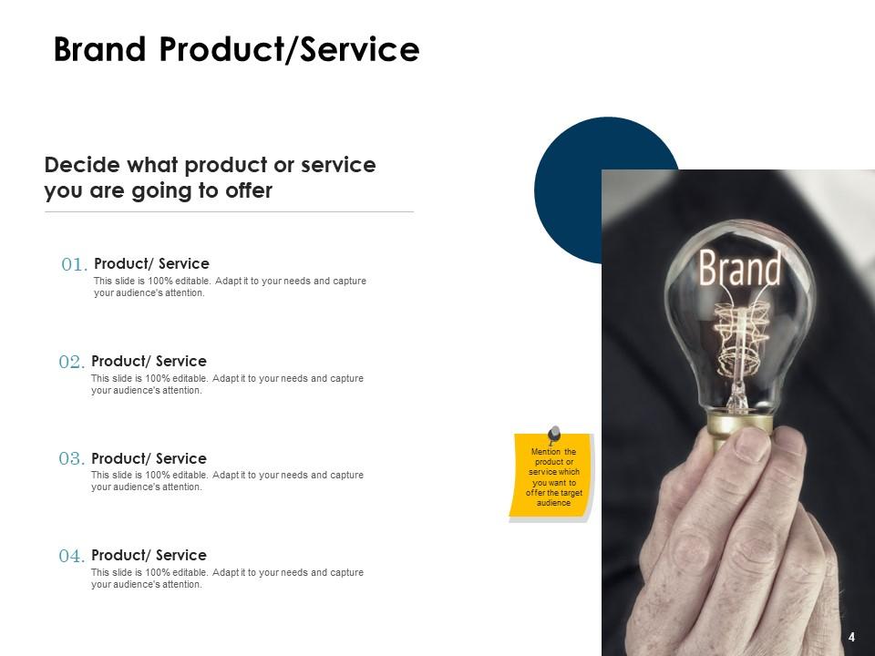
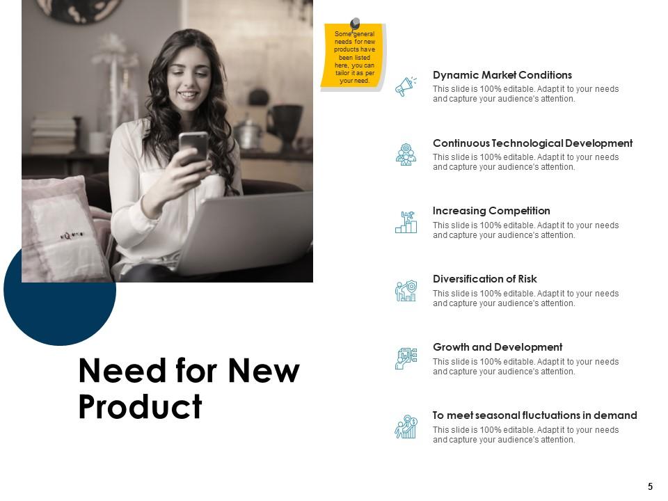
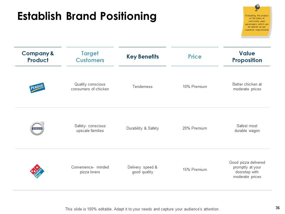
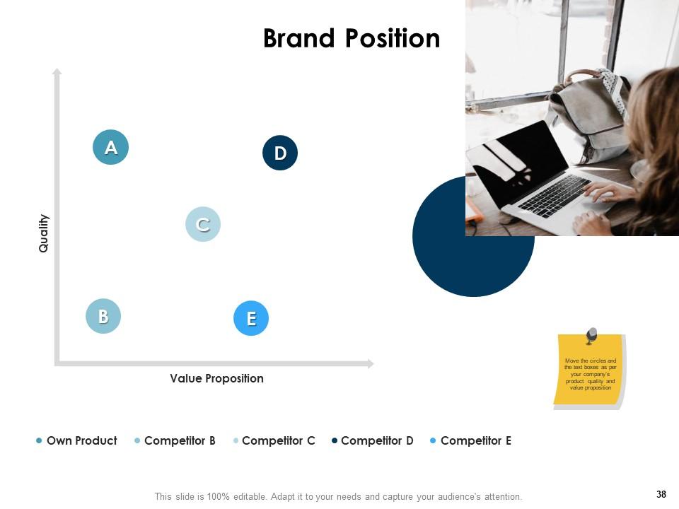
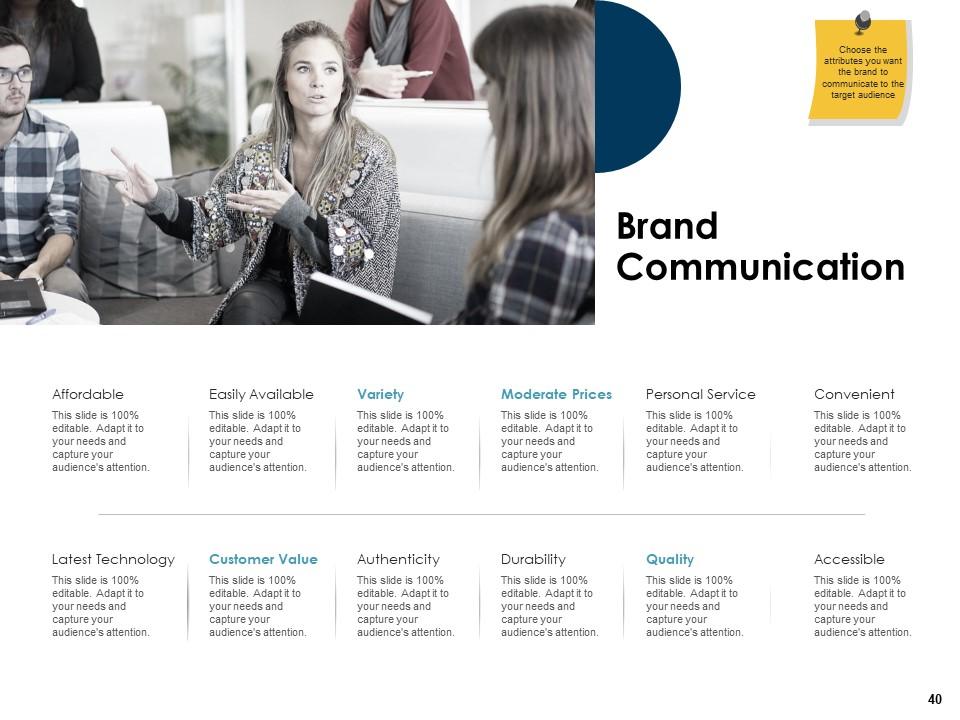
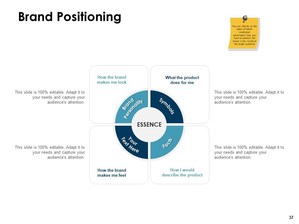
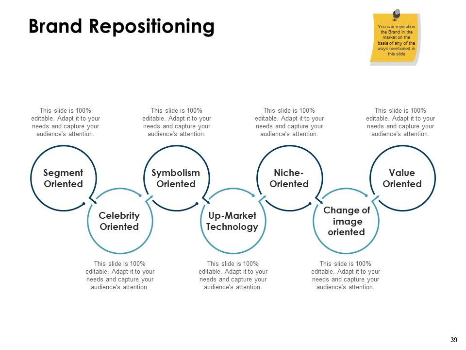
Determine the ways to increase the customer relevancy and product value by using our content ready Brand Identity PowerPoint Presentation Slides. With the aid of this visually appealing brand positioning framework PPT template, you can mention the steps that fulfill the needs of the target audience related to the specific product or item. Use brand positioning PowerPoint graphic and concentrate on the areas that enhance the reputation of your brand in the marketplace. You can articulate the key benefits of your brand or products with the help of market positioning PPT visuals. Take the assistance of the brand management PowerPoint layout and list out the ways to maximize your brand value. You can also employ this professionally designed brand positioning map presentation slides to represent ways to position your product in the market. Thus, give clarity behind the message of your brand by downloading our ready-to-use market positioning PPT complete deck.
People who downloaded this PowerPoint presentation also viewed the following :
Brand identity powerpoint presentation slides with all 70 slides:
Use our Brand Identity Powerpoint Presentation Slides to effectively help you save your valuable time. They are readymade to fit into any presentation structure.
FAQs for Brand identity
So brand identity has five main pieces: visuals (logo, colors, fonts), your voice/tone, values and mission, who you're targeting, and your overall personality. It's kinda like how a person has their own vibe, you know? Honestly, everyone obsesses over the visual stuff, but the voice and personality bits are what actually make people give a damn about you. Start by picking 3-5 words that describe your brand's personality - like "playful" or "trustworthy" or whatever fits. Then just make sure everything you do reflects those traits. Simple but works.
Dude, color psychology is seriously underrated! Blue builds trust (that's why every tech company uses it), while red screams urgency and gets people hyped. Green = healthy/eco-friendly vibes, orange feels super approachable. People react to these colors before they even process your actual message - it's pretty crazy when you think about it. Don't just pick colors because they're cute together. Make them work for your brand story. Like, if you're going for trustworthy and professional, you'll want cooler tones. Random thought: I swear orange makes me want to buy snacks every time.
Your fonts are literally your brand's personality before anyone reads a word. Coca-Cola vs IBM - totally different vibes just from their typefaces. Crazy how much that matters. Choose fonts that match your vibe. Playful? Serious? Luxury? Whatever you're going for, your typography should scream it. I always tell people to stick with 2-3 fonts max though - any more and things get messy fast. Consistency is huge too. Same fonts everywhere builds recognition and trust. Plus readable fonts = better user experience. Make some basic rules about when to use each font. Trust me, it'll pull everything together way better than you'd expect.
Your logo is literally the first impression people get of your business. Think about it - you can spot Apple or Nike from a mile away, right? That's the power of good branding. It's crazy how much a simple design affects whether people trust you or not. A strong logo shapes how customers see your personality and quality level. The key is using it consistently everywhere - your website, business cards, social media, whatever. I'd start by looking at where your current logo shows up and making sure it looks the same across all those places. Consistency builds that recognition factor over time.
Your brand values are like your north star - they keep everything aligned. Without them, your messaging ends up scattered (I've seen this mess up so many good brands). They shape how you look, sound, and who you partner with. Plus they're what actually makes people give a damn about your brand beyond just your product. Pick 3-5 core values first. Then go through all your stuff and see what matches up. It's honestly kind of eye-opening when you realize how much doesn't fit your actual values.
Dude, stories work because people connect with emotions way more than boring product specs. Think about it - would you rather hear someone's resume or their epic fail story? Exactly. Share your origin story, show customer wins, post behind-the-scenes stuff. It lets people see your brand's actual personality instead of just another sales pitch. Plus, even if your competitors have similar products, they don't have YOUR stories. Honestly, most brands are terrible at this. Just pick one authentic story that shows what you're really about and start weaving it everywhere.
Start with a brand style guide - logos, colors, fonts, voice, all that stuff. But here's the thing: actually make people use it! I swear half the companies I know have gorgeous guidelines sitting unused in some random folder. Get templates going to keep things consistent. Train whoever's doing your social media (they're usually the biggest culprits for going off-brand). Regular audits help catch weird stuff before it spirals. Oh, and set up approvals for anything public-facing. Saves you from those "who approved this disaster" moments later.
Honestly, going global with your brand is tricky as hell. What crushes it here might totally bomb somewhere else - or even piss people off. Take McDonald's in India - they had to completely rethink everything because of dietary stuff and what locals actually wanted. Colors mean different things, symbols can be offensive, even your company name might translate to something awful. You can't just slap the same strategy everywhere and call it a day. Research each market hard, but here's the thing - you gotta stay flexible with your visuals and messaging while keeping your core values solid.
Your brand voice is basically your personality - like are you the helpful friend or the no-nonsense expert? That stays consistent. Tone is how you adjust that personality for different situations (more serious for apologies, casual for social media). I used to think this was all marketing BS, but honestly? It's what makes people remember you without even seeing your logo. When someone reads your stuff and immediately knows it's you - that's the goal. Start with 3-4 personality traits, then figure out how you'd sound angry vs. excited vs. professional. Trust me, it works.
Honestly, customer feedback is like a mirror for your brand – shows you what's actually happening vs what's in your head. If people keep calling you "cheap" but you're trying to be "affordable luxury," well... there's your problem right there. Pay attention to the exact words customers use in reviews and comments. Sometimes they'll point out cool things about your brand you never even noticed. The disconnect between how you see yourself and how others see you? That's pure gold for figuring out what needs tweaking in your messaging or strategy.
Oh man, the worst thing you can do is try to please everyone - you'll just end up with bland nothing. Skip copying what your competitors are doing too closely. Keep your logo simple (I've seen way too many that look like a hot mess on business cards). Don't be inconsistent across your social media and stuff either. Honestly? Do the boring research work first before you start designing anything cool. Figure out who you're actually talking to and what your brand stands for. Trendy stuff gets old fast, but authentic brands stick around. A solid strategy doc upfront will save you from redoing everything later.
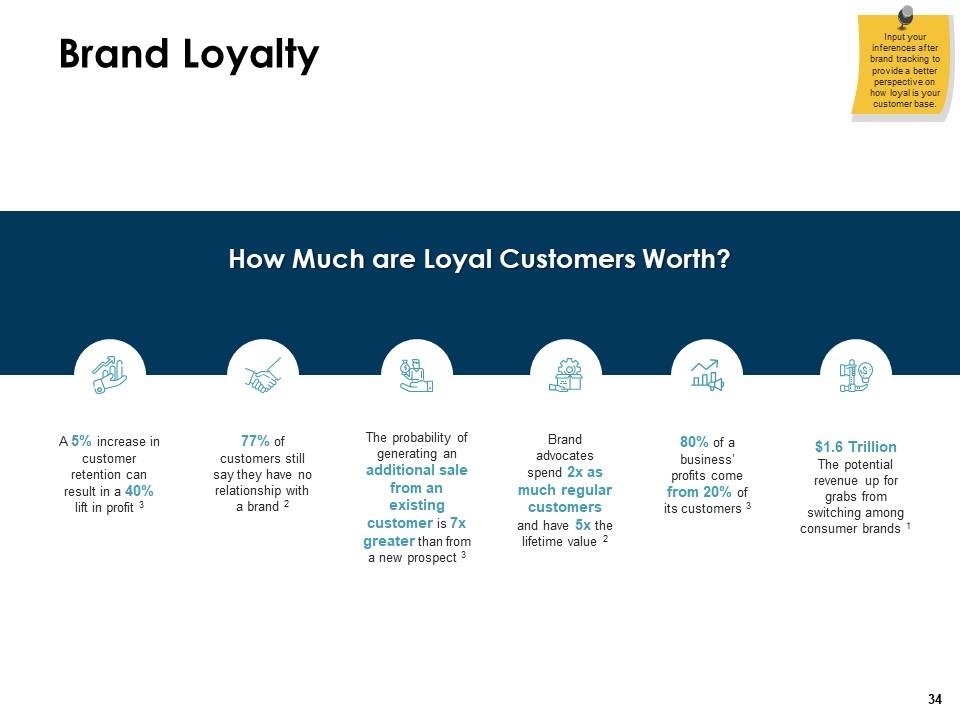
Honestly, it's all about trust and connection. When customers know what to expect from your brand - same vibe, consistent messaging, reliable quality - they start feeling comfortable with you. Like that one restaurant where you always order the same thing because you know it'll be good. People get attached to brands that feel authentic and don't try too hard to be something they're not. Even when competitors drop their prices or come out with some shiny new thing, loyal customers stick around. They've made your brand part of who they are. Just stay consistent across everything you do and don't fake it.
Honestly, you need to measure both the numbers and how people actually feel about your brand. Run awareness surveys and recognition tests - can people pick your logo out of a lineup? Social media sentiment is probably your best friend here since it shows real reactions to your visual stuff. Track engagement on branded posts, conversion rates from campaigns, and loyalty metrics like repeat buys. Oh and definitely measure before/after any rebrand - stakeholders love seeing actual ROI data. The perception stuff is just as important as the hard metrics though.
Figure out what your brand actually *stands for* first - like the stuff people genuinely care about when they think of you. Your logo can change, but if you mess with your core "why," you'll just confuse everyone. Honestly, I've watched companies rebrand themselves into oblivion doing this. Think wardrobe update, not total makeover. Test tweaks with your current customers before going all-in. Some things are sacred (don't touch those), others need a refresh. Roll it out slowly so people aren't like "wait, who are you again?"
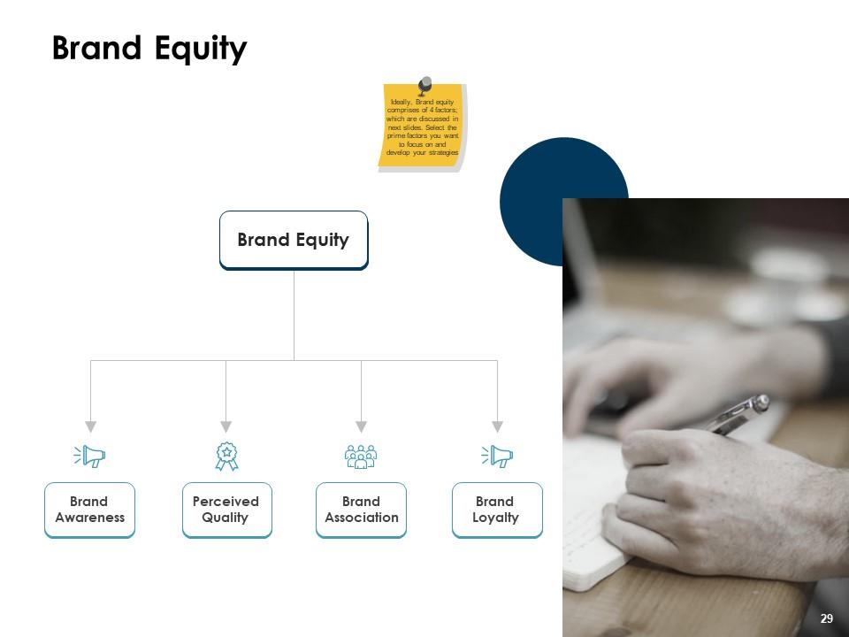
So brand identity is like the foundation - it's your visuals, messaging, all that stuff you put out consistently. Over time, that builds into brand equity, which is basically the actual value your brand brings to the table. Think of it this way: identity is what you're showing people, equity is what comes back. The more consistent you are with your identity, the more people recognize and trust you. And honestly, trust is everything in business these days. I'd say nail down your identity first - get that visual style and messaging locked in. The equity part happens naturally once people start experiencing your brand the same way every time.
-
Designs have enough space to add content.
-
Excellent work done on template design and graphics.
-
Great designs, really helpful.
-
Nice and innovative design.