


Pie chart ppt slide





Try Before you Buy Download Free Sample Product
 Impress Your
 Audience
 100%
100% Editable
 Save Hours
 of Time


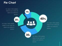
Utilize this not so conventional-looking pie chart and provide your presentation a modern outlook with the help of our Pie Chart PPT Slide. This PPT layout assists you in condensing wide-ranging data and presenting it in an accessible way to your viewers. Convey the facts and data using this adaptable PPT slide that allows you to change the color and edit the chart according to your requirements. By utilizing this pie chart PPT layout you will be able to precisely describe the part-to-whole relationship of any category in your data. Our PPT template assists you in presenting an accurate and informative visual treat. Download this pie chart PPT to provide efficiency and innovation to your presentation. Remove complexity and make the information easy to understand for your audience through this brilliantly organized PPT presentation. On top of it, this PPT graphic has a contemporary outlook automatically providing your presentation a fresh and up-to-date outlook.
People who downloaded this PowerPoint presentation also viewed the following :
Pie chart ppt slide with all 5 slides:
Affirm innocence with our Pie Chart Ppt Slide. Display evidence that corroborates the facts.
FAQs for Pie
Pie charts excel at showing proportional relationships within a whole, making percentage distributions immediately clear, while enabling quick visual comparison of parts to the total dataset. Unlike bar charts or line graphs, pie charts deliver instant understanding of market share, budget allocation, and demographic breakdowns, with many organizations finding that stakeholders grasp financial distributions and resource allocation faster through circular visualization.
Effective pie chart color selection involves using high-contrast combinations, maintaining consistent brand colors, avoiding adjacent similar hues, and ensuring accessibility through colorblind-friendly palettes. These strategic choices enhance data comprehension by creating clear visual separation between segments, with many presentation designers finding that thoughtful color application significantly improves audience engagement and message retention.
Common pie chart mistakes include using too many slices, choosing poor color contrast, omitting data labels, starting slices at random positions, and displaying 3D effects that distort perception. These errors undermine data clarity and audience comprehension, with many presentations finding that simplified designs with clear labeling and logical slice ordering ultimately deliver more impactful insights.
Pie charts with too many slices create visual clutter and make data interpretation difficult, with most experts recommending 5-7 slices maximum for optimal clarity. Beyond this threshold, smaller segments become hard to distinguish and compare, while audiences struggle to process the information effectively, ultimately reducing the chart's communicative power and strategic value in business presentations.
**INPUT**: Which software or tools are best for creating professional-looking pie charts? **OUTPUT**: Professional pie chart creation tools include Excel, Tableau, PowerBI, Google Charts, and specialized presentation software like PowerPoint or Keynote. These platforms streamline data visualization by offering customizable templates, dynamic color schemes, and interactive features, with many organizations finding that integrated dashboard tools ultimately deliver enhanced stakeholder engagement and clearer financial reporting. [Word count: 54 words]
Pie chart labeling best practices include using direct labels on slices when space permits, placing percentages or values clearly, maintaining consistent font sizes, using leader lines for smaller segments, and ensuring high contrast between text and background colors. These approaches enhance readability by eliminating guesswork, reducing eye movement between chart and legend, and streamlining data interpretation, with many organizations finding that clear labeling significantly improves audience comprehension and decision-making speed.
Larger angles in pie charts create stronger visual impact, making data segments appear more significant to viewers, while smaller angles can minimize perceived importance even when representing substantial values. Through angular proportion, audiences instinctively assess relative magnitude, with many organizations finding that strategic slice arrangement and emphasis enhances data comprehension and decision-making across presentations.
Pie charts work best for showing parts of a whole when you have fewer than seven categories and want to emphasize proportional relationships, while bar charts excel at comparing values across categories or displaying data over time. Financial services use pie charts for portfolio allocation and budget breakdowns, whereas retail organizations prefer bar charts for sales comparisons and performance tracking, ultimately delivering clearer insights based on your analytical objectives.
Pie chart design significantly impacts audience retention by ensuring clarity, visual appeal, and cognitive ease during presentations. Well-designed charts with distinct colors, readable labels, and logical data arrangement help viewers quickly grasp key insights, maintain focus, and remember critical information, ultimately enhancing presentation effectiveness and audience engagement throughout business communications.
Interactive pie charts can be enhanced through clickable segments, hover tooltips, drill-down capabilities, animation transitions, and dynamic filtering options. These features enable presenters to reveal detailed data progressively, engage audiences through exploration, and customize views in real-time, ultimately delivering more compelling presentations and better audience retention across digital platforms.
2D pie charts provide accurate data representation with clear proportional relationships, while 3D pie charts add visual depth but can distort perception through perspective effects that make certain segments appear larger or smaller than their actual values. While 3D versions enhance visual appeal for presentations, many data analysts prefer 2D charts for precise comparisons, ultimately delivering clearer insights for decision-making across business reporting.
Pie charts can visualize hierarchical data through nested designs, multi-level segmentation, and drill-down capabilities that reveal parent-child relationships within datasets. Organizations in retail, finance, and healthcare leverage these approaches to display budget allocations, departmental structures, and service categories, enabling stakeholders to understand proportional relationships while maintaining clear visual hierarchy for strategic decision-making.
Pie charts work best with categorical datasets showing parts of a whole, percentage breakdowns, budget allocations, market share distributions, and demographic compositions. These visualizations excel when presenting financial data like departmental spending, customer segments by region, or product line revenues, with many organizations finding that pie charts effectively communicate proportional relationships to stakeholders who need quick, intuitive insights.
Cultural perceptions significantly influence pie chart interpretation through color symbolism, associations, and cultural contexts that vary across different regions and societies. While red may signal danger in Western cultures but prosperity in Asian markets, and green represents growth versus inexperience, organizations must consider these cultural nuances when presenting data internationally, ultimately ensuring accurate communication and avoiding misinterpretation across diverse audiences.
Using percentages in pie charts enables clear proportional comparisons and standardizes data for easier interpretation, while absolute numbers provide actual scale and magnitude context that percentages can obscure. Many organizations find that combining both approaches delivers optimal transparency, with financial services and healthcare sectors increasingly using dual labeling to enhance stakeholder understanding and support more informed decision-making processes.
-
Easily Editable.
-
Commendable slides with attractive designs. Extremely pleased with the fact that they are easy to modify. Great work!