


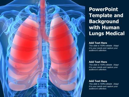
Powerpoint template and background with human lungs medical




Try Before you Buy Download Free Sample Product
 Impress Your
 Audience
 100%
100% Editable
 Save Hours
 of Time


Download the PowerPoint image slide titled Powerpoint Template And Background With Human Lungs Medical. This PowerPoint template is customizable and available in standard as well as widescreen sizes. You can present information on various topics like Image slides, Lungs by deploying this interactive slide. Download and deliver an attention-grabbing presentation by utilizing this completely editable image slide.
People who downloaded this PowerPoint presentation also viewed the following :
Powerpoint template and background with human lungs medical with all 2 slides:
Use our Powerpoint Template And Background With Human Lungs Medical to effectively help you save your valuable time. They are readymade to fit into any presentation structure.
FAQs for Powerpoint template and background with
Definitely hit the main parts - trachea, bronchi, bronchioles, and alveoli. The diaphragm's super important since it's literally what makes you breathe. Oh, and don't skip the pleura! Those membrane layers are boring but actually crucial. Gas exchange at the alveolar level is where the magic happens. Include the lung lobes too (right has three, left has two - weird but true). Pulmonary arteries and veins show how oxygenation works. Clear labels are your friend here. Animations for airflow would be clutch if you can swing it - makes everything click for people watching.
Oh totally, visuals are a game-changer for lung stuff. Like, you can actually show how those tiny bronchioles branch out instead of just talking about it. Honestly, explaining alveoli without pictures is basically impossible - it's like describing a sunset to someone with their eyes closed. 3D models work really well, plus animated diagrams that break down breathing step by step. Interactive stuff is clutch too since people can explore different lung layers themselves. I'd grab a good medical template with quality anatomical illustrations. Way better for keeping people focused and they'll actually remember it later.
Definitely go with asthma, COPD, pneumonia, and lung cancer - those cover your main bases. Pulmonary embolism's worth adding too if you've got space. Honestly, you could probably spend forever just on asthma and COPD since they're everywhere. TB might be good depending on your audience? I'd organize it acute vs chronic - makes way more sense than just listing random diseases. Oh, and don't sleep on lung cancer stats, they're pretty eye-opening if you haven't looked recently.
Draw a cross-section with the alveoli and capillaries wrapped around them - that's the key spot. Use arrows showing oxygen going from air sacs into blood, CO2 flowing back out. Red for oxygenated blood, blue for the other stuff. I'd definitely add a close-up of that alveolar wall since it's crazy thin, like way thinner than tissue paper. Clear labels are a must. Oh, and throw in some step-by-step text next to your diagram - people get it way faster when they can read AND see what's happening. Trust me on that one.
Think of the diaphragm like your breathing muscle - it flattens when you breathe in, creating that suction that pulls air down into your lungs. Then it relaxes and pushes everything back out. For your presentation, definitely use a side-view diagram with arrows showing how it moves up and down. Those animated GIFs are honestly the best for this stuff! Make the diaphragm pop with red or blue coloring so it's not just blending into all the other lung tissue. Oh, and do a before/after slide comparing inhalation vs exhalation - people really get it when they see both states side by side. Don't forget pressure indicators too.
Okay so definitely hit the big myths - people think lung damage always heals itself (nope), that only smokers get lung disease, and that being winded is just getting old. Vaping being "safe" is such BS too. Air pollution screws everyone over, not just city folks. Most people ignore symptoms until they're really bad, which is backwards. Show them stats on early detection - that stuff actually motivates people. Give concrete screening schedules they won't forget. Oh and emphasize being proactive about lung health instead of waiting for problems. That reactive approach never works out well.
Try clickable buttons and hyperlinks first - they're pretty straightforward to set up. Trigger animations are amazing for this stuff, your audience can click different lung parts to see explanations or zoom into the alveoli. I'd skip PowerPoint's action buttons though, they look super outdated. Quiz slides work well too, or you could do one of those branching presentations where people pick different respiratory scenarios. Oh, and those step-by-step reveal animations are perfect for showing lung structures gradually. Start simple with click-to-reveal - honestly makes any presentation feel way more professional.
Start with the heavy hitters - lung disease kills more people than almost anything else globally. We're talking 235 million with asthma, 65 million with COPD. Tobacco's still brutal too: 8 million deaths per year, plus another 1.2 million from secondhand smoke alone. Air pollution? That's 7 million premature deaths annually. I know it sounds depressing but honestly, that's what makes these stats so powerful for your presentation. Don't forget the money angle - lung disease costs the US $150 billion every year. People remember shocking numbers way better than generic "smoking is bad" warnings.
Honestly, the grow/shrink effect works great for showing how lung volume changes - I use it all the time. Try animating the diaphragm moving up and down too. Particle flows or arrows help show which way air's moving through the system. Color gradients are perfect for the oxygen/carbon dioxide exchange part. Just don't make everything too fast or people won't catch what's happening. Oh, and if you're feeling ambitious, custom motion paths for air particles look pretty slick. The timing thing is key though - slower than you think it should be.
Honestly, I'd go with some cool anatomical illustrations - maybe blues and teals for the background so the lungs really stand out. Those animated breathing cycles are pretty engaging, and color-coding different lung sections helps people follow along way better than boring text slides. Oh, and definitely throw in some interactive stuff like clickable hotspots. People zone out otherwise. Start strong with a bold title slide that has a nice lung graphic. The trick is making it medically accurate but not putting everyone to sleep - you know how dry these presentations can get!
Honestly, before/after lung photos work better than any lecture - that visual comparison really gets people's attention. Show clean vs. polluted environments side by side, maybe add some brutal city air quality stats (everyone secretly loves being horrified by those numbers). Break down how smoke and chemicals actually get into lung tissue with simple infographics. Make it personal though - stuff like walking behind buses or living near construction sites. People need to see themselves in these scenarios. Oh, and definitely end with actual tips they can use. Nobody wants to leave feeling completely doomed about the air they're breathing.
I'd do 2-3 slides max for patient stories. Before/after scenarios work great - just anonymize everything obviously. Recovery timelines are honestly way more interesting than people think! Mix up the conditions: maybe a COPD case, asthma success, and someone who quit smoking. Throw in some patient quotes about their experience, pair each with lung imaging from your template. Those callout boxes in the template? Perfect for highlighting the big wins or takeaways from each case. Keep stories short but punchy - you want impact, not a novel.
Honestly, those side-by-side visuals hit different - like when you see healthy pink lungs next to the blackened, damaged ones. Way more effective than just throwing numbers at people. I'd look for templates that show the progression over time, makes the damage feel real instead of abstract. The recovery data after quitting is clutch too, gives people actual hope. Oh and definitely find one where you can customize text boxes - local smoking rates or personal stories make it way more relatable. The before/after shots are probably gonna be your biggest selling point though.
Definitely go with side-by-side anatomical illustrations - they're perfect for showing healthy vs diseased lungs. The contrast in tissue color and texture really jumps out at people. CT scan comparisons work great too since they're actual clinical data your audience might recognize from their own experiences or whatever. You can also do cross-sectional diagrams to focus on specific areas like alveoli damage. More visual contrast = better impact, honestly. I'd color-code everything - maybe blue/pink for normal tissue and darker reds or grays for diseased areas. Oh, and don't cheap out on image resolution. People sitting in the back won't see blurry details, which defeats the whole purpose.
Just duplicate your slides first - saves so much time. Then do a terminology sweep and swap the medical jargon for normal words (like "collapsed lung" instead of "pneumothorax"). General audiences need way more visuals and analogies than med students do. Drop those dense data tables too - nobody outside healthcare wants to see that stuff. I always find the trickiest part is getting the right level of detail. Med students want all the complex pathophysiology, but regular people just need the main points. Oh, and definitely add more explanatory text since they won't have your background knowledge to fill in gaps.
-
Nice and innovative design.
-
Commendable slides with attractive designs. Extremely pleased with the fact that they are easy to modify. Great work!