


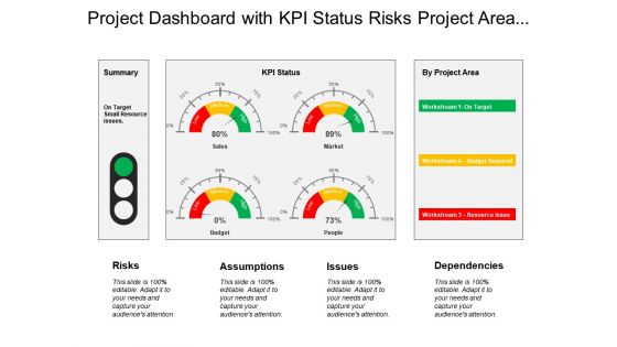
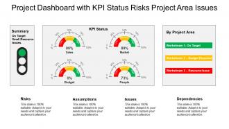
Project Dashboard Snapshot With Kpi Status Risks Project Area Issues





Try Before you Buy Download Free Sample Product
 Impress Your
 Audience
 100%
100% Editable
 Save Hours
 of Time


The glocal approach of our Project Dashboard Snapshot With Kpi Status Risks Project Area Issues comes handy. Benefit from the best of diverse cultures.
People who downloaded this PowerPoint presentation also viewed the following :
Project Dashboard Snapshot With Kpi Status Risks Project Area Issues with all 6 slides:
Develop commercial bonds with our Project Dashboard Snapshot With Kpi Status Risks Project Area Issues. They are good for business conclaves.

FAQs for Project Dashboard Snapshot With Kpi Status Risks
Okay so definitely track budget vs actual spend and timeline stuff with milestones. Resource utilization rates too. But here's what kills me - everyone forgets risk indicators! Quality metrics are huge too, like defect rates or how happy customers actually are. Team velocity matters a ton. Oh, and if you're juggling multiple stakeholders, track engagement levels or you'll hate your life. Keep it visual and update regularly so problems don't blindside you. Start with maybe 5-7 key things instead of drowning people in charts they'll never look at.
Honestly, charts and graphs are game-changers for dashboards. Your brain processes visuals way faster than rows of numbers - like, you'll instantly spot a red progress bar screaming "we're behind schedule" instead of hunting through spreadsheet data. Bar charts work great for budget vs actual spending. Color coding helps too, just keep it consistent so people don't get confused. I probably spend too much time tweaking colors, but whatever. The whole point is giving stakeholders those quick visual cues so they can catch trends and problems at a glance without squinting at boring tables.
Honestly, manual updates are such a pain - just connect your dashboard straight to whatever tools you're already using. APIs, databases, project management stuff, whatever. I usually set mine to refresh every 15-30 minutes unless it's something super urgent. Make sure someone actually owns the data quality piece though, because things will break and you don't want to be the one scrambling to fix it during a meeting. Also have a backup plan ready. The whole point is making it run itself so you're not constantly babysitting spreadsheets while still keeping everyone in the loop.
So you basically just switch up what you're tracking depending on your field. Construction folks obsess over safety incidents and whether they're burning through budget too fast. Software teams? Sprint velocity and bug counts are their bread and butter. Healthcare has to track compliance stuff religiously - patient outcomes too. Marketing people have the flashiest dashboards though, all those colorful ROI charts and conversion funnels. Figure out what your industry actually cares about first. Like, what's the first thing your boss checks Monday morning? That's probably what should be front and center on your dashboard.
Honestly, user feedback makes or breaks dashboards. Ask people what they actually need upfront - don't just guess what looks cool. I've watched so many projects tank because devs built these elaborate things nobody wanted. Get input on which metrics matter and how people want to see stuff displayed. Also figure out their daily workflow - like, when do they even check this thing? Run feedback sessions while you're building it, not after. Oh and treat it like it'll keep changing because it will. People's needs shift once they start using it for real.
So most dashboards connect through APIs or built-in connectors - stuff like Jira, Asana, Trello usually sync right up. Zapier works too if you need something more custom. The auto-sync thing is honestly pretty sweet when it actually works. Real-time updates are clutch so you're not looking at stale data. I'd start by listing your main tools first, then find dashboards that work with those. Some connect instantly once you log in. Others... well, let's just say integration can be a pain sometimes. Check compatibility before you get too invested in any one solution.
Honestly, the worst thing you can do is cram everything onto one screen - I've seen so many dashboards that are just visual chaos. Don't get sucked into showing every metric just because you have the data. Those vanity numbers that look cool? Skip them if they won't actually help people make decisions. Design for whoever's gonna stare at this thing every day, not the executives who see it once in a presentation. Three to five key metrics is plenty to start. Test it with real users early - they'll tell you what's broken way faster than you'll figure it out yourself.
So basically you just swap out the widgets depending on what method you're using. Agile needs sprint burndowns, velocity stuff, story points - all that iteration tracking. Waterfall's more about Gantt charts and milestone percentages since it's linear. Most tools let you create different templates, which is honestly a lifesaver. I'd make separate configs for each one. That way you're not rebuilding everything when you switch projects. Way easier than starting from scratch each time.
Monday.com and Asana are probably your best bets - both have decent free versions you can test out first. Most teams still use the usual suspects: Microsoft Project, Trello, that sort of thing. Power BI and Tableau are solid if you need fancy analytics, though they're overkill for basic tracking. Excel is everywhere too (even though nobody wants to admit it lol). Custom dashboards with Grafana work great if someone on your team knows what they're doing. I'd honestly just start with Monday.com since it looks professional and updates automatically without being too complicated.
Honestly, dashboards are a game changer for dealing with stakeholders. You can skip those painful status update emails that everyone ignores anyway. Just point people to live data showing your progress and any roadblocks. Way better than endless meetings where you're repeating the same stuff over and over. The visual thing really works too - makes complex project details actually readable for different types of people. I'd set up weekly automated sharing so you're not constantly doing manual updates. Trust me, it'll save you so much time once you get it running.
Start with your main project management tool - Jira, Asana, whatever you're using. Then hook up your code repo for dev metrics and budget tracking systems. Slack or Teams data is actually super valuable here because that's where people complain about real blockers that never make it into formal reports. Testing platforms and deployment stuff should be next. Oh, and if customers touch this project at all, definitely grab that feedback data too. Honestly, you want to cover schedule, quality, and resources from every angle. Build it out gradually though - don't try connecting everything at once or you'll go crazy.
A project dashboard basically gives you this bird's-eye view of everything that could go wrong before it actually does. Real-time visibility into all your risk indicators - budget issues, milestone delays, resource problems. It's honestly pretty clutch having all that info in one spot instead of hunting through spreadsheets. The visual setup makes patterns way easier to catch, and you can set alerts for when things hit critical levels. What I really like about them though is how they make stakeholder conversations so much smoother. Everyone can see the same potential issues, so getting approval for fixes doesn't turn into this whole thing.
Basic dashboards are just static charts showing completion rates and budget stuff. Real data-driven ones though? Completely different story. You get live data feeds, predictive analytics that catch problems early, plus automated alerts when shit hits the fan. The game-changer is being able to drill down into specifics and run "what if" scenarios - honestly wish I'd discovered this sooner. Different stakeholders can customize their views too. Everything syncs with your existing tools automatically. If you're still doing manual PowerPoint updates, time to upgrade your whole setup.
Dude, mobile accessibility is a total game changer for project dashboards. Your team can check progress anywhere - stuck in traffic, grabbing coffee, whatever. Quick phone checks during meetings mean faster decisions and way better collaboration. Everyone's on their phones constantly anyway (myself included, let's be real), so might as well use that habit productively. The best part? People can approve stuff and update status without hunting down their laptop. I'd actually build mobile-first, then worry about desktop. You'll be shocked how much more people actually use it.
Honestly, dashboards are game-changers for teams. Everyone can see what's happening without those endless status meetings - which are the worst, let's be real. Your team stops playing guessing games about who's doing what since everything's right there. Issues get caught early instead of exploding later. The key is figuring out what info your people actually check daily (not what you think they should check) and building around that. No more "wait, I thought you were handling the Johnson thing" moments. Start simple though - you can always add more widgets later once people get hooked on using it.
-
Wonderful templates design to use in business meetings.
-
Understandable and informative presentation.