

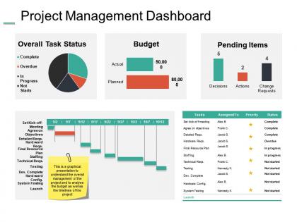
Project management dashboard snapshot ppt summary example introduction




Try Before you Buy Download Free Sample Product
 Impress Your
 Audience
 100%
100% Editable
 Save Hours
 of Time


A project management dashboard is a tool used by project managers to track and monitor the progress of their projects. It provides a clear and concise overview of the project's status, risks, and issues. The dashboard can be customized to display the information that is most important to the project manager.If you're looking for a more comprehensive overview of project management dashboards, or are in need of some inspiration to create your own, SlideTeam's collection of project management PowerPoint presentations is a great place to start. Our templates are easy to use and can be customized to fit your specific needs, so you can get up and running quickly with minimal effort. Plus, they're free to download. Start exploring our library today and see how you can take your project management skills to the next level.
People who downloaded this PowerPoint presentation also viewed the following :
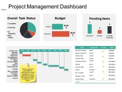
Project management dashboard snapshot ppt summary example introduction with all 5 slides:
Convince the hard core with our Project Management Dashboard Snapshot Ppt Summary Example Introduction. Gain the admiration of those in charge.


FAQs for Project management dashboard snapshot ppt
Start with the basics: timeline tracking, budget vs actual costs, and task completion rates. Resource allocation is huge too - seriously, nothing's worse than realizing someone's drowning in work when deadlines are looming. Sprint velocity matters if you're running agile. Oh, and don't skip stakeholder satisfaction scores because they'll save you from nasty surprises later. Make everything visual with charts and colors so problems jump out immediately. Honestly, stick to 6-8 metrics first. Your team can handle more complexity once they're used to actually checking the dashboard regularly.
So basically it gives your whole team one place to check what's happening. Real-time updates on who's doing what, deadlines, progress - you know the drill. Way fewer "wait what's the status on that thing?" messages blowing up your phone. You can spot problems before they turn into disasters, and people actually know how their stuff connects to everyone else's work. Honestly though, none of this matters if your team doesn't actually use the damn thing consistently. Pick something dead simple or people will just ignore it and you're back to chaos.
Honestly, it depends what you're going for. Power BI and Tableau are crazy customizable but kinda steep to learn. Monday.com or Asana might be better if you want something that works right away - their dashboards have really improved. Google Sheets could work too if your team's already on Google stuff, though it's pretty basic. Oh, and Notion is weirdly good at this now. I'd probably just pick whatever your team already uses and see how far you can push it before switching to something fancier.
Honestly, real-time updates are a game changer - your dashboard becomes like mission control instead of just looking at old reports. Catch problems while they're still small rather than finding out about disasters three days too late. Everyone on your team sees the same current numbers, so no more awkward "um, what data are we even looking at?" moments in meetings. Oh and stakeholders can check progress themselves instead of constantly asking you for updates (which is honestly such a relief). Just get those data feeds running automatically and you'll actually know what's happening with your project for once.
Dude, visual dashboards are a game changer for project management. Instead of staring at endless spreadsheet rows, you get charts and graphs that actually tell a story. Red/green status lights, progress bars, timeline stuff - it all helps you spot problems instantly. Your team can see if you're behind schedule or burning through budget way too fast. I remember our old status meetings were brutal until we switched to visual reporting. Now everyone gets it right away. Start simple though - don't go crazy with fancy charts at first. The whole point is catching trends and patterns you'd never notice in raw numbers.
Check your dashboard for overdue tasks and maxed-out team members - that's usually where things get stuck. Charts and progress bars are honestly your best friend here because they make the patterns super obvious. Red zones or anything trending downward? That's your problem right there. When work starts piling up at certain handoff points between teams, dig deeper. Is it a people issue, crappy process, or just unrealistic planning? Focus on whatever bottleneck is blocking the most work downstream first - you'll get the biggest impact that way. Also look at task duration versus your original estimates for reality checks.
Put the important stuff right up front - status updates, deadlines, blockers. That's what people actually look for first. Visual stuff like progress bars and color coding saves everyone from reading through tons of text (trust me on this one). Don't try to cram everything on one screen - group similar info together instead. Let users customize their view based on what they do. Navigation should be super intuitive. Oh, and definitely test with real users before you launch it. They'll spot problems you'd never think of.
Honestly, just give each group their own view. Executives want the big picture - budget burns and timelines. Team leads need task details and who's doing what. Developers? They only care about sprint stuff and what's blocking them (trust me on this one). Project managers are different - they need everything with risk flags and dependency maps. Set up role-based filters so people aren't drowning in irrelevant data. Auto-reports work great for each group. Then they can dig deeper if something catches their eye.
Honestly, connecting your project dashboard to your CRM or ERP is huge. No more jumping between fifteen different apps all day. When sales updates an opportunity, your project timelines automatically adjust - saves so much headache. Everyone can actually see how their stuff ties into the bigger picture instead of working blind. Plus you'll spot problems way earlier since you're not missing half the story. Oh, and don't go crazy trying to integrate everything at once. Pick one system first and get that working smoothly.
First thing - get your data syncing automatically from Jira or whatever tools you're using. Trust me, manual entry is where everything goes to hell. We had a project showing 110% complete once (still laugh about that one). Set up validation checks that catch weird stuff like that right away. Weekly spot-checks are your friend - just pick a few key metrics and cross-reference with your source systems. Oh, and definitely limit who can mess with the data manually. Train those people well! Start by mapping out where your data comes from and where things usually break. Those are your danger zones.
Mobile dashboards are seriously clutch. You can approve stuff, check project updates, and chat with your team wherever you are. I'm always updating stakeholders during my commute or catching problems before they get worse. Real-time notifications keep everything on track - honestly wish I'd started using one sooner. Your team can log hours right from job sites too, which is super convenient. The best part? No more "I'll handle that when I get back to my laptop" situations. Just make sure whatever you pick actually works well on phones because some are pretty clunky.
Honestly, dashboards are a game-changer for catching project risks early. Real-time visibility means you'll spot problems before they explode in your face. All your risk indicators, mitigation tracking, timeline impacts - everything's right there instead of scattered across different tools. Visual alerts show you which fires need putting out first. No more playing the "should I panic now?" guessing game. Plus stakeholders get instant status updates without you having to build endless presentation decks (thank god). Set up automated alerts for your critical thresholds so you're not obsessively checking every five minutes.
Ugh, the worst thing you can do is cram everything onto one screen. Seriously looks like a cockpit explosion! Stick to maybe 5-7 metrics that actually matter for decisions. Don't throw data up there just because you have it - each thing should answer "so what?" Skip vanity metrics too, they're useless even if they make you feel warm inside. Sometimes a plain number beats fancy charts anyway. Oh, and definitely talk to whoever's gonna use this thing first! I've seen so many beautiful dashboards that nobody opens. Start basic, then add stuff based on what people actually check daily.
Honestly, having a PM dashboard is like finally turning the lights on. You can see your budget burn, timeline progress, and who's working on what - all in one spot instead of hunting through a million emails. Makes spotting problems way easier before they blow up. I used to waste so much time trying to piece together project status from different sources. The visual setup helps you catch bottlenecks fast and actually make decisions with real data. My advice? Pick 3-5 metrics that actually matter to you first, then build around those.
You'll want customizable views and automated workflows - those are game changers. Also grab something with solid resource management tools. Make sure it handles multiple project hierarchies so you can actually break down big messy projects. Role-based permissions are a must because nobody wants Karen from accounting accidentally deleting everything! Real-time collaboration helps tons, plus good filtering and integration with whatever tools you're already stuck using. Oh, and automatic executive reports will save your sanity - I swear half my old job was just making pretty charts for the C-suite.
No Reviews