

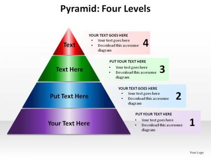
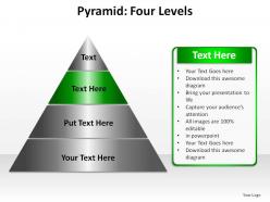
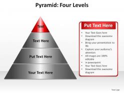
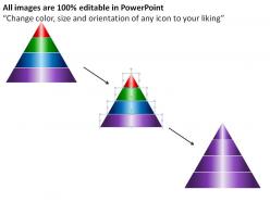
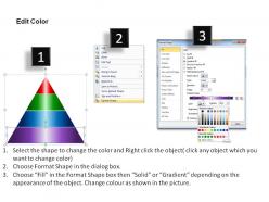
Pyramid four levels ppt slides presentation diagrams templates powerpoint info graphics




Try Before you Buy Download Free Sample Product
 Impress Your
 Audience
 100%
100% Editable
 Save Hours
 of Time


Set the hall ablaze with your presentation. Leave your audience awestruck through our pyramid four levels ppt slides presentation diagrams templates powerpoint info graphics.
People who downloaded this PowerPoint presentation also viewed the following :
Pyramid four levels ppt slides presentation diagrams templates powerpoint info graphics with all 8 slides:
Create visually striking presentation with our pyramid four levels ppt slides presentation diagrams templates powerpoint info graphics. They will emphatically project your core ideas.

FAQs for Pyramid four levels ppt slides presentation diagrams templates
Effective pyramid diagrams include hierarchical structure, clear level distinctions, logical flow from broad to specific concepts, consistent visual formatting, and compelling content organization. These elements enhance audience comprehension by presenting complex information systematically, enabling presenters to build compelling narratives that guide viewers through strategic frameworks, with many organizations finding that well-structured pyramids significantly improve stakeholder engagement and decision-making processes.
Pyramid diagrams enhance understanding by visually organizing complex information into clear hierarchical levels, showing relationships between concepts, and breaking down abstract ideas into digestible components. Through structured visual representation, organizations streamline communication of strategic frameworks, organizational structures, and process flows, with many businesses finding that pyramid formats significantly improve stakeholder comprehension and decision-making efficiency.
Industries that benefit most from pyramid diagrams include consulting, healthcare, financial services, technology, and manufacturing, where hierarchical structures and priority-based information are essential. These sectors leverage pyramid visuals to streamline complex organizational charts, strategic frameworks, and process workflows, with many consulting firms and healthcare institutions finding that visual hierarchies enhance client presentations and stakeholder communication.
Different colors and shapes in pyramid diagrams significantly influence audience perception by enhancing hierarchy comprehension, emotional response, and information retention. Warm colors like red and orange convey urgency and importance at peak levels, while cool blues suggest stability at foundational tiers, with geometric variations helping distinguish between categories, ultimately delivering clearer communication and stronger audience engagement across presentations.
Best practices for labeling pyramid levels include using concise, descriptive text, consistent font sizes that decrease with each level, parallel language structure, and logical hierarchical flow from broad to specific concepts. These approaches enhance comprehension by creating visual hierarchy, reducing cognitive load, and ensuring immediate understanding, with many organizations finding that clear labeling significantly improves audience engagement and information retention across presentations.
Pyramid diagrams in digital presentations enable interactive layers, animated builds, hyperlinked navigation, and dynamic color schemes that engage audiences more effectively than static printed versions. Digital formats allow presenters to reveal hierarchy levels progressively, incorporate clickable elements for deeper exploration, and seamlessly integrate multimedia content, ultimately delivering more compelling storytelling and enhanced audience retention across virtual and hybrid business environments.
Professional pyramid diagram tools include Microsoft PowerPoint, Lucidchart, Canva, Visio, and specialized platforms like SlideTeam with pre-designed templates. These software solutions streamline diagram creation by offering drag-and-drop functionality, customizable layouts, and collaboration features, with many organizations finding that template-based platforms deliver faster results and consistent professional quality across teams.
Pyramid diagrams can be integrated with icons, color coding, data charts, flowcharts, and interactive elements to enhance comprehension and engagement. These combinations work particularly well in strategic presentations and training materials, where organizations layer visual storytelling with hierarchical data, ultimately delivering clearer communication and stronger audience retention across corporate and educational settings.
Pyramid diagrams excel at showing hierarchical relationships and proportional data flows, while bar charts emphasize quantitative comparisons and infographics blend visual storytelling with data presentation. Each format serves distinct purposes, with pyramids being particularly effective for organizational structures, market segmentation, and process flows, while bar charts deliver precise numerical analysis and infographics enhance audience engagement through strategic visual narratives.
Common pitfalls include overcrowding levels with excessive text, using inconsistent visual hierarchy, creating unclear relationships between tiers, poor color choices that reduce readability, and failing to maintain logical flow from top to bottom. These design mistakes can confuse audiences and undermine message clarity, with many organizations finding that simplified, well-structured pyramids enhance comprehension and strategic communication effectiveness.
Pyramid diagrams effectively represent temporal data and hierarchical changes by displaying multiple time periods side-by-side or using layered sections that show evolution. Organizations use these to track workforce demographics over quarters, market segmentation shifts, or organizational restructuring progressions, with each pyramid layer representing different time intervals, ultimately enabling strategic planning teams to visualize trends and anticipate future structural needs.
Pyramid diagrams enhance presentation storytelling by creating visual hierarchy, establishing logical flow from broad concepts to specific details, and guiding audience attention through structured narratives. These diagrams enable presenters to build compelling arguments systematically, moving from foundational principles to actionable insights, while helping audiences retain complex information through clear visual progression and memorable structural frameworks.
The inverted pyramid diagram prioritizes most critical information at the top, making it ideal for journalism, crisis communication, and executive reporting where immediate impact matters most. While traditional pyramids show hierarchical progression from broad foundations to specific outcomes, inverted structures enable rapid decision-making in newsrooms, emergency response teams, and boardroom presentations, ultimately delivering faster comprehension and more efficient information processing.
Pyramid diagrams aren't ideal when presenting non-hierarchical relationships, cyclical processes, or data requiring equal weighting across elements, as they inherently suggest ranking and stratification. They also prove less effective for complex networks, interconnected systems, or collaborative structures where multiple pathways exist, with many organizations finding that matrix formats or network diagrams better represent distributed decision-making and cross-functional workflows.
Peer feedback enhances pyramid diagrams by identifying unclear hierarchies, suggesting better visual flow, and ensuring logical information progression from top to bottom. Colleagues can spot missing connections, recommend color coding improvements, and verify that key messages resonate with target audiences, ultimately delivering clearer presentations and stronger stakeholder engagement across organizations.
-
Great quality slides in rapid time.
-
Easily Editable.