


Qualitative research data analysis ppt powerpoint presentation show layout cpb




Try Before you Buy Download Free Sample Product
 Impress Your
 Audience
 100%
100% Editable
 Save Hours
 of Time


Our Qualitative Research Data Analysis Ppt Powerpoint Presentation Show Layout Cpb are explicit and effective. They combine clarity and concise expression.
People who downloaded this PowerPoint presentation also viewed the following :
Content of this Powerpoint Presentation
Description:
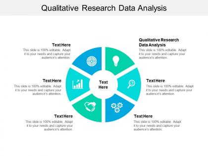
The image is of a PowerPoint slide titled "Qualitative Research Data Analysis," designed for a presentation on analyzing qualitative data. The slide features a circular diagram in the center, divided into six segments, each with an icon and a placeholder text "Text Here." These segments represent different aspects or steps in the process of qualitative data analysis.
Each segment of the circle likely corresponds to a specific theme or component of qualitative analysis such as data collection, coding, thematic analysis, interpretation, and presentation of findings. The icons serve as visual cues for each of these components: a magnifying glass could represent data examination, gears could stand for process, a handshake may imply collaboration or source verification, and so on.
The note "This slide is 100% editable. Adapt it to your needs and capture your audience's attention." suggests that the template can be customized for specific analyses or research findings. The presenter can replace "Text Here" with relevant information, such as the names of the analytical methods used, key themes identified in the data, or steps in the research process.
Use Cases:
Qualitative research data analysis is pivotal for deriving insights across many sectors. Here's how various industries can utilize such a slide for presentations:
1. Market Research:
Use: Presenting findings from consumer focus groups.
Presenter: Market Analyst.
Audience: Marketing Team, Product Managers.
2. Healthcare:
Use: Analyzing patient feedback on services.
Presenter: Healthcare Administrator.
Audience: Clinical Staff, Hospital Board Members.
3. Education:
Use: Discussing results from educational program evaluations.
Presenter: Educational Researcher.
Audience: Teachers, Policy Makers.
4. Social Work:
Use: Reporting on community needs assessments.
Presenter: Social Program Coordinator.
Audience: NGO Staff, Grant Providers.
5. Human Resources:
Use: Sharing insights from employee satisfaction surveys.
Presenter: HR Manager.
Audience: Company Executives, Department Heads.
6. User Experience Design:
Use: Reviewing user testing feedback for software or websites.
Presenter: UX Researcher.
Audience: Designers, Product Development Teams.
7. Public Policy:
Use: Illustrating public opinion on proposed regulations.
Presenter: Policy Analyst.
Audience: Government Officials, Civic Leaders.
Qualitative research data analysis ppt powerpoint presentation show layout cpb with all 2 slides:
Give your audience a fulfilling experience. They will find our Qualitative Research Data Analysis Ppt Powerpoint Presentation Show Layout Cpb elevating.
FAQs for Qualitative research data analysis ppt powerpoint presentation
So you're trying to find patterns and themes that actually answer your research questions. Start by just reading through everything once - don't analyze yet, just get familiar with what you've got. Then you'll code and categorize until the key concepts start jumping out at you. Look for how different ideas connect to each other. Honestly, the whole thing feels pretty messy at first (all those interviews and documents are a lot). But you're building toward insights that tell a coherent story about whatever you're studying. Keep interpreting until you can explain what's really happening.
Okay so thematic analysis is just finding patterns in your data - super straightforward. Grounded theory though? That's building whole new theories from the ground up. Way more work tbh. Thematic analysis lets you spot themes that answer your research question. You can even use stuff that already exists as frameworks. But grounded theory means you're constantly comparing data, creating concepts, building theories as you analyze. It's exhausting honestly. Think of it like organizing your closet vs. designing a whole new storage system. If you've got interview data to make sense of, just go with thematic analysis.
For qualitative analysis, you'll want to check out NVivo, ATLAS.ti, or MAXQDA. They're the main ones everyone uses. NVivo's super popular but honestly the interface is pretty annoying to navigate. ATLAS.ti has really nice visual features though. MAXQDA sits somewhere in the middle - decent functionality without being too overwhelming. If money's tight, try Dedoose since it's web-based and cheaper. Hell, you could even start with Excel for basic coding if your project isn't massive. Definitely test the free trials first - you don't want to drop money on software that'll drive you crazy.
Honestly, triangulation is your best friend here - basically using different data sources or methods to double-check everything. Going back to participants with "does this actually sound right?" is clutch. I always forget how much peer debriefing helps until someone points out something obvious I missed. Document your decisions obsessively (I know, tedious but worth it). Being upfront about your own biases matters too. Oh, and spend real time with your data - like, really sit with it. Try member checking first though. Participants will call you out if you're completely off base, which honestly saves you from looking ridiculous later.
So coding is basically tagging your interview transcripts and field notes to find patterns. You're labeling chunks of data to spot themes - honestly, looking at a pile of transcripts can be pretty intimidating at first! But that's where you turn messy quotes into actual insights. I'd say start broad with your labels, then get more specific in later rounds. Don't stress too much about perfect categories initially since you can always tweak them. Oh and definitely start early - procrastinating on coding just makes the whole thing way more overwhelming later.
So data saturation happens when your interviews start feeling repetitive - like everyone's basically telling you the same stuff. Your codes stop evolving and new conversations just back up what you already discovered. Honestly, it's pretty obvious when it hits! Here's the annoying part though: you can't just stop right when you think you've reached it. You need a few extra interviews to actually confirm it (learned that the hard way). Most people shoot for around 12-15 interviews but don't get too hung up on that number. Complex topics might need way more.
Definitely get on those transcriptions ASAP while everything's still fresh. I'd recommend Otter.ai or Rev to save time, though you'll have to go back and fix their mistakes anyway. Include the "ums" and "ahs" only if they actually matter for your research - otherwise they're just annoying clutter. Don't forget to mark stuff like [laughs] or [long pause] in brackets since those reactions can tell you a lot. Oh, and block out way more time than you think. Seriously, plan on like 4-6 hours per hour of recording.
Strip out anything that could ID your participants - names, places, dates, whatever. Keep that data locked down tight and don't go sharing raw transcripts with random people. I've seen researchers get way too excited about dramatic quotes and forget there's actual humans behind the data. Try not to cherry-pick stuff that just backs up what you already think. Oh, and figure out beforehand what you'll do if something sketchy comes up during analysis - that's always awkward to handle on the fly. Double-check your consent forms to make sure you're staying in bounds.
So member checking is where you bring your findings back to participants and ask if you got it right. I'll usually show them the main themes or key quotes - "does this actually match what you experienced?" Honestly, it's pretty cool because they'll often catch stuff you missed or explain something that didn't make sense. Follow-up interviews work great, but emails are fine too depending on your setup. Their feedback becomes part of your analysis - sometimes they confirm what you found, other times they help you tweak things. Just document how their input changed your final results.
Oh man, focus groups are tricky! You'll have people talking over each other constantly, plus the loud ones always dominate while shy participants barely speak. Audio gets messy fast - good luck figuring out who said what later when you're trying to code everything. Also, people tend to give those "nice" answers they think the group wants to hear instead of being honest. The data volume is honestly overwhelming too. My biggest tip? Get decent recording gear and maybe bring someone just to take notes on who's speaking when. Trust me, you'll thank yourself later when you're not squinting at transcripts trying to match voices.
Honestly, mixing methods is a game-changer for qual analysis. Start with surveys to spot big patterns, then use interviews to dig into the why behind those numbers. Or flip it - let your focus groups guide what quantitative stuff to look at next. I always think of it like getting a second opinion, but for data. You're basically cross-checking your findings instead of hoping one method got it right. Way more solid when you can point to both the stories AND the stats backing up your conclusions. Plus stakeholders eat that stuff up.
Honestly, qualitative data is perfect for building theories. You can create brand new ones using grounded theory or test existing theories against real data. Interviews and observations show you patterns that surveys totally miss - like, the context and nuance you get is incredible. People's actual experiences make your theories so much stronger. Look for new concepts in your data, or spots where current theories don't quite work. I'd start by coding everything systematically. The themes that keep popping up? That's where the good theoretical stuff happens. Way more robust than just numbers.
Oh man, reflexivity is basically admitting that you're not some robot analyzing data - your own stuff absolutely influences what you see. Your background, experiences, all that baggage? It shapes which themes jump out at you and which quotes hit different. Super awkward at first because you're constantly second-guessing yourself. But honestly, that self-awareness makes your whole analysis way more solid. I'd definitely keep a little journal while you're coding - just quick notes when you catch yourself having strong reactions to certain responses. Makes a huge difference in the end.
Oh nice, there's actually tons of ways to visualize qualitative stuff! Word clouds are super helpful for theme frequency. Concept maps show relationships between categories - honestly those are my favorite because you catch connections you'd totally miss otherwise. Journey maps work well if your data follows a timeline. Matrix displays let you compare themes across different groups. For presentations, infographics mixing key quotes with visuals usually land well. I'd start with whatever software you already know (even PowerPoint works) then get fancier later. The main thing is picking what matches your story best.
Honestly, structured coding frameworks are your best friend here - they keep you grounded in what's actually there. Always go back to participants for member checking though, because we hear what we expect way too often. I used to skip this step and regretted it every time. Multiple data sources help catch blind spots, and keeping a reflexivity journal sounds nerdy but it works. Write down your biases and gut reactions as you go. Get colleagues to review your stuff independently too. Fresh perspective catches things you'll totally miss.
No Reviews