


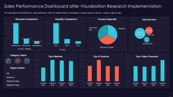
Sales performance dashboard after visualization research implementation




Try Before you Buy Download Free Sample Product
 Impress Your
 Audience
 100%
100% Editable
 Save Hours
 of Time


This slide depicts the dashboard for sales performance after the implementation of visualization research based on revenue, quantity, regional sales.
People who downloaded this PowerPoint presentation also viewed the following :
Sales performance dashboard after visualization research implementation with all 7 slides:
Use our Sales Performance Dashboard After Visualization Research Implementation to effectively help you save your valuable time. They are readymade to fit into any presentation structure.






FAQs for Sales performance dashboard after
Key sales performance dashboard metrics include revenue growth, conversion rates, average deal size, sales cycle length, and pipeline velocity. These metrics enable organizations to streamline forecasting, enhance team accountability, and accelerate decision-making, with many sales teams finding that comprehensive dashboard visibility ultimately delivers improved quota attainment and competitive advantage.
Visualization techniques enhance sales performance dashboards by transforming complex data into intuitive charts, heat maps, trend lines, and interactive graphs that enable instant pattern recognition. Through color-coded performance indicators and drill-down capabilities, sales managers can quickly identify top performers, spot declining territories, and track quota achievements, ultimately delivering faster decision-making and improved team accountability.
Real-time data enables sales performance dashboards to provide immediate insights into pipeline changes, conversion rates, lead quality, and team performance metrics. This instant visibility allows sales managers to quickly identify bottlenecks, adjust strategies mid-cycle, and respond to market opportunities, ultimately delivering faster decision-making and improved revenue outcomes across organizations.
Sales performance dashboards should be updated in real-time for key metrics like pipeline changes and daily activities, while strategic KPIs can be refreshed weekly or monthly. The frequency depends on your sales cycle length and decision-making needs, with many organizations finding that automated hourly updates for critical metrics, combined with comprehensive weekly reviews, delivers optimal visibility and enables faster course corrections without overwhelming teams.
Best practices for designing an intuitive sales performance dashboard include prioritizing key metrics visibility, implementing clear visual hierarchies, ensuring real-time data integration, using consistent color coding, and maintaining clean layouts with minimal clutter. These design principles enhance decision-making by streamlining data interpretation, reducing cognitive load, and enabling faster pattern recognition, with many sales organizations finding that well-designed dashboards significantly improve team performance and strategic responsiveness.
Sales teams can customize dashboards by selecting relevant KPIs, adjusting time periods, creating role-based views, integrating CRM data, and configuring automated alerts for key metrics. Through drag-and-drop interfaces and filtering options, organizations streamline reporting processes, enhance visibility into pipeline performance, and enable data-driven decision making, with many teams finding that personalized dashboards significantly improve sales efficiency and strategic focus.
**INPUT**: What software tools are most recommended for creating sales performance dashboards? **OUTPUT**: Recommended sales performance dashboard tools include Tableau, Power BI, Salesforce Analytics, HubSpot, and Google Data Studio, each offering distinct visualization and integration capabilities. These platforms streamline data analysis by automating reporting, enabling real-time tracking, and delivering customizable metrics, with many sales organizations finding that strategic dashboard implementation enhances decision-making speed and ultimately drives revenue growth. [Word count: 58 words]
Success of a sales performance dashboard is measured through improved decision-making speed, increased quota attainment rates, enhanced forecast accuracy, and reduced time spent on data compilation. Organizations typically track metrics like user adoption rates, time-to-insight improvements, and correlation between dashboard usage and actual sales performance, with many finding that effective dashboards boost team productivity by 20-30%.
Sales performance dashboards facilitate better decision-making by providing real-time visibility into key metrics, identifying trends and patterns, highlighting underperforming areas, and enabling data-driven forecasting. Through centralized analytics, managers can quickly allocate resources, adjust strategies, and coach team members more effectively, while many organizations find that dashboard insights ultimately streamline operations and accelerate revenue growth.
Integrating data from multiple sources involves connecting CRM systems, marketing automation platforms, financial databases, and external tools through APIs, data warehouses, and ETL processes. This strategic combination enables real-time synchronization, automated data cleansing, and unified reporting, with many sales organizations finding that streamlined integration ultimately delivers enhanced visibility and faster decision-making capabilities.
Common pitfalls include overloading with excessive metrics, using unclear visualizations, lacking real-time data integration, ignoring user-specific needs, and creating static rather than interactive displays. These issues often result from insufficient stakeholder consultation and poor data hierarchy planning, with many sales organizations finding that focused, role-specific dashboards with 5-7 key metrics deliver significantly better adoption rates and actionable insights.
Dashboards adapt for remote sales teams through real-time activity tracking, mobile accessibility, automated performance alerts, and integrated communication tools that enable continuous visibility. These cloud-based platforms streamline remote management by centralizing pipeline data, territory metrics, and team collaborations, with many organizations finding that enhanced digital visibility ultimately delivers improved accountability and faster response times across distributed sales operations.
Storytelling transforms raw sales metrics into compelling narratives that drive action, helping stakeholders understand performance trends, identify opportunities, and make strategic decisions quickly. Through visual hierarchies, contextual annotations, and progressive data reveals, sales teams can communicate complex performance insights more effectively to executives and clients, ultimately enhancing buy-in and accelerating decision-making processes.
Mobile accessibility enables sales teams to access real-time performance data, customer insights, and pipeline updates from anywhere, eliminating delays in decision-making and client responses. This flexibility allows representatives to update opportunities during client meetings, access competitor analysis on-the-go, and respond to leads immediately, ultimately delivering faster deal closures and enhanced customer experiences.
User feedback significantly influences sales performance dashboards through interface design improvements, metric customization requests, visualization preference changes, and workflow optimization suggestions. Sales teams regularly provide insights on data accessibility, report formatting, and real-time tracking needs, with many organizations finding that incorporating user suggestions enhances adoption rates, streamlines daily operations, and ultimately delivers more actionable insights for revenue growth.
-
Informative design.
-
Easily Editable.