

Self introduction ppt presentation slides powerpoint presentation slides





Try Before you Buy Download Free Sample Product
 Impress Your
Audience
 100%
Editable
 Save Hours
of Time


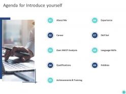
Display an understandable set of data with our self introduction PowerPoint presentation slides. This present oneself PPT deck puts up an informative agenda for you that includes multiple areas like own SWOT, skill set, qualifications, and a lot more. Authorizes you to note down all your personal characteristics, this introduce yourself PowerPoint layout makes sure you do not forget to mention any necessary information. By assimilating this introducing oneself PPT bundle, you can not only clearly represent your career milestones but your future goals in a very impressive manner as well. Exhibiting your strengths, weaknesses, opportunities, and threats, this broaching yourself creative PowerPoint set also assists you in presenting your achievements and training throughout your period of employment. This PPT bundle leaves a long lasting impression on the viewer. This submitting yourself creative PPT set displays your collection of hobbies and language skills to make you stand out in your particular field of work. Download immediately to make your self introduction presentation an exceptional one.
People who downloaded this PowerPoint presentation also viewed the following :
Self introduction ppt presentation slides powerpoint presentation slides with all 46 slides:
Use our Self Introduction Ppt Presentation Slides Powerpoint Presentation Slides to effectively help you save your valuable time. They are readymade to fit into any presentation structure.





FAQs for Self introduction ppt presentation slides
Okay so first things first - definitely include your name, what you do, and one thing you want them to actually remember about you work-wise. Maybe throw in where you've worked or what project you're currently obsessing over. I know everyone says skip personal stuff, but honestly? One real detail about yourself helps way more than people think. Just don't make it weird. Keep your contact info somewhere obvious if you're trying to network. But please don't list your entire career history - that's what resumes are for. You've got like 60 seconds max before people's attention drifts. Make sure you can read everything without squinting!
Dude, photos from your hobbies or work projects are game-changers for intros. People remember visuals way better than boring bullet points - plus they're natural conversation starters. I threw in some pics from my hiking trips last time and everyone wanted to chat about trails afterward. Charts work well for showing career stuff too. Just don't go overboard with text-heavy slides (honestly, they're the worst). High-quality images that actually relate to your story make all the difference. You'll have way more to talk about instead of just reading off slides like a robot.
Ugh, don't cram walls of text on your slides - nobody wants to squint at tiny paragraphs. Keep bullet points super short. And please don't just recite your resume! That's boring as hell. Show some personality instead of that generic "passionate about excellence" garbage everyone says. Here's the thing though - practice talking around your slides, not reading directly from them. It gets so awkward when people just stare down and read word for word. Tell actual stories about your key points. Oh, and mix up what you share - people want to know what makes you interesting as a person, not just your job history.
Honestly, you've gotta completely switch up your approach depending on the audience. Executives? Hit them with ROI and business wins right away - they don't care about technical stuff. Academic crowds want your research methods and publications. Job interviews are all about matching what they actually need. I keep three different versions ready because scrambling to change things last minute sucks. Oh, and formality matters too - startup people love when you're funny and real, but corporate boards expect that buttoned-up vibe. Pro tip: stalk their company culture online first and copy how they talk in your slides.
Honestly, less is more with slides. One main idea per slide, tons of white space. I always go with boring fonts like Arial or Calibri - they're just easier to read. Make your text huge (24pt+) so people in the back aren't squinting. Don't dump everything on one slide! Better to have 10 clean slides than 5 messy ones. Good images help, but skip the cheesy stock photos of people pointing at laptops. Your slides should back up what you're saying, not say it for you - that's your job.
Think of your intro slides like a mini movie trailer - seriously, that analogy actually works! Open with your "origin story" about what got you interested in your field. Then hit the key plot points: challenges you faced, those pivotal moments that changed everything. Don't just list achievements though. Instead of saying "I'm detail-oriented," try something like "I spent three sleepless nights debugging code that taught me systematic testing matters." Keep each slide to one story beat. Concrete examples beat generic statements every time. Wrap up with what's exciting you about future opportunities or where you're headed next.
Dude, colors totally matter for first impressions! Navy blue screams professional and trustworthy - can't go wrong there. Red's great for showing energy, just don't go crazy with it or you'll look aggressive. Green feels balanced, purple's more creative. I swear some people think using bright neon makes them memorable, but honestly? It just tanks your credibility. Stick to maybe 2-3 colors that actually match what you're trying to say about yourself. My go-to advice is always navy with one accent color that fits your field. Works every time.
Just pick your 2-3 best experiences that actually relate to what you're talking about. Nobody cares about every random job you've had - like seriously, skip that filing gig from 2015. Go with roles that show off skills your audience will care about. Bullet points work way better than paragraphs here. One line per job, maybe throw in a quick win or number if you've got one. The whole point is proving you know what you're talking about without dumping your entire work history on them. Think credibility, not autobiography.
Honestly, stick to 2-3 minutes tops for self-intros. That's like 6-8 slides if you're doing 20-30 seconds each. People's attention spans are terrible these days - I learned this the hard way watching colleagues present way too long. Hit the basics: who you are, your background, what you bring to the table. Maybe throw in something quirky so they actually remember you? Focus on what matters to your specific audience though. And definitely practice timing yourself beforehand. Nothing worse than either rushing through everything or watching people's eyes glaze over because you're dragging it out forever.
Ok so definitely keep your stories short and connect them to whatever skill you're trying to show off. Like instead of just saying "I'm good at problem-solving," tell a quick 30-second story about that time you figured out some creative fix at work. Before/after photos work really well too if you can swing it. Most people's attention spans are pretty shot during intros anyway - stories at least keep them awake. Oh and make sure your story actually backs up your point, not just some random thing that happened to you once.
Honestly, go with something clean and minimal - you want them looking at you, not getting distracted by fancy graphics. White space is your friend here. Simple fonts, maybe throw in one accent color if you're feeling it. I've watched people go way overboard with animations and... yikes, it's just too much. Skip the busy backgrounds or templates with a million design elements since you'll be adding your own photos anyway and it might clash. Oh, and make sure there's actual space designated for your headshot and main info. Keep it polished but still feels like *you*, you know?
Yeah, definitely use numbers in your personal branding! Stuff like "boosted sales 23%" or "cut processing time by 40%" makes way more impact than just saying you're good at things. Honestly, people love concrete results - it's like proof you actually know what you're doing. Throw in some industry stats too if they're relevant, shows you get the big picture. Just don't go crazy with charts everywhere. Pick maybe 2-3 of your best metrics that really show your worth. Keep it simple but powerful, you know?
Don't just dive into boring stuff about yourself right off the bat. Start with something that'll grab them - maybe a crazy statistic from your industry or a quick funny story. Questions work great too if they make people actually think. Oh, and weird hobbies are gold! Like "I'm Sarah, I debug code during the day and train rescue dogs at night." Honestly, some of the best intros I've heard were just people sharing what genuinely gets them excited about their work. Whatever you pick, just make sure it feels like you and practice it so you don't sound robotic.
Definitely use multimedia to spice things up! A quick video of you doing something you love beats just talking about it any day. Photos are solid too - maybe from trips or cool projects you've done. Oh, and if you play music or speak another language, throw in a short audio clip. That stuff actually shows who you are instead of just describing it. But seriously, don't go crazy with it - I've sat through presentations that were basically assault on the senses. Keep it simple and tie everything back to what you're saying. The whole point is letting people see your personality, not overwhelming them.
Dude, infographics totally save your intro slides from being snooze-fests. Instead of bullet points that make people's eyes glaze over, you can turn your experience into actual visual stories. Like, show your career as a timeline or your skills as those satisfying progress bars. People absorb visual stuff so much faster than walls of text - I learned this the hard way after bombing a presentation once. Your audience will actually pay attention instead of checking their phones. Canva's free and pretty solid for beginners. Even basic charts beat plain text every time.
-
Professional and unique presentations.
-
Appreciate the research and its presentable format.
-
Great designs, Easily Editable.
-
Thanks for all your great templates they have saved me lots of time and accelerate my presentations. Great product, keep them up!
-
It saves your time and decrease your efforts in half.
-
Good research work and creative work done on every template.
-
Enough space for editing and adding your own content.
-
Excellent products for quick understanding.
-
Wonderful templates design to use in business meetings.