


Self promotion presentation powerpoint presentation slides




Try Before you Buy Download Free Sample Product
 Impress Your
 Audience
 100%
100% Editable
 Save Hours
 of Time


Incorporate this Self Promotion Presentation Powerpoint Presentation Slides to make a dynamic first impression. You can highlight your professional objectives, personal profile, accomplishments and awards, educational background, job experience and various training programs you have undergone to elucidate your competence. By taking aid of this self-introduction PowerPoint template you can draw attention to your professional skills, various case studies, and projects you have completed in a striking way. Furthermore, by encapsulating this self-promotion PPT layout, you can mention your hobbies, linguistic skills and own SWOT analysis to your employer. This infographic personal overview PPT layout can be utilized to showcase the key landmarks of your employment to your interviewer. Your employment path progression, additional responsibilities held and extracurricular office activities can be illustrated to your evaluator by this visual resume PPT complete deck. Download this self-marketing PowerPoint slideshow to stand out other applicants and seize the job opportunity.
People who downloaded this PowerPoint presentation also viewed the following :
Content of this Powerpoint Presentation
Slide 1: This slide introduces Self Promotion Presentation. State Your Company Name and begin.
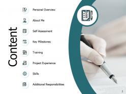
Slide 2: This slide shows Content of the presentation.
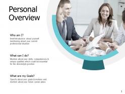
Slide 3: This slide presents Personal Overview describing- What are my Goals? Who am I? and What can I do?
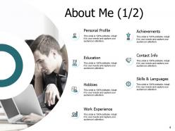
Slide 4: This is About Me slide including- Contact Info, Personal Profile, Hobbies, Achievements, Skill & Languages, Education, Work Experience.
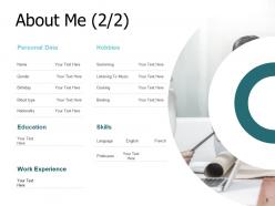
Slide 5: This is an optional About Me slide.
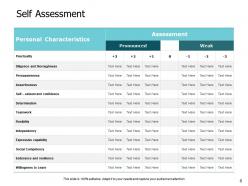
Slide 6: This slide represents Self Assessment in tabular form including various personal characteristics.
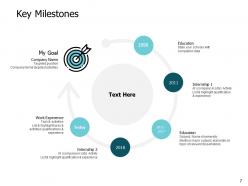
Slide 7: This slide showcases Key Milestones with the help of a timeline.
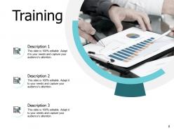
Slide 8: This slide shows Training with related imagery.
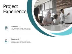
Slide 9: This slide presents Project Experience. Add data as per requirements.
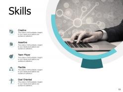
Slide 10: This slide displays Skills such as- Creative, Team Player, Assertive, Flexible, Goal Oriented.
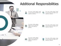
Slide 11: This slide represents Additional Responsibilities with related imagery and text boxes.
Slide 12: This slide showcases Self Promotion Presentation Icons.
Slide 13: This slide is titled as Additional Slides for moving forward.
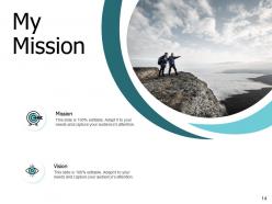
Slide 14: This is My Mission slide with related icons.
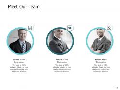
Slide 15: This is Meet Our Team slide with names and designation.
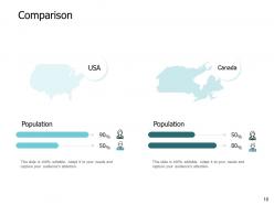
Slide 16: This is a Comparison slide to state comparison between commodities, entities etc.
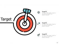
Slide 17: This is a Target slide. State your targets here.
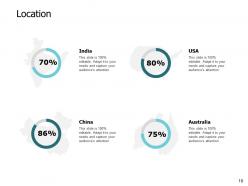
Slide 18: This is a Location slide to show data related with different locations.
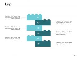
Slide 19: This is a Lego slide with additional text boxes.
Slide 20: This is a Venn slide with text boxes to show information.
Slide 21: This is an Idea Generation slide to state a new idea or highlight information, specifications etc.
Slide 22: This is a Thank You slide with address, contact numbers and email address.
Self promotion presentation powerpoint presentation slides with all 22 slides:
Use our Self Promotion Presentation Powerpoint Presentation Slides to effectively help you save your valuable time. They are readymade to fit into any presentation structure.
FAQs for Self promotion presentation
Honestly, share your messy work-in-progress stuff way more than polished pieces. People eat up behind-the-scenes content and sketches - they want to see how you actually make things. Try collaborating with other creatives too since you'll both get exposure to each other's audiences. I used to hate the idea of networking events, but even hopping into virtual ones sometimes pays off. Authentically commenting on 5-10 other artists' posts daily works better than constantly promoting yourself. Sounds tedious but it actually builds real connections. Those genuine relationships are worth way more than random followers anyway.
Templates are honestly a lifesaver for self-promotion stuff. They make everything look way more professional without you having to be some design genius. I used to waste hours messing with fonts and getting frustrated! You can whip up pitch decks, social media posts, portfolio pieces - all that looks actually decent instead of thrown together. The consistency thing is huge too since people remember brands that look cohesive. I'd grab 2-3 templates that vibe with your style, then just swap in your colors and content. Oh and they save you so much time, which is probably the best part.
When you tell stories about your wins, people actually remember them. Just rattling off accomplishments? Boring. But when you explain the mess you walked into, what you did about it, and how things turned out - that sticks. Templates save your butt when you're put on the spot. CAR works great: Challenge, Action, Result. STAR's another solid one - Situation, Task, Action, Result. I swear these frameworks make such a difference because they give your brain something to grab onto instead of just... freezing up. The whole point is making your stories feel real, not like you're reading from a resume.
Honestly, visual data beats boring bullet points every time. Instead of just saying "I boosted sales," show that revenue spike with a clean chart - way more convincing. People actually remember visuals, unlike walls of text that make everyone's eyes glaze over. You can map out project timelines, track skill growth, whatever metrics matter for your role. It proves you think analytically and can break down complex stuff clearly. Employers eat that up. I'd start with something simple like Canva or Google Charts to visualize your biggest wins first.
Honestly, your presentation template matters way more than you'd think. First impressions and all that - people notice when you look put-together vs. just slapping content into default PowerPoint. Pick 2-3 colors that match your other stuff and stick with clean fonts. Consistency makes you way more memorable to clients or whoever you're presenting to. I learned this the hard way after using Comic Sans in a client pitch once (don't ask). The whole thing just screams "I actually care about details" instead of "I threw this together last minute."
Ugh, the worst thing you can do is just copy-paste those generic templates everyone uses. You'll sound like every other person sliding into their DMs. Don't be super salesy right away either - that's an instant turnoff. Actually bring something useful to the table instead of just asking for favors. I learned this the hard way lol. Space out your messages too, don't spam everyone at 2pm on a Tuesday. Each message should feel like you actually looked at their profile for more than 5 seconds. Make it sound like you, not some LinkedIn bro.
Honestly, social media integration in templates is a game changer. You get clickable icons and share buttons built right in, plus QR codes that link to your profiles. No more awkward "find me on LinkedIn" moments at the end of presentations. Your audience can just click and follow you instantly instead of trying to remember your handle later (let's be real, they won't). I'd definitely start with LinkedIn and Twitter integration first. Oh, and the follower boost is actually pretty noticeable once people start using those buttons.
Honestly, consistent design is like a cheat code for getting noticed. Pick the same colors and fonts across all your platforms - LinkedIn, Twitter, your website, whatever. People's brains start recognizing your stuff instantly, even in crazy busy feeds. It's wild how that works. You'll look way more professional than someone just throwing random designs everywhere (which, let's be real, most people do). I'd say grab 2-3 signature elements and stick with them no matter what. Start with colors first - that's usually the easiest win.
Honestly, presentation feedback is pure gold for figuring out how to sell yourself better. Pay attention to what people consistently praise - like if they always mention your storytelling or how you break down data. Those are your superpowers! I used to totally dismiss the "soft" comments until I realized they were showing me what actually makes me stand out. Notice which questions come up over and over too. That tells you what really clicks with people. Oh, and track which examples get the biggest reactions - those are money. Then work all that good stuff into your LinkedIn, elevator pitch, whatever. You're basically letting your audience tell you exactly what makes you awesome.
Honestly, I'd drop testimonials right after you mention specific skills or wins - it backs up what you just said. Keep them super short though, like 1-2 sentences max because people zone out reading long quotes. Always include the person's name, title, and company underneath for credibility. Oh and make them pop visually with bigger fonts or pull-quote styling. Mix up the types too - some about your work, others about how you collaborate. Just make sure you get permission first! I usually swap them out depending on who I'm presenting to. Keeps things feeling relevant instead of stale.
So here's the thing - niche markets are perfect for presentation templates because you can get super specific. Build templates using your industry's exact language and hit those pain points everyone's dealing with. Honestly, it's like speaking their language from day one. Your audience will immediately know you understand their world. Templates keep your branding consistent while you customize for different segments. Oh, and focus on the 3-4 biggest problems your niche faces - create slide themes around those you can swap in and out. Way more efficient than starting from scratch every time.
Honestly, Canva's your best bet to start - they've got templates made specifically for self-promo stuff. Beautiful.AI is cool because it fixes your design automatically as you go. If you're feeling creative, Figma gives you way more control but it's kinda tricky to learn. Loom's great for quick video recordings you can share right away. Gamma makes those interactive presentations that do really well on LinkedIn. Just remember different platforms need different sizes - like Instagram Stories vs LinkedIn carousels are totally different dimensions. I'd probably just stick with Canva unless you need something super specific.
Honestly, interactive stuff is a game changer because it stops feeling like you're just talking *at* people. Ask quick questions like "raise your hand if you've dealt with this problem" or throw in a poll. Gets them involved instead of zoned out. I actually love doing brief breakout discussions too - people share their own experiences and suddenly you're not the only one talking (which is honestly a relief). Even simple demos where they participate work great. The whole point is making it feel like a conversation, not some boring presentation where you're bragging about yourself for 20 minutes straight.
Honestly, templates are just starting points - you've gotta make them totally your own. I see people just filling in blanks and getting crickets back, which makes sense! Swap out all that generic fluff for actual examples from your work. Real numbers hit different than vague statements. The structure can stay, but I'd rewrite like 70% with your own voice and experiences. Also, match the vibe to whatever industry you're targeting - what works for tech startups won't fly in finance. Templates work when they don't feel like templates, you know?
Oh man, cultural stuff makes such a difference when you're presenting yourself! Like in the US you can totally brag about your achievements directly, but try that in Japan and you'll come off as arrogant. I bombed a presentation there once because I didn't get this. Collectivist cultures want you emphasizing team wins and staying humble. Visual design matters too - some places expect formal layouts while others are more casual. Even how much personal info you share changes. Honestly just google communication norms for wherever you're presenting beforehand.
-
The content is very helpful from business point of view.
-
Very well designed and informative templates.
-
Design layout is very impressive.
-
Professional and unique presentations.
-
Excellent design and quick turnaround.
-
Innovative and Colorful designs.