


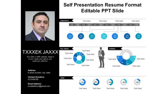
Self presentation resume format editable ppt slide




Try Before you Buy Download Free Sample Product
 Impress Your
 Audience
 100%
100% Editable
 Save Hours
 of Time


Pick this wonderfully designed, affordable, high quality and complete package of self presentation resume format editable PPT slide which is available only for you in thousands of editable styles. Avail this opportunity to represent yourself and your important and requisite information with the usage of this uniquely designed curriculum vitae PowerPoint template which suits every profession. The personal presentation PowerPoint slide not only saves your precious and limited time, money and energy but also prepares you a wonderful presentation of your good self and successful interview. The uniquely designed features and integrated components of this complete pack of template are flexible to all kinds of changes you need to make while preparing for interview and new job. Quality assurance and reasonability are the chief components of this Powerpoint presentation. So why choose ordinary, pick this PPT and attract, influence and convince your interviewer(s) that you are worthy to be selected on your own terms. Affordable high quality Self Presentation Resume Format Editable Ppt Slide are available in thousands of styles. Suited for every presentation need.
People who downloaded this PowerPoint presentation also viewed the following :
Self presentation resume format editable ppt slide with all 5 slides:
Our Self Presentation Resume Format Editable Ppt Slide empower you to command attention. Folks feel driven to heed your ideas.
FAQs for Self presentation resume format
Okay so first thing - make sure your resume actually looks clean with good headings and white space. Write a personal summary that shows who you are, not just boring buzzwords everyone uses. For skills, be specific about what you can actually do. Honestly, I'm so tired of seeing "team player" on every single resume! List real achievements with numbers in your work section, not just what your job description said. If you've got cool projects, definitely include those. Oh and keep it one page unless you're like super experienced - recruiters won't read a novel.
Your resume design totally matters - hiring managers judge you in seconds before reading anything. I know it sounds shallow, but a messy or outdated layout makes you look disorganized. Clean, modern templates suggest you're on top of things. Creative colors? Great for design jobs, terrible for banking or law firms. You've got to match the vibe of wherever you're applying. Oh, and readability trumps everything else. They need to scan your info fast or you're toast. Find something that highlights your experience without being distracting. It's annoying but first impressions count way more than they should.
Honestly, just go with navy, dark gray, or black - can't really go wrong there. Maybe throw in a tiny pop of color like teal for headers if you want, but I wouldn't get crazy with it. Saw this one resume once that was practically neon green and... yikes. Creative fields get away with more obviously, but still keep it classy. Oh, and definitely print a test copy first! Some places still print everything in black and white, so you don't want your careful color choices turning into a gray mess. Less is definitely more with this stuff.
Honestly, try adding some visual elements to break up all that text - icons, color coding, maybe even small charts showing your impact numbers. Nobody wants to scan through walls of boring bullet points anyway. Think of it like mapping out your career story visually. Progress bars for skills look pretty clean, or timeline graphics for showing how you've grown. Just don't go overboard with random decorations that don't actually mean anything - that screams "trying too hard." Start simple. Maybe icons next to different job types or something. The visuals should actually tell your story, not just look pretty.
Okay so biggest thing - don't cram everything on one page like you're playing Tetris. White space actually helps. Also those generic objective statements? Total waste of space. And please don't use tiny fonts that make people squint - I've seen resumes where I literally couldn't read the text. Skip the weird skill bar graphics too, they're meaningless. Keep your formatting consistent throughout. Most places don't want photos either unless they specifically ask. Oh and this is huge - actually customize it for each job instead of sending the same thing everywhere. Pick a good template first, then tweak it properly before hitting send.
Honestly, just swap out the keywords and shift what you emphasize. Tech jobs? Put your programming languages right up top. Creative stuff leads with portfolio work - they want to see what you've made. Finance is obsessed with numbers, so quantify literally everything you can think of. The template structure stays the same (which is why templates are clutch), but you're basically giving it a makeover with whatever language that industry cares about. Oh, and definitely steal buzzwords from job postings. Sounds sketchy but everyone does it.
Honestly, typography can make or break your resume. Stick with boring fonts like Arial or Calibri - I know they're not exciting, but they work. Keep your font size around 10-12 points so people can actually read it without glasses. Bold your section headers, but that's about it for fancy stuff. Don't get creative with spacing or use multiple fonts because it'll just look messy. The whole point is making it easy for someone to scan through quickly. I learned this the hard way when my first resume looked like a ransom note!
Look, your brand needs to pop visually - pick a color scheme and stick with it. Clean fonts help too, maybe throw in a simple logo if you're feeling fancy. But honestly? The messaging matters way more than people think. Lead with what makes you different, not just generic skills everyone has. Your achievements should tell the same story throughout - like, don't highlight teamwork in one section then pivot to being a solo performer elsewhere. Match your industry's vibe too. Everything should feel cohesive, you know? It's less about perfection and more about consistency.
Videos work really well - maybe a quick intro or project walkthrough. Interactive portfolios are solid too. Infographics can show your skills timeline nicely. Audio clips if they make sense for your field. Screenshots of your work are always good, especially before/after comparisons. Honestly though? I've seen people go crazy with flashy animations that just end up being distracting. Keep it simple - each thing you add should either show off a skill or help tell your story better. Oh, and definitely test everything on different devices first. Nothing worse than sending something that crashes on their phone.
Dude, whitespace is EVERYTHING on resumes. Like, I can't stress this enough - it's what separates the pros from people who just threw words on a page. Aim for maybe 40-50% whitespace so whoever's reading it can actually focus. I swear, cramming every detail into one page just makes it look messy and overwhelming. Good margins help guide someone's eyes through your experience naturally. Try starting with 1-inch margins and add some breathing room between sections. Oh, and proper line spacing too - it'll look way cleaner immediately. Trust me on this one.
Honestly, infographics can make you stand out when everyone else is sending boring walls of text. They're perfect for showing off skills or career progression - like actual timelines instead of those ridiculous percentage circles that mean nothing. Hiring managers can scan your stuff way faster when it's visual. Plus you get to show some personality and creativity, which is huge. Just don't go crazy with it though, or you'll look like you're trying to hide that you don't have real experience. Keep it clean and make sure it fits your industry - some fields are way more conservative about this stuff.
Skip the boring testimonials section at the bottom - just sprinkle quotes throughout your actual job descriptions instead. Grab stuff from your LinkedIn recommendations or performance reviews. Like if you boosted productivity by 40%, throw in your manager's quote about your leadership right after. One sentence max though, nobody wants to read a novel. Always include their name and title so it looks legit. I actually think this works way better than those generic testimonial dumps. Just make sure the quotes are recent and actually match what you're applying for, otherwise it's kinda pointless.
Numbers are everything - write "boosted sales 32%" instead of just "improved sales." Way more eye-catching. Strong action words like "spearheaded" or "streamlined" beat boring ones every time. Honestly, recruiters skim resumes so fast you need to make your wins obvious. Focus on what you accomplished, not just what your job was. If you've got multiple big wins, throw them in a separate "Key Achievements" section. Think about what you'd brag about to friends - that's probably resume gold. Don't make hiring managers hunt for why you're awesome.
Don't mess with the basic resume format - that's not where personality lives anyway. Instead, focus on *how* you describe what you did. Skip "improved team efficiency" and go with something like "got everyone talking by starting weekly coffee chats." Way more interesting, right? Your summary section is gold for this stuff since it's already more relaxed. Active voice helps tons here. And honestly? Ditch those boring buzzwords everyone uses. Get specific about your weird little methods that actually worked. Show them your approach through the details, not some generic "results-driven professional" nonsense.
Dude, try adding clickable icons that link to your portfolio or project demos. QR codes are everywhere now - recruiters can scan them to see your work instantly. Skills progress bars look way cooler than boring bullet points, trust me. You can also do expandable sections for project details. If you're doing a digital version, maybe throw in some video snippets? The goal is getting them to actually interact with it instead of just skimming through. Oh, and don't forget it needs to print decently too since some hiring managers are still stuck in 2010.
-
Illustrative design with editable content. Exceptional value for money. Highly pleased with the product.
-
Use of different colors is good. It's simple and attractive.