


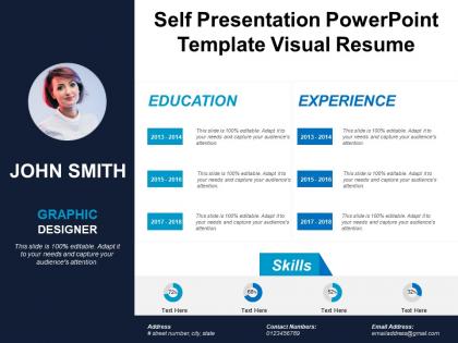
Self presentation powerpoint template visual resume




Try Before you Buy Download Free Sample Product
 Impress Your
 Audience
 100%
100% Editable
 Save Hours
 of Time


The self introduction PowerPoint slide act as an encouragement for an individual to create an amazing first impression. Ideally, an individual wants to leave his best impression on the job interview, group meeting, or motivational, seminar work-related seminar and so on. The self presentation PPT template is useful in a school or even in casual event presentations. Our template of self introduction is useful to provide lengthy and detail work presentations. While speaking in seminars, the speaker can use this self introduction PowerPoint slide to familiarize hid viewers with his personal as well as professional background. By using this method, the viewers feel at ease with the new face and they listen to him attentively, after knowing the previous experiences of an individual on the subject matter. The self presentation skills presentation template helps the user to demonstrate his set of skills and capabilities as well. Our self introduction PowerPoint slide provides an infographic layout and helps in presenting agenda, bio, quote, mission & vision, key skills, education, working experience, companies & clients, portfolio design, career objectives, case study, career path, testimonials, strengths & weaknesses, contact information and so on. Encourage folks to develop green habits with our Self Presentation Powerpoint Template Visual Resume. Do your bit for the Eco-system.
People who downloaded this PowerPoint presentation also viewed the following :
Self presentation powerpoint template visual resume with all 5 slides:
Be acclaimed as a good judge with our Self Presentation Powerpoint Template Visual Resume. Impress folks by your insistence on being fair.
FAQs for Self presentation powerpoint
Honestly, just focus on making the important stuff pop right away - bold headers, decent spacing, stuff that flows naturally when you look at it. Charts and icons beat huge text blocks every time because who wants to read a novel? Pick maybe 2-3 fonts max and don't go crazy with colors. The white space thing is huge though - people always try cramming everything in and it looks messy. Way better to have some breathing room. Oh, and here's a good test: show it to someone for like 5 seconds and see what sticks. If they can't remember the main points, you've probably got too much going on.
So basically a visual resume swaps out boring text blocks for actual design stuff - charts, icons, cool graphics, whatever. Progress bars can show your skill levels. Infographics make your achievements way more interesting to look at. Colors and smart layouts help everything stand out. I mean, regular resumes are honestly pretty painful to stare at. They're perfect for creative jobs, marketing, design roles where people actually care about your visual taste. Oh, and don't go overboard with the fancy stuff - it still needs to be readable and have real substance behind all the pretty elements.
So visual resumes are perfect if you're going after jobs in graphic design, marketing, advertising, or UX/UI - basically anywhere your design skills are literally what they're hiring for. Media, fashion, and digital marketing too. I've definitely seen some cringe ones that were way overdone, but the good ones? They instantly prove you can design and think creatively. Don't even think about using one for traditional stuff like finance, law, or healthcare though - they'll just think you're not serious. Oh, and personal branding is huge in creative fields now. If visual creativity matters for the role, definitely go for it.
Start with hierarchy and white space - your important stuff needs to pop right away. Cramped layouts are death for readability. I'd stick to maybe 2-3 colors tops because honestly? I've seen resumes that look like someone attacked them with highlighters. Not cute. Make sure there's good contrast so people can actually scan it easily. Clean fonts, keep everything aligned. You can throw in some icons or charts but don't go crazy - they should help, not make it look like a Pinterest board. Recruiters literally spend 6 seconds looking at first, so organization matters way more than you think.
Honestly, colors can totally make or break your resume. Blue's your safest bet - screams trustworthy and professional. Red's tricky though, gives off energy but might come across too aggressive for most jobs. Green says "growth minded" and purple works if you're going for creative vibes. Match your palette to the industry, you know? Tech and finance folks love their blues and grays. Creative fields? Go wild (within reason). But seriously, don't turn it into a rainbow - stick to 2-3 colors max. Use them to draw attention to your best stuff, like that promotion or killer project. It's basically visual manipulation, but the good kind.
Skill bars work really well, plus clean icons for your contact stuff. I'd go with minimal infographics that show career progression too - way better than making it look like some crazy PowerPoint deck. Charts are solid for measurable things like sales numbers or project timelines. Honestly, icons just make everything more scannable and break up all that text. But here's the thing - if it doesn't actually help tell your story or make info easier to read, ditch it. You don't want fancy graphics stealing the show from your actual experience.
Honestly, clean and structured is your best bet - throw in some color accents or a nice modern font to show you're not boring. Don't go overboard though. Like, think Apple store vibes, not Vegas billboard. Two or three colors tops, and obviously make sure people can actually read the thing. Let your experience do the talking instead of cramming it with graphics. Oh, and consider what field you're in - marketing folks can get away with more pizzazz than accountants, you know? Quick test: show it to someone for ten seconds and see what sticks.
Dude, typography can totally make or break your visual resume. Clean, professional fonts are your best friend - don't go crazy with like 5 different typefaces (I learned this the hard way lol). Use different weights and sizes to make your name and section headers pop. Your key achievements should stand out too. Spacing matters more than you'd think. Keep everything aligned and consistent. Two font families max, maybe three if you're feeling adventurous. And definitely check how it looks when printed smaller - sometimes what looks great on screen turns into a blur on paper.
Pick 2-3 words that describe your professional vibe first - that's your foundation. Then build everything around those words. Your colors, fonts, layout style should all match that energy. Tech people usually go clean and minimal, while designers can get away with bolder choices (obviously). If you've got a logo or monogram, throw it in there. Even your headshot and how you write about your wins should feel like the same person created them. I actually think this part's pretty fun once you dive in - it's like creating your own little brand identity. Just make sure everything feels authentically you, not some cookie-cutter template.
Ugh, don't go crazy with colors and graphics - I see resumes that look like someone attacked them with a highlighter set. Keep it simple with maybe 2-3 colors max. White space is your friend here. Also, resist cramming everything onto one page if it makes things unreadable. Those tiny fonts nobody can actually see? Skip them. Same with fancy scripts that look cool but are impossible to scan quickly. Print it out first - if you can't skim it in 10 seconds, it's too cluttered. Clean beats flashy every time.
Look, it's honestly such a balancing act between looking good and not getting filtered out by those stupid ATS systems. The fancy templates with all the graphics and weird layouts? They're basically useless because the software can't read them properly. Super annoying, I know. What works is sticking to clean fonts and boring but reliable section headers like "Work Experience." Don't put your contact info or job titles inside images - keep everything as actual text. I learned this the hard way when my beautifully designed resume probably never made it past the robots. Go for something that looks decent but won't confuse the screening software.
Canva's probably your best bet to start - super easy to use and the templates actually look professional. If you've got design chops, Adobe InDesign gives you way more control but it's kind of a pain to learn. I've used Figma before and it works great too. You won't believe this, but I've seen people make killer resumes in PowerPoint (I know, right?). Piktochart and Visme are decent middle options if you want something fancier than Canva but not as complicated as Adobe. Just don't forget to keep it readable for those automated job systems!
Honestly, just make two different versions - way easier that way. Digital ones can be super colorful and you can add clickable links, interactive stuff, all that. But print is trickier. You'll need high-res images and stick to CMYK colors because what looks amazing on your screen might print out looking like garbage. Keep the print version clean and readable since details get lost when it's smaller. Oh, and definitely print a test copy first - I learned that the hard way when mine came out all weird and blurry.
Visual resumes totally depend on your field. Designers go portfolio-style with project showcases, marketers do infographic layouts showing campaign wins. Tech people often build interactive web resumes or keep it minimal while highlighting coding work. Creative fields like photography? They go all out with gorgeous portfolios. Finance surprised me though - even they're sneaking in data visualizations now. Just match your industry's energy. Conservative fields need subtle touches, creative ones let you get wild. Oh, and definitely browse Behance or Pinterest for ideas in your specific area!
Instead of just dumping your jobs and skills everywhere, try connecting them like a story. Pick 2-3 big themes from your career - maybe it's problem-solving or creative growth, whatever. Then design around those themes using timelines or infographics that show key moments and challenges you've tackled. Honestly, the coolest ones I've seen read like mini case studies. Make employers see the flow between your experiences rather than random job hopping. It's about showing where you've been AND where you're going. Does that make sense?
-
Awesome presentation, really professional and easy to edit.
-
Awesome presentation, really professional and easy to edit.