

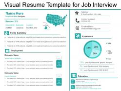
Visual resume template for job interview





Try Before you Buy Download Free Sample Product
 Impress Your
Audience
 100%
Editable
 Save Hours
of Time


Present your skills and accomplishments using this Visual Resume Template For Job Interview slide. Use this CV template to provide a summary of your skills, abilities, and secure your job interview. Take the help of this professional CV slideshow and explain your career objective to employers in an effective manner. This PPT visual can be employed for various purposes such as job search, scholarship application, consulting gigs, contracts, business startups, public speaking, etc. Include the most important items in your resume like job experience, educational experience, speaking skills, volunteer work, special skills and experience, personal qualities, etc. by taking the advantage of our readily available slideshow. Use an amazing format along with an eye-catching font to attract employers and create a wonderful first impression. Also, employ the ways to make your resume visually appealing in this attention-grabbing PPT visual. Thus download this amazing curriculum vitae PowerPoint presentation and make a lasting impression on your recruiter.
People who downloaded this PowerPoint presentation also viewed the following :
Visual resume template for job interview with all 6 slides:
Brief the interrogators with our Visual Resume Template For Job Interview. Focus on the gaps that have to be filled.


FAQs for Visual resume template
Focus on clean fonts and tons of white space - that's what actually makes resumes look professional. Put your contact info right at the top where people can't miss it. After that, organize your experience, skills, and education with the same formatting throughout so it flows nicely. Progress bars for skills are cool, but honestly? I've seen way too many people kill their chances with crazy graphics that confuse the scanning software. Keep it simple. Oh, and definitely print a copy first - you'd be surprised how many resumes look terrible on paper even when they seem fine on screen.
Okay so basically visuals help tell your career story instead of just dumping info everywhere. You can use timelines or color coding to show how you've grown - makes way more sense than random bullet points. Charts are actually pretty cool for showing skill levels too. I mean, anything's better than those boring black-and-white resumes everyone submits, right? Just don't go overboard with fancy graphics that don't mean anything. Figure out what story you're trying to tell first. Then pick visuals that actually support it. The whole point is guiding someone through your experience smoothly.
Definitely go with neutral colors - navy, gray, or classic black and white work best. HR people see hundreds of these daily, so bright rainbow stuff just distracts them. You can add some personality with subtle accents though! Muted blue, forest green, or burgundy look polished without being boring. Oh, and here's a trick my old boss taught me - print it in black and white first. If it's still easy to read and scan, you're good to go. Text readability is everything. Don't make them squint to figure out what you're saying, you know?
Honestly, infographics can be pretty powerful if you use them right. Focus on your biggest wins - maybe a timeline of your career moves or charts showing your skills. Revenue growth visuals work great too if you've got those numbers. Just don't make them tiny and impossible to read (I've seen some tragic resumes with microscopic charts). Each one should actually tell part of your story, not just fill space. Two or three solid infographics max - you're building a resume, not designing some flashy brochure. Pick the ones that really show off what makes you stand out.
Honestly, just go with Canva if you don't have much design experience - their templates are actually pretty decent and you won't spend forever figuring it out. Adobe InDesign is amazing if you're willing to learn it, but that's more for serious design work. Oh, and Figma's free which is nice, plus sharing drafts is super easy. I've even seen people use PowerPoint in a pinch (not ideal but whatever works, right?). You can probably whip something up in Canva in like an hour and just export it as PDF. That's what I'd do anyway.
Match your visual resume to what the industry actually cares about. Creative fields like design or marketing? Go wild with colors and graphics - show off your portfolio right there. Finance or law are the opposite - keep everything clean and minimal, focus on your actual achievements instead of fancy design stuff. Tech companies dig clean, modern layouts with dedicated sections for skills and projects. I swear the color scheme alone can tank you in some industries though. Quick hack: check out the websites of companies you're targeting. Their branding will tell you everything about their visual vibe.
Ugh, the biggest trap is cramming in every design trick you know. Like those confusing skill bar graphics - what's 60% JavaScript even supposed to mean? I've seen resumes that look like rainbow explosions. Keep your contact info super clear and leave white space so it's not overwhelming. Don't forget ATS systems still need to scan it properly. Print it in black and white first - if it's a hot mess, you went too far. You want it polished but not so fancy that recruiters can't find your actual experience buried under all the graphics.
Honestly, visual resumes can be pretty cool - they definitely catch people's eye way more than boring text documents. If you're going for something in design, marketing, or media, go for it! Shows off your creative chops. But here's where it gets tricky... conservative fields like finance or law? They might think you're not serious enough. I learned this the hard way when my friend tried a colorful resume for a banking job - total disaster. Short sentences work. Know who's reading it first, then decide if it's worth the risk.
Honestly, go for creative stuff - graphic design, marketing, web dev, UX work. Those fields actually want to see your design chops upfront. I've seen some crazy good infographic resumes that got people hired on the spot. But definitely avoid the boring corporate world like finance or law - they're still stuck in Times New Roman hell, you know? Oh, and check out the company's website first. If it looks modern and fun, they'll probably love your creative resume. If it screams 1995... maybe stick with the traditional format.
Dude, stick with boring fonts like Arial or Calibri - I know it's not exciting but trust me. Don't put any crucial info in images or fancy text boxes because the ATS literally can't see them. Found that out when my gorgeous design got crickets for responses lol. Simple formatting works best, no tables or weird graphics. Use basic headings too - "Work Experience" instead of something clever like "My Professional Journey" or whatever. Oh and save two versions: a PDF for actual humans to look at, plus a plain Word doc for the robot screening. The whole system's pretty dumb honestly but you gotta play the game.
Dude, pick fonts that actually match your field - creative jobs can get away with fun stuff, but corporate? Stick with Arial or Calibri. Typography literally makes or breaks whether someone can read your resume without squinting. Use bold for headers and important bits, but don't go crazy with it. I swear, half the resumes I see use these "artistic" fonts that look terrible when you print them. Two font families max, and test how everything looks on paper too. Size matters for hierarchy - make it obvious what's most important. Trust me, recruiters scan these things in like 10 seconds.
Dude, consistency makes or breaks a visual resume. Same fonts throughout. Same colors - pick like 2-3 max and don't go crazy. Your spacing needs to match between sections too. I swear, nothing looks more amateur than when someone clearly copy-pasted from different templates. You can spot it a mile away! Keep your headings formatted the same way. Use the same bullet style everywhere. Oh, and maintain those margins - sounds boring but it actually matters. Think of it as your personal brand carried through the whole thing. Details like this separate the pros from everyone else.
Okay so there are basically a few types that work really well. Infographic ones are great - they turn your career into charts and timelines, perfect for data people or marketers. Creative fields do this portfolio-hybrid thing where the resume itself shows off their design skills. I've seen some that look like magazine spreads, which is honestly pretty cool. Web-based interactive ones let employers click through sections too. The trick is matching your style to your industry though. Graphic designers can go totally wild with colors, but accountants? Stick to clean, simple infographics.
Every visual choice you make tells employers who you are. Colors, fonts, layout - it all adds up to your professional story. I'd go with a cohesive palette that fits your field (blues work great for tech, warmer tones for creative stuff). Font choice is huge too - honestly, Comic Sans will kill any serious vibe you're going for. Think of it as your visual voice. Whatever role you want, make sure your design choices match that energy. Then stick with those same elements throughout. Consistency is what makes people remember you.
Pick 3-5 of your absolute best pieces that match what they're looking for. Screenshots work great, or mockups - whatever shows off your skills best. Write a quick blurb for each one explaining what problem you solved and what happened because of it. This is honestly where you can blow away those cookie-cutter resumes everyone else sends. Each piece should tell a different story and show off different abilities. Oh, and don't make the files huge or people won't wait for them to load. Link to the full project too if you can - sometimes they'll actually click through.
-
Perfect template with attractive color combination.
-
Commendable slides with attractive designs. Extremely pleased with the fact that they are easy to modify. Great work!