


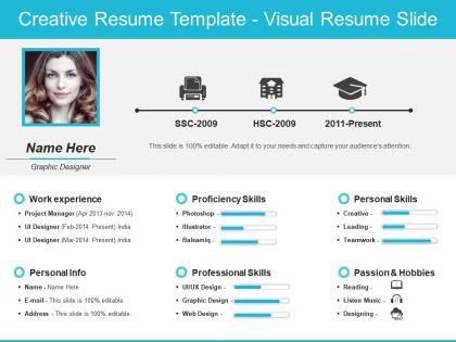
Creative resume template visual resume slide




Try Before you Buy Download Free Sample Product
 Impress Your
 Audience
 100%
100% Editable
 Save Hours
 of Time


Be an advocate of clean energy with our Creative Resume Template Visual Resume Slide. Highlight the ill effects of fossil fuels.
People who downloaded this PowerPoint presentation also viewed the following :
Creative resume template visual resume slide with all 6 slides:
Your thoughts have brought you a long way. Set course for the future with our Creative Resume Template Visual Resume Slide.
FAQs for Creative resume template
Okay so visual hierarchy is huge—clear sections, but don't go crazy with fonts. Two or three tops. Your header needs your name and contact info obviously, plus write a summary that actually means something about what you do. Seriously, white space will save you here. For skills, experience, education... present them creatively! Icons work, color coding, weird layouts. Just don't sacrifice readability for fancy design. Oh and here's my test: can someone spot your phone number in under five seconds? If not, you've overcomplicated it.
Honestly, think about what industry you're targeting first. Tech and finance? Go with blue - it screams "I'm trustworthy and won't mess up your code." Marketing or startups love green since it feels fresh and growth-oriented. Red's tricky though. Super energetic but can be intense, so maybe just use it for accents. Purple works if you're in creative fields, but probably skip it for banking (learned that one the hard way). Stick with black or dark gray for your main text so people can actually read it. Then pick one, maybe two colors max for headers or borders. Don't just choose whatever you like - actually look up the company's vibe first.
Honestly, typography can make or break your whole resume. Most recruiters barely glance at these things for like 5 seconds, so readability is everything. I'd stick with fonts that show your personality but aren't hard to read - save the super experimental stuff for your portfolio maybe? Play around with different weights and sizes to make your name stand out and create some visual flow. Just don't use more than 2-3 font families or it gets chaotic fast. Also think about your field - graphic designers can get away with way more than someone applying to be an accountant, you know?
Dude, infographics are game-changers for resumes. They turn boring skill lists into actual visual stories that pop. So instead of writing "good at project management," you can literally show timelines of stuff you've finished or use charts for skill levels. Perfect for displaying career growth or those big wins - revenue jumps, team sizes, whatever. Recruiters barely glance at resumes anyway (like 6 seconds max), so visuals help yours jump out from all that text. Oh and keep them clean - don't go crazy with graphics that just distract from your actual experience.
Honestly, bullet points with actual numbers are your best friend here. Like "boosted social media engagement by 40%" instead of just "managed social accounts" - way more impressive. I'd throw in some visual stuff too - progress bars, icons, maybe even a small chart if you're feeling fancy. You could do color-coded sections or infographics, but don't go crazy with it. Nobody wants to squint at your resume. Pick your 3-5 biggest wins and make them pop. Oh, and always start with action words and lead with the impact first, not just what you did.
Honestly, just stalk their website and social media first to see their vibe. Tech companies love bold colors and modern stuff, but if you're applying to finance or law? Keep it super clean and boring - they want to know you take spreadsheets seriously lol. Creative fields are the opposite though - they actually want to see you have taste. I always do this quick check: would my resume fit right in on their careers page? If it looks weird there, it'll probably feel off to them too. Match their energy with your fonts and colors.
Honestly, the biggest trap is going overboard with design and burying your actual skills. Your experience should still be the main focus, you know? Don't make it so fancy that nobody can read it - and definitely keep it ATS-friendly or those systems will just toss it. I've seen people use cool graphics to hide weak content, which backfires hard. Make sure there's enough white space and test how it prints in black and white (trust me on this one). Oh, and have someone else look at it first. Sometimes we're too close to our own work to see if it actually makes sense.
Think of your resume as your visual handshake – it should scream "you" before they even read the words. Match your colors and fonts to your vibe and industry. Bold graphics work great for design roles, while tech positions usually call for clean, minimal looks. Honestly, I've seen too many resumes that look like they came from the same boring template. Custom icons, your signature colors, creative headers – whatever makes you stand out. Just don't go so crazy that people can't actually read your qualifications. The design should make you memorable, not give them a headache.
Honestly, Canva's my go-to for this stuff - super easy and the templates don't look terrible. If you're feeling fancy, InDesign is amazing but has a steeper learning curve. Figma works too if you already know it. PowerPoint can actually work in a pinch (don't judge me lol). I'd start with Canva to figure out your vibe first. You can always move to something more advanced later if you need crazy customization. Illustrator's decent too but honestly feels like overkill for most resumes.
Okay so whitespace is honestly everything on creative resumes. I see people panic about "wasting space" and just cram text everywhere - huge mistake. You need breathing room around your headers and between sections, otherwise it looks chaotic. Good whitespace actually guides where someone's eye goes first. Like, it makes you look way more polished and intentional than cramming does. Trust me on this one. Start with at least half-inch margins. Then add extra spacing between your major sections. Short sentences work too. The visual hierarchy you create will make everything so much easier to scan through quickly.
Honestly, multi-page templates are perfect when you've got a lot to show off. Creative fields especially – you need room for proper portfolio sections and case studies that actually explain your work. Single pages feel way too cramped for that stuff. Plus you can throw in testimonials without everything looking like a mess. But here's the thing: some hiring managers just want that quick one-page scan, so your first page better be killer. I mean, they're probably skimming anyway. Go multi-page if you genuinely need the space, otherwise you're just adding fluff.
Okay so instead of just boring chronological lists, creative resumes let you actually show your career story visually. Think timelines, infographics, color coding - stuff that shows how your skills grew over time. Way more interesting than bullet points, right? Employers can see your progression and get why you switched jobs or industries. Honestly, I think it's especially good for highlighting transferable skills that usually get lost in traditional formats. Oh and try organizing by themes or skill areas instead of dates - makes everything look more intentional. Your career path won't seem so random that way.
Clickable icons are super useful - link them to your portfolio, socials, whatever you want to show off. QR codes are everywhere now, so why not add one that goes straight to your work or a video intro? Skills sections look way better as progress bars instead of boring bullet points. Infographics work great for showing off your wins and numbers too. Oh, and interactive timelines for your career path are pretty cool if you've got the space. One thing though - definitely keep a plain version handy since most company systems can't read the fancy interactive stuff and you'll just confuse their robots.
Okay so here's the thing - when your resume, portfolio, and presentation slides all match (same fonts, colors, layout style), you instantly look more professional. Like, employers notice that stuff. It's the visual equivalent of showing up to an interview put-together. Pick maybe 2-3 fonts and stick with them across everything - I learned this the hard way after using like 6 different ones on my first portfolio lol. But seriously, it shows you can maintain standards across projects. Super important if you're going for client-facing roles or anything involving brand work. Small detail that makes a big difference.
Make those links pop with bright colors or underlines - you don't want people hunting for them. Stick your LinkedIn right up in the header with your phone number and stuff. Portfolio link should be super prominent too (honestly, half the time that matters more than the actual resume). Don't just dump ugly URLs everywhere - use clean text like "View Portfolio" instead. Oh, and QR codes are kinda genius for printed copies since people can scan them with their phones. Just double-check everything works before you send it out. Nothing worse than a dead link killing your vibe.
-
Very well designed and informative templates.
-
The Designed Graphic are very professional and classic.