

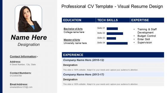
Professional cv template visual resume design




Try Before you Buy Download Free Sample Product
 Impress Your
 Audience
 100%
100% Editable
 Save Hours
 of Time


Create a wonderful summary of your accomplishments with the help of this Professional CV Template Visual Resume Design PPT. This resume PowerPoint presentation consists of achievements, qualifications, expertise, skills and personal information of the interviewees. Utilize this professional CV PPT slideshow and show your life goal or purpose clearly to interviewers. Take advantage of this achievement summary PowerPoint slide to showcase the kinds of resumes including chronological and functional resumes. Take the assistance of this CV PPT graphic to make a great first impression in the eyes of managers who will take your interview. Use an amazing format, cover letter, and font type to captivate employers for offering you the job you applied for is okay. Employ this self-introduction PowerPoint visual to understand what type of candidate is needed by a particular organization and ensure that you match their expectations. Download this curriculum vitae PPT infographic and depict your career objective in an appealing way to land your dream job.
People who downloaded this PowerPoint presentation also viewed the following :
Professional cv template visual resume design with all 6 slides:
Pay the bills with our Professional Cv Template Visual Resume Design. They keep the coffers full.

FAQs for Professional cv template
Okay so first thing - keep your layout super clean with clear sections and definitely include a professional headshot. Use some color strategically to guide people's eyes around the page. I'd throw in some infographics for skill levels and maybe timeline graphics for your work experience. Icons help break up all that text too because honestly, walls of text are brutal to look at. Make your contact info really prominent - can't believe how many people bury that stuff. Oh and stick to one page max! The trick is finding that sweet spot between looking cool and still being readable. Export as PDF when you send it so nothing gets weird with the formatting.
Match your colors to whatever industry you're going after. Finance or healthcare? Blue's your friend - screams trustworthy and professional. Green works for anything growth-related. Creative jobs can get away with bolder stuff like orange or purple, but honestly? I've seen some truly awful rainbow disasters that just hurt to look at. Keep it simple - two colors tops, maybe three if you're feeling fancy. Blue headers, gray text, then one pop of color for important stuff. Oh, and check how it prints in black and white since some old-school people still do that. Cultural stuff matters too depending on who's reading it.
Honestly, infographics can make your resume so much more eye-catching than those boring text walls. Recruiters literally spend like 6 seconds scanning resumes – which is insane if you think about it – so visuals help your best stuff pop immediately. Charts work great for showing achievements, timelines are perfect for career progression, and those little progress bars beat just writing "proficient in Excel." The visual flow naturally guides their attention where you want it. But don't get too design-crazy and forget the actual content matters. I'd probably pick 2-3 important things to make visual and keep everything else simple.
Honestly, just match your template to whatever industry you're targeting. Creative fields? Go wild with colors and make your portfolio the star. Corporate stuff needs clean layouts with subtle colors - focus on your numbers and wins. Tech people are obsessed with those little skill bars and programming icons, so definitely include those. Finance and healthcare folks want conservative designs with traditional fonts. I'd research what your specific field values most first, then adjust your template to put those qualifications front and center. The visual hierarchy should basically scream "this is what matters to you guys."
Honestly, just go with Canva - seriously can't go wrong there. Super easy to use and they've got a million templates already made. Adobe InDesign is technically the best but it's way too complicated unless you already know design stuff. Oh and Figma's pretty solid too, runs right in your browser which is nice. You could even use PowerPoint if you're desperate, though the layouts won't look as clean. I'd definitely start with Canva since you'll have something decent in like 20 minutes, then mess around with the fancier tools later if you want.
Look, go with a clean layout that's easy to read - forget the neon colors and crazy fonts. Nobody's got time for that. Add some subtle creative touches like nice color accents or clean icons to show you've got design sense, but don't go nuts with it. Your creativity should help the info pop, not fight against it. Research your field first though - graphic designers can get way more creative than accountants (obviously). Here's my test: would you respect this person in a meeting? If yes, you're good to go.
Honestly, less is more with resume design. Pick 2-3 colors tops and stick with one clean font - I've seen people go crazy with rainbow colors and it just looks unprofessional. Don't make your text tiny either, nobody wants to squint. The worst are those "creative" layouts that zigzag all over the place. How's anyone supposed to follow your work history? Make your contact info easy to find and leave some breathing room on the page. Oh, and definitely print a test copy first because what looks fine on your laptop screen can turn into a hot mess on paper.
Okay so infographics are game-changers for resumes. Instead of just writing "proficient in Excel," throw in a skill meter or use bar graphs to show sales targets you've crushed. Icons help break up all that text too - makes everything way easier to scan. I've been playing around with color coding different sections and honestly? It looks so much cleaner than those boring traditional resumes. Just don't go crazy with the fonts or you'll overwhelm people. Start simple, maybe grab a template, then add one visual thing at a time until it clicks.
Dude, typography can make or break your resume. Recruiters literally spend like 6 seconds scanning each one, so you need fonts that are super easy to read. I'd go with something clean like Arial or Helvetica - nothing fancy. Keep it to 2-3 font sizes max: bigger for your name, medium for headers, smaller for everything else. Body text should be at least 10-11pt or people will squint trying to read it. Here's what I always do: print it out first. If it looks messy on paper, it'll look worse on screen. Sans-serif fonts work best for modern resumes anyway.
Honestly, LinkedIn is all about mobile optimization - everyone's scrolling on their phones anyway. Strip your visual resume way down. Simple colors, bigger text, bullet points instead of chunky paragraphs. Standard fonts only (nothing fancy that won't load properly). Compress your graphics so they don't take forever to load. People have zero patience for slow stuff. Make it scannable in like 10 seconds max. Upload the PDF to your featured section, but also pull out your best achievements and put them directly in your job descriptions. That way they'll actually get seen.
Honestly, the best visual resumes I've seen fall into three main types. Infographic ones are huge with designers - all those charts and icons really show off their skills. Timeline formats work amazing for project managers since they map out your career progression super clearly. Then there's portfolio-integrated ones where your actual work samples get built right into the resume layout. Those are pretty slick if you ask me. The thing is, each format solves a real problem - whether it's proving you're creative, organizing messy info, or just showing what you can actually do. Don't just pick something that looks cool though. Go with whatever tells your story best.
Go with PDF for sure. It keeps all your formatting and fonts exactly how you made them, and literally everyone can open PDFs these days. Word docs are risky - I've had employers tell me my resume looked completely wonky because they didn't have the right fonts installed. Super embarrassing. JPEGs could work if your design is really graphics-heavy, but honestly PDF feels way more professional. Oh, and compress that file size first! Nobody wants to sit there downloading some massive resume file - learned that one from experience too.
Look, a visual resume is basically your chance to show off who you are beyond just words on paper. You're not stuck with boring black text anymore - instead you get to flex your design skills and personality right upfront. Think of it like a mini portfolio that screams "this is my vibe." Employers can instantly see your creative side and attention to detail. Social media loves them too, way more shareable than those old-school Word docs. Honestly, I'd probably scroll past a plain resume on LinkedIn but stop for a colorful one. Just grab a template that fits your field and make the colors totally yours.
Ugh, visual resumes are such a trap! They look amazing but ATS systems literally can't read them - all your graphics and fancy formatting just turn into gibberish. Super annoying because who wants to stare at boring black text all day? But yeah, if your keywords are buried in images, you're basically invisible to the system. I'd keep two versions honestly. Use the plain one for online apps and break out the pretty one when you're actually meeting people. Way more work but that's job hunting for you.
Dude, get feedback on that visual resume for sure! You literally can't see your own mistakes after staring at it forever. Fresh eyes will catch confusing layouts or sections that are hard to read. Industry people know what hiring managers actually want - they'll tell you if you're using some outdated design trend (happens to everyone). Plus they can suggest better ways to show off your skills. I always think I'm being creative but sometimes it just makes things harder to read, you know? Show it to like 2-3 people before you send it anywhere.
-
Excellent template with unique design.
-
Visually stunning presentation, love the content.