


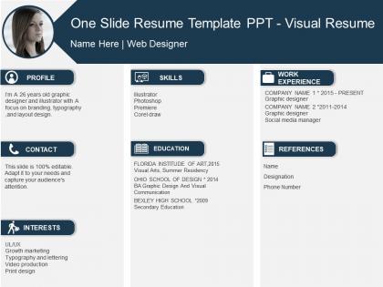
One slide resume template ppt visual resume




Try Before you Buy Download Free Sample Product
 Impress Your
 Audience
 100%
100% Editable
 Save Hours
 of Time


Face the brunt of change with our One Slide Resume Template Ppt Visual Resume. You will emerge better for it.
People who downloaded this PowerPoint presentation also viewed the following :
One slide resume template ppt visual resume with all 6 slides:
Focus on gaining the advantage with our One Slide Resume Template Ppt Visual Resume. They help channelize the grey cells.

FAQs for One slide resume template
Okay so definitely include your contact info at the top and maybe a professional photo if that's normal in your industry. Experience, skills, education - the usual suspects. Icons and colors can help make everything pop, but seriously don't go crazy with it or you'll look like you discovered Canva for the first time lol. White space is your friend for easy scanning. I'd grab a simple template first, then tweak it based on what's expected in your field. The whole point is making your stuff readable while looking put-together.
Colors are honestly huge for first impressions on resumes. Blue's your safe bet - screams trustworthy and professional. Green works too, gives off that balanced, growth-minded vibe. I'd avoid red unless it's just tiny accents because it can come across pretty aggressive. Think about where you're applying though - creative companies might love bold purples or oranges, but if you're going for finance or law? Stick with blues and grays, trust me. Keep it to 2-3 colors max and make sure they actually match the vibe of both you and the company culture.
Honestly, go with single-page infographics or clean slide layouts. Both scan well and won't mess with ATS systems. For creative jobs, infographics are perfect since you can show off design skills while laying out your experience. Slide decks work really well too, especially in consulting where everyone loves presentations anyway. Don't get too fancy though - most recruiters just want to quickly scan your stuff. Always save as PDF no matter what style you pick. Oh, and keep a boring text version around for online apps that hate creativity.
Honestly, it depends on where you're applying. Finance and law firms? Keep it super clean - boring fonts, minimal colors, the whole conservative thing. But creative fields like design or marketing actually want to see some personality - bold colors, cool layouts, whatever shows your style. Tech companies are weird because they want modern but not too flashy, if that makes sense. I'd definitely stalk the company's website and social first to see their vibe, then match that energy. Just don't sacrifice readability for fancy design - nobody's got time to decode your resume. Oh, and stuff those industry keywords in there somewhere.
Dude, typography can totally make or break your resume. Recruiters literally spend like 6 seconds scanning it initially - so harsh but that's reality. Go with clean fonts that are super easy to read. I'd stick to maybe 2-3 font families tops and keep your sizing consistent for similar stuff. Also make sure there's good contrast between text and background (learned that one the hard way). Pick a solid sans-serif for headers first and test different sizes. Good typography creates this visual hierarchy thing where your best info pops right away. Honestly it's way more important than people think.
Honestly, icons are pretty solid for showing skill levels - like those progress bars or star ratings you see everywhere. For technical stuff, just use the actual software logos (Photoshop, Excel) since recruiters know them instantly. You can get creative with other skills too - camera for photography, code brackets for programming. Don't go crazy though, it gets tacky real quick! Keep your style consistent and make sure everything's obvious at first glance. Oh and the icons should make things clearer, not replace actually explaining what you can do. That'd be weird.
Don't go overboard with the design unless you're actually a graphic designer. Cluttered layouts are the worst - too many colors, weird fonts that nobody can read. Recruiters scan these things super fast. Your experience should be the main focus, not some fancy chart you spent hours on (been there). Keep it clean and ATS-friendly for online applications. Always have a boring traditional version ready too. Here's a good test: ask someone to find your phone number in under 5 seconds. If they can't, you've overdone it.
Honestly, there's some cool stuff you can do with digital resumes now. Links to your portfolio are pretty standard, but QR codes for video intros are getting popular too. Interactive skill charts look slick if done right. Some platforms actually let you embed video or audio clips straight into the document - which is wild when you think about it. Animated infographics can work, but I'd be careful not to make it look like a kid's birthday invitation, you know? Each element should actually show off something relevant about your skills. I'd start with just one or two things and test how they look on different devices first. Last thing you want is your resume breaking on someone's phone.
Canva's honestly your best bet for visual resumes - super easy to use and they've got tons of templates. If you're already comfortable with design stuff, InDesign is amazing but there's definitely a learning curve. Figma works great too and it's free, which is nice. I've even seen people do cool things with PowerPoint if you don't mind getting a little creative with it. Just don't go too crazy with animations and weird fonts since some company systems can't handle that stuff. I'd probably start with a Canva template and tweak it from there.
Okay so consistency is huge on resumes. Pick like 2 fonts max and actually stick to them - I swear some people use a different font for every section and it looks insane. Same goes for colors and spacing. You want everything to feel like it belongs together, not like you copy-pasted from 5 different templates. Here's what I do: step back after you're done and squint at it. Does it look cohesive or does it hurt your eyes? Also pro tip - use the same amount of space between each section. Sounds boring but it makes such a difference. Trust me on this one.
Honestly, visual resumes can work in traditional industries, but you've gotta be smart about it. Finance, law, healthcare - they still want clean, text-focused formats that highlight your experience. But here's the thing: subtle visual touches actually help you stand out. Think good typography, maybe a small color accent, or simple infographic sections for skills. Nothing crazy flashy though. I've seen project managers and consultants pull this off really well - shows they're not stuck in the past, you know? My buddy in consulting did this and got way more callbacks. Just research the company culture first and adjust accordingly.
So here's the thing with visual resumes - you gotta make them ATS-friendly or they're basically useless. Use normal fonts like Arial or Times New Roman, and make sure all your text is actually selectable text, not stuck inside images. Save it as both PDF and Word since systems are picky about formats. White space is your friend here. Those crazy graphics might look amazing but they totally mess with applicant tracking systems. Put your contact info and skills as real text, not fancy visual stuff. Oh, and definitely print it in black and white to see how it looks - you'd be surprised how many people skip this step. For super traditional industries, maybe create a boring backup version too.
So instead of just listing jobs, turn your visual resume into an actual story. Timeline formats work great for this! Add little snippets under each role that show what you actually accomplished - like "boosted team morale during that messy restructuring" vs boring stuff like "managed team." People get super creative with infographics too, which honestly makes you stand out. The key is showing how you've grown and tackled challenges. Make it easy for hiring managers to follow your journey and see where you're going next. Way more engaging than those cookie-cutter resumes everyone submits.
Honestly, visual resumes are game-changers if you're in creative fields. Recruiters literally spend like 6 seconds per resume, so anything that grabs their eye helps. Charts and graphics make your skills way easier to understand at a glance - way better than just listing "Adobe Photoshop: Expert" or whatever. Perfect for marketing, design, that whole world. But here's the thing - some old-school industries still want boring traditional formats. Finance guys probably aren't impressed by your color-coded skill bars, you know? Start simple with a clean template. Only add visual stuff that actually tells your story better, not just random flashy elements.
Yeah, ATS systems are such a pain for visual resumes. They only read plain text, so all your cool graphics and creative layouts just confuse them. Your resume might come out looking like total garbage on the other end - or worse, they'll miss key info that's in images or weird text boxes. Really sucks for designers and creative people. I'd keep two versions honestly - a boring, clean one for most applications, and save your beautiful visual one for when you're applying directly or you know they actually want to see creative work. Trust me on this one.
-
it's great! thanks
-
Excellent products for quick understanding.
-
Wonderful templates design to use in business meetings.