


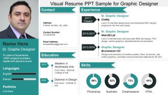
Visual resume ppt sample for graphic designer





Try Before you Buy Download Free Sample Product
 Impress Your
 Audience
 100%
100% Editable
 Save Hours
 of Time


Our Visual Resume Ppt Sample For Graphic Designer have a cool effect. Everyone feels completely calm.
People who downloaded this PowerPoint presentation also viewed the following :
Visual resume ppt sample for graphic designer with all 6 slides:
Our Visual Resume Ppt Sample For Graphic Designer will fill you with glee. You will feel extremely fortunate.
FAQs for Visual resume ppt sample
So basically a visual resume is like an infographic version of your work history - lots of graphics, charts, and cool layouts instead of boring bullet points. You can show your skill levels with progress bars, maybe do a timeline thing for jobs you've had. Way more creative than the standard black-and-white format everyone's used to. Perfect if you're going for design or marketing roles, but honestly some old-school companies still want the traditional version. I'd probably make both just to be safe - you never know what they're expecting when you apply.
Put your name and contact info at the top - make it big and obvious. Skills section should be scannable, maybe throw in some icons or those progress bar things (I'm weirdly obsessed with those). Work experience needs clear dates and real numbers for your wins when you can. Also add a quick "about me" bit. If your job's creative, definitely include portfolio samples. The design should be clean - don't go crazy with weird fonts that make recruiters squint. Honestly, the whole resume should tell your story fast since most people barely glance at these things anyway.
Good design basically guides where people look first, then second, etc. Use contrast to make your biggest wins pop. White space keeps things from looking messy – honestly, some resumes I've seen look like someone just threw text at a wall. Stick with consistent fonts and colors so you don't look amateur. Your name should probably be the strongest focal point, then build out from there. Alignment matters too because it makes everything look intentional instead of random. The whole point is supporting your content, not making it flashy just because you can.
Don't go overboard with flashy stuff - I've literally seen resumes that look like casino ads and it's just... no. Too many colors and fonts make it impossible to read anyway. Keep it clean but not boring, you know? The design should help highlight your actual skills, not cover them up. Oh and super important - test if it works with those applicant tracking systems if you're applying online. Have someone do the 10-second scan test too. If they can't spot your key info right away, tone it down. You want them focusing on why you're awesome, not trying to decode your layout.
Visual resumes are huge in creative fields - design, marketing, media - since you can actually show your work instead of just talking about it. Tech loves them too for showcasing projects and code. But honestly? Even boring industries like finance are starting to come around. Anything beats another bland resume, right? You just gotta match the vibe to your industry. I'd check out what successful people in your field are doing online first - that'll give you a good sense of what works.
Colors seriously matter more than you'd think on resumes. Blue screams trustworthy and professional - can't go wrong there. Red's energetic but might come off aggressive, green feels balanced and growth-oriented. Purple's creative but maybe too much for stuffy corporate places. I swear I've watched people land interviews partly because their resume colors matched the company's brand perfectly. Weird but true. Black and gray look sleek but don't overdo it or you'll seem cold. Stick to 2-3 colors that actually fit your industry. That's honestly half the battle right there.
Honestly, infographics can make your resume way less boring. Instead of just listing skills, try bar charts or progress bars to show how good you are at different software. Icons with percentages work too. Timeline graphics are perfect for career stuff - nobody wants to read those chunky paragraphs anyway. Just don't go crazy with colors and effects. Pick your 2-3 strongest skills that match the job and focus on those. I made the mistake once of trying to visualize everything and it looked like a kindergarten art project.
Honestly, just go with Canva - super easy to use and has a million templates. You don't need to be a designer or anything. InDesign's powerful but honestly might be overkill unless you're already familiar with Adobe stuff. Figma's solid too and it's free, which is nice. I mean, I've even seen decent ones made in PowerPoint, though that feels kinda janky to me. Oh, and whatever you do, don't get too crazy with the design. Hiring managers still need to actually read your experience quickly.
Honestly, think of your career like chapters in a book - make it visual! Timeline infographics work great, or before/after project shots. Some people even do comic strips (sounds crazy but I've seen it work). Use arrows and color coding to walk them through your journey. The whole point is showing challenges you beat, wins you scored, skills you picked up. Way better than just listing job titles and dates, which is boring as hell. Oh, and icons help too - they break things up nicely.
Honestly, visual resumes are pretty cool for creative jobs - graphic design, marketing, that kind of stuff. They definitely make you memorable when everyone else is submitting the same boring Word docs. But here's the annoying part: most companies use those applicant tracking systems that absolutely hate anything fancy, so your beautiful design might never make it to an actual person. Some old-school industries think visuals look unprofessional too. My advice? Make both versions. Use the visual one for networking events or when you're applying directly to someone, but keep that traditional format ready for online applications. Better safe than sorry, you know?
Look, first thing you'll want to do is match your skills to whatever they're asking for in the job posting. Put the most relevant stuff right at the top. Then get a bit creative with the design - maybe use their company colors or something that vibes with their brand aesthetic. Honestly, I probably go overboard tweaking colors and fonts, but whatever. Rearrange your sections so the good stuff hits them first. Swap out projects that actually relate to what they do. Your portfolio examples should connect to the role you want. Don't just throw random work samples in there hoping something sticks.
Skill bars are perfect for this - they're visual and recruiters can scan them fast. I'd group similar stuff together too, like putting all your programming languages in one section and design tools in another. Makes it way easier to find things. Those little icons for Python, Adobe, etc. are honestly my favorite touch - they make everything look so much cleaner. Just don't get too fancy with the design or it becomes hard to read. Oh, and definitely be honest about your levels since they might actually test you on stuff during interviews. Nobody wants that awkward moment!
Honestly, LinkedIn's pretty straightforward once you get the hang of it. Your banner is prime real estate - throw some stats or skills up there, maybe infographic style. Don't overthink it. Professional headshot is obvious, but make sure you actually look approachable (I see way too many corporate zombie photos). Upload portfolio stuff directly to your experience sections - charts, project pics, whatever shows your work. The platform wants you to use their format, so just roll with it instead of trying to hack it. Start with the banner since that's what people see first anyway.
Oh definitely go minimalist - clean layouts with tons of white space look so much better than cramped designs. People are doing these cool skill bars and timeline things now, which actually makes sense since bosses eat up anything with numbers. Interactive PDFs are pretty popular too where you can click around different sections. I'd stick with muted blues or greens instead of bright colors that look terrible when printed (learned that one the hard way). Just don't go too crazy with fancy stuff because those automated systems still need to actually read your resume.
Yeah, stick those social links right by your contact info with some clean icons. LinkedIn's a no-brainer, but if you're creative, throw in Instagram. Tech people should definitely add GitHub. I've even seen some people do QR codes which is... actually pretty smart tbh. Just clean up your profiles first - seriously, nothing's worse than linking to your old drunk tweets or whatever. Maybe grab 2-3 platforms that actually show off your skills. And make them look intentional, not just slapped on there. You could even embed some actual posts if they're good examples of your work.
-
Great quality product.
-
Commendable slides with attractive designs. Extremely pleased with the fact that they are easy to modify. Great work!
-
Good work...