


Single slide curriculum vitae template visual resume
You must be logged in to download this presentation.


Try Before you Buy Download Free Sample Product
 Impress Your
 Audience
Editable
of Time


Our Single Slide Curriculum Vitae Template Visual Resume enable a conscious effort. Awareness of your brand will develop fast.
People who downloaded this PowerPoint presentation also viewed the following :
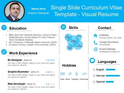
Single slide curriculum vitae template visual resume with all 6 slides:
Display erudition of a high class. with our Single Slide Curriculum Vitae Template Visual Resume. Get acclaimed for your intelligence.

FAQs for Single slide curriculum vitae
Okay so for a solid visual resume, you need the basics - contact info, summary, experience, skills, education. Don't go nuts with fonts (two max, seriously). White space is your friend so it doesn't look cluttered. I'd throw in some color or icons to make it flow better visually. Your name should be the biggest thing at the top, then make section headers smaller but still prominent. Honestly, recruiters barely glance at these things for like 6 seconds initially. So keep everything scannable. Oh and definitely print it out to test - sometimes what looks good on screen is terrible on paper.
Dude, colors totally help you stand out from those boring black-and-white resumes everyone else sends. Your brain processes color way faster than text, so why not use that? Blues work great for finance stuff since they scream "trustworthy," while creative fields let you go wilder with your palette. The trick is creating visual hierarchy - recruiters will look at your important stuff first if you guide their eyes with color. Oh, and don't go crazy with it. Stick to maybe 2-3 colors max or you'll look like a kid's art project.
Your resume's typography can make or break first impressions. Make your name bold and bigger so it jumps out immediately. For everything else, keep fonts clean and scannable - hiring managers literally spend like 10 seconds skimming these things. I'd stick with maybe 2-3 font families tops. Way too many people pick these elaborate fonts that look "creative" but are actually a nightmare to read quickly. Play with different weights and sizes instead of mixing random typefaces. Short version: good typography creates a clear hierarchy so the important stuff gets noticed first.
Honestly, infographics are a game-changer for making your resume actually interesting. Instead of those dull bullet points, you can show skill levels with charts or map out your career with timelines. I've seen some pretty cool ones using pie charts for how you spend your time or bar graphs for project wins. Way better than just listing stuff, right? Don't go overboard though - pick maybe 2-3 key things to highlight visually. Oh, and definitely start with your best skills since those'll look most impressive as graphics. Makes such a difference.
So basically, traditional resumes are just your standard text format everyone knows. Visual ones? They're like infographics for your work history - lots of graphics, charts, fancy layouts, the whole deal. Perfect if you're trying to show off design skills or work in creative stuff like marketing. Only thing is, those HR computer systems hate them and can't read the fancy formatting properly. Honestly, I'd stick with traditional for most jobs since they always get through the system fine. But if you're going for something creative, maybe do both? Use the visual one as like a portfolio piece.
Honestly, it depends on where you're applying. Creative fields like graphic design? Go nuts with colors and cool layouts - that's literally showing off your skills. But finance or law firms will probably think you're weird if you send something too flashy. I'd stick with clean fonts and subtle colors for those stuffy corporate places. Quick tip though - stalk their website and LinkedIn first to see what vibe they're going for. You want to stand out from all those boring Word doc resumes, but not in a way that makes them think you don't get their culture.
Honestly, start with Canva - their templates don't suck and it's ridiculously easy to use. If you're already decent with design stuff, Adobe InDesign gives you way more control, but it's probably overkill unless you're going for something really specific. Figma's solid too and won't cost you anything. Oh, and PowerPoint actually works better than you'd think now (their templates got way better recently). Just make sure whatever you use spits out a clean PDF. Also test how it looks printed in regular black and white - you'd be surprised how many people forget that part.
Dude, visual resumes are perfect for this! Throw in some icons next to your achievements and maybe use progress bars for skills - way better than boring bullet points. Star ratings work great too. I've seen people do infographic-style blocks for major accomplishments that look pretty slick. Color coding helps separate academic stuff from work awards. Oh, and those little badge things are clutch for categorizing different types of achievements. Just don't go crazy with the graphics though - you'll end up looking like a kindergarten art project instead of landing the job.
Honestly? Visual resumes usually backfire. Those fancy layouts mess with ATS systems - your resume gets rejected before anyone even sees it. Hiring managers often think you're compensating for weak experience with flashy design, which isn't great. Conservative fields hate them anyway. Here's the thing though - if your design skills suck (and most people's do), it'll look super amateur. I'd skip the creativity unless you're applying for design jobs specifically. Save that energy for your portfolio instead and just go with clean, simple formatting. Way safer bet.
Dude, white space is everything on resumes. Seriously. Without it, your resume looks like someone threw up text all over the page and nobody wants to read that nightmare. Give each section some breathing room so hiring managers can actually scan it without getting a headache. Honestly, I've watched people stuff every inch with text thinking more = better, but it backfires hard. Leave decent margins, space out your sections, and don't panic about "empty" spots - they're doing the heavy lifting by making your good stuff pop. The clean look guides where people's eyes go first.
Honestly, check out Behance and Dribbble first - designers there crush it with infographic resumes that look amazing but aren't impossible to read. You'll see cool stuff like career timelines and those little icon skill ratings. Pinterest is solid too if you search "infographic resume." The smart ones still stick to normal resume structure, just make it visual. Bar charts for showing sales numbers or whatever always look slick. Oh, and don't go crazy with colors - I've seen some that hurt your eyes. The whole point is standing out without making HR squint at your accomplishments.
Start with vector graphics and scalable fonts - trust me on this one. Your resume needs to look sharp whether someone's printing it or scrolling through on their phone. Most decent templates come in different formats now (PDF for printing, HTML for online stuff). Keep your main design consistent but tweak font sizes and spacing so it's actually readable everywhere. Colors are weird though - they always look different printed vs on screen, so definitely print a test copy first. I learned that the hard way once when my "navy blue" came out looking like purple nonsense.
Multimedia stuff can definitely help your resume stand out - like videos or interactive charts that actually show your work instead of just talking about it. But honestly, don't go crazy with animations and effects. I've seen resumes that look like slot machines and it's just... no. You want people focusing on your skills, not getting distracted by bouncing graphics. Videos and portfolio samples work great if they're relevant to the job. Oh, and test everything on your phone first - half the time these fancy elements don't even load properly on mobile, which would suck if that's how they're viewing it.
Honestly, just don't go overboard with the fancy stuff. Pick maybe 2-3 fonts that people can actually read, and make sure there's good contrast so the text pops off the page. I've seen resumes that look like someone threw up rainbow colors everywhere - total nightmare to read! Keep your spacing consistent and use white space so it doesn't feel cramped. The most important thing? Your best info should jump out first. Have a friend do the 30-second test - if they can't spot your key skills that fast, you've probably gotten too artsy with it.
Honestly, just keep everything super basic. Arial or Calibri fonts work best - don't get fancy with it. Black text, white background, that's it. Those colorful visual resumes look cool but they totally mess with ATS systems. Use clear headers like "Experience" and "Education." Here's the thing though - avoid text boxes or columns since the software reads left to right. I always tell people to paste their resume into Notepad as a test. If it looks readable there, you're good to go. Oh, and save both PDF and Word versions just in case!
-
best self introduction ppt!
-
helpful
-
helpful
-
Excellent site.
-
Graphics are very appealing to eyes.
-
Great experience, I would definitely use your services further.