


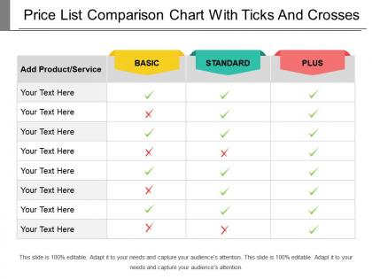
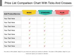
Price list comparison chart with ticks and crosses





Try Before you Buy Download Free Sample Product
 Impress Your
 Audience
 100%
100% Editable
 Save Hours
 of Time


Examine inner details with our Price List Comparison Chart With Ticks And Crosses. Carefully investigate every aspect.
People who downloaded this PowerPoint presentation also viewed the following :
Price list comparison chart with ticks and crosses with all 5 slides:
Handle deficiencies with our Price List Comparison Chart With Ticks And Crosses. Initiate action to acquire desired assets.
FAQs for Price list comparison chart with
Start with the basics - prices, product names, main features. But don't forget the sneaky stuff like shipping costs or monthly fees that'll bite you later. I made that mistake once with a "cheap" software that had crazy subscription costs! Reviews and ratings help too, plus warranty details if you can find them. Honestly, delivery times matter more than people think. Just don't go overboard - maybe 3-4 key points or you'll get decision paralysis. Oh, and date everything since prices flip around constantly. Make sure you're actually comparing similar things too.
Honestly, color coding is a game changer - I always use green for the cheapest stuff. Icons work way better than writing everything out, and bar charts let people see price gaps instantly without having to think too hard. Don't cram everything together either; white space actually helps a ton. Oh, and make sure it's super obvious - like, your brain-dead coworker should spot the best deal in seconds. Sometimes I'll throw in little symbols or highlighting just to make the winners pop more.
Put your product names first, then price - that's what people look at anyway. Group similar stuff together instead of randomly throwing features around. Trust me, I made a total disaster chart last month doing it wrong! Keep everything consistent across products - like if you show monthly costs for one, do it for all of them. Colors help but don't go crazy with them, maybe just highlight the good deals. Oh and definitely have someone else look at it first. What seems obvious to you might be completely confusing to them.
Look at what your customers are actually shopping around for - not just what you think makes sense. Check your sales calls or ask your team what people mention as alternatives. Google your main keywords too; that stuff probably shows up in their research. Pick competitors in your actual price range with similar features. No point throwing Amazon in there if you're a small startup, you know? 3-5 realistic options work best. Someone should be able to look at your chart and think "yeah, I'd consider all of these." Otherwise you're just wasting their time with comparisons that don't matter.
Honestly, I'd just start with Excel or Google Sheets - they're boring but they work. If your data gets messy or you want fancy interactive stuff, Tableau and Power BI are solid choices. Canva's pretty good too if you suck at design like I do and need something that looks decent fast. ChartJS works great for web stuff, though sometimes a basic HTML table does the job just fine. Really depends who's gonna see it and how much you'll be updating things. My advice? Pick whatever you already know how to use, then switch later if you need more features.
Dude, color coding is a game changer for price charts. Green for good deals, red for stuff that's way overpriced, yellow for meh options - basically your eyes do the work instead of your brain having to crunch numbers constantly. People can spot the patterns instantly without reading every single price. Just stick with three colors tops at first (I always end up going overboard with like 7 different shades and it looks ridiculous). Keep it simple and consistent across the whole thing. Trust me, it's like giving your users superpowers for finding deals.
Honestly, the worst thing you can do is cram everything onto one chart - people's eyes just glaze over. Keep it to your top 3-5 competitors, seriously. Make sure you're actually comparing the same stuff too (I've seen people mix monthly vs annual pricing and it's a mess). Colors should be obvious, fonts big enough to read without squinting. Oh, and always slap a date on there since prices change all the time. Don't overthink the design - clean beats fancy every time.
Look, I always use price comparison charts for big purchases - like $200+. Those small percentage differences actually matter when you're buying electronics or appliances. Subscription services are huge too since monthly fees add up fast (learned that the hard way with streaming services lol). If something has tons of features or weird pricing tiers, charts save you from doing math in your head. Basically, anytime you'd actually feel the savings in your budget, it's worth the 5 minutes to compare. Why leave money on the table?
Ugh, dynamic pricing is such a pain for comparison charts. Prices flip constantly - demand shifts, inventory changes, competitors adjust their rates. You'll pull data at 9am showing Product A cheaper than B, then by lunch they've completely switched positions. It's like chasing your tail honestly. Best bet is refreshing your data every hour if you can swing it. Always timestamp everything so people know how current your info actually is. Without that, you're basically showing them last week's gas prices and calling it helpful.
Honestly, reviews are what make price comparison charts actually worth looking at. You'll see Product A for $50 and Product B for $80, but without reviews you're just guessing. The cheaper one might be total crap or the expensive one could be overpriced junk. Reviews tell you about real stuff - does it break after a month, is their customer service awful, are there surprise fees? I learned this the hard way buying the cheapest phone charger once (spoiler: it died in two weeks). When you're comparing, don't just look at price. Factor in review scores too so you can find that sweet spot between decent quality and good value.
Price comparison charts are solid for showing why your product's worth it. If you're more expensive, highlight those extra features that justify the cost. Cheapest option? Flaunt it. I'll be honest though - some companies totally game these things by picking weird competitors or cherry-picking features that make them look amazing. When you're transparent about it, they work great on landing pages and sales stuff. Just keep your pricing updated because customers will definitely check, and nothing's worse than getting caught with old data that makes you look sloppy.
Honestly, I'd start with basic engagement stuff - how long people actually look at the chart and if they bounce right after. A/B test your current page against the new chart to see what converts better. The cool part is tracking which price points grab attention most. Surveys help too, but the real question is whether people use it to decide or just scroll past. Click-through rates matter obviously. Oh and conversion rates before/after - that's your money metric right there. User testing sessions can be super revealing if you have time for those.
Honestly, I'd do it weekly at minimum - daily if you're dealing with stuff that changes fast. Learned this lesson when a competitor slashed prices 20% and we missed it for two weeks (ouch). Most B2B services can get away with weekly updates. Consumer goods though? That's a different story - you need daily tracking there. Set up alerts if you can so you catch big shifts right away. The whole point is keeping your chart current enough that people actually use it for decisions instead of it just sitting there looking pretty in presentations.
Dude, first thing - double check your price data is spot on and current. Wrong prices = false advertising lawsuits, which nobody wants. Also, make sure you're allowed to use competitor pricing, especially if it's not public info. Companies can get really weird about that stuff. Don't claim "lowest prices" unless you can actually prove it. I'd add disclaimers about when you last updated everything and that prices change. Oh, and screenshot your sources! Update regularly too. Better safe than sorry with this kind of thing.
Your price comparison chart needs to work on phones or people will just give up. Make columns stack vertically instead of side-by-side. Buttons should be big enough that you don't accidentally tap the wrong thing - honestly, some sites are terrible at this. Text has to be readable without zooming in, and the whole thing should load fast even on crappy mobile data. Oh, and make sure screen readers can handle it too. Test it on a few different phones first. You'll probably find weird issues you didn't expect, like buttons being too close together or text getting cut off.
-
Informative design.
-
Nice and innovative design.