


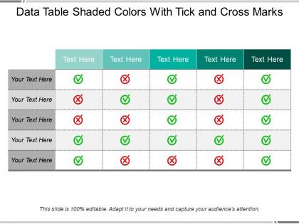
Data table shaded colors with tick and cross marks




Try Before you Buy Download Free Sample Product
 Impress Your
 Audience
 100%
100% Editable
 Save Hours
 of Time


Get the audience behind you with our Data Table Shaded Colors With Tick And Cross Marks. They will be eager to follow in your footsteps.
People who downloaded this PowerPoint presentation also viewed the following :
Data table shaded colors with tick and cross marks with all 5 slides:
Our Data Table Shaded Colors With Tick And Cross Marks give you a competitive edge. They assure you greater choice.
FAQs for Data table shaded colors with tick
Honestly, most dashboards I see are just way too cluttered. Start simple—bar charts, line graphs, nothing fancy. Your audience shouldn't have to squint and wonder what they're looking at, you know? Ditch the 3D effects and random colors that don't mean anything. I'm kind of obsessed with the "test it on a coworker" rule—if they look confused, you've got more work to do. Label stuff clearly and pick chart types that actually match your data. Sometimes the prettiest visualization completely misses the point. Focus on telling your story fast.
Honestly, your color choices can totally mess with how people interpret your data. Like, if you use red for something positive, everyone's brain immediately thinks "danger" or "bad news" - it's just how we're wired. Green feels good, red feels alarming. Sequential colors work well for showing progression (think light blue to dark blue), but those rainbow charts? Sure, they're pretty, but they don't make logical sense for data. Oh, and don't forget about colorblind folks - that's like 8% of guys who can't tell red from green. I'd stick with colorblind-friendly palettes and just ask yourself: what story does this actually tell someone seeing it for the first time?
Dude, storytelling is what makes data viz actually work. Without it, you're just showing people a bunch of charts that'll put them to sleep. Think about it - you need to walk your audience through what's happening, like "here's the problem, here's what we found, here's why you should care." The whole point is helping people see the "so what" moment. Anyone can dump numbers into Excel, but when you build a real narrative around your data, people actually get it. Oh and honestly? Most people won't remember your fancy charts, but they'll remember a good story. Start with your main point and make everything else support that.
Honestly, your chart choice totally changes how people read your data. Bar charts make everything feel super precise and definitive. Line charts are great for showing trends over time. But pie charts? Ugh, they're so overused - anything more than 3-4 slices gets messy fast. Area charts can be tricky too since all that filled space makes tiny differences look huge. Match your chart to what you're actually trying to show. Growth over time? Go with lines. Comparing different values? Bars work best. Just make sure to get a second pair of eyes on it before you share it.
So Tableau and Power BI are the big ones everyone's using for business dashboards right now. Python's got great libraries - Matplotlib and Seaborn are solid choices. R with ggplot2 is perfect if you're heavy into stats work. Don't overlook Excel though, seriously - it's still amazing for quick charts when you need something fast. D3.js gives you complete control for web stuff but man, the learning curve is brutal. Plotly's way more beginner-friendly. If you're just getting started, try Tableau Public since it's free, or jump into Python's visualization tools. Really depends on your data and how much you want to code.
Honestly, interactive stuff is a game changer because people can dig into the data themselves rather than just staring at static charts. Filters and hover effects let them ask questions and get instant answers - way more engaging than passive consumption. Users stick around longer and actually remember what they learned. Oh, and they share interactive visualizations way more too. Don't go overboard though - keep interactions simple and useful, not just fancy for the sake of it. Tooltips and basic filtering are perfect starting points. You can get fancier later once people know how to use the basics.
Ugh, the worst thing is when people go crazy with 3D effects and rainbow colors - nobody can read that mess. Also, watch your y-axis! Starting it at some random number instead of zero is so misleading. I swear every corporate presentation does this. Match your chart type to what you're showing too - bars for comparing stuff, lines for trends. Oh, and here's the thing that'll save you: before making anything, figure out your one main point. If you can't explain it in a sentence, scrap it and start over.
Honestly, data viz is a game changer because your brain just picks up on visual stuff way faster than staring at spreadsheet rows. Heat maps and scatter plots make patterns pop out that you'd never catch otherwise - like finding correlations or weird outliers. It's kinda like the difference between reading a phone book versus looking at an actual map, you know? The relationships just become super obvious. I'd start with basic charts first (don't overthink it), then get fancy with more complex stuff once you figure out what's actually interesting in your data.
Honestly, the biggest thing is just not being misleading with your data. Don't cherry-pick date ranges or mess with scales to make your point look better. Chart types matter too - some can totally distort what's actually happening. Privacy's another big one, especially since people can sometimes be identified way easier than you'd expect from seemingly anonymous data. Think about whether your viz might reinforce harmful stereotypes or make certain groups look unfairly bad. I always ask myself: would I be cool with someone presenting my data this way? When you're unsure, just be transparent about your methods and add context.
Scale choice is huge - it literally controls what story your data tells. Truncate your y-axis or go logarithmic? You're manipulating how dramatic things look. I've watched people turn boring 2% growth into something that looks explosive just by starting their axis at 95% instead of zero. Crazy how that works. Stretch your time axis and suddenly choppy data looks smooth as butter. Before you finalize anything, ask yourself: would I feel tricked if someone showed me this chart cold? That's usually a good gut check for whether you're being honest about the actual magnitude of change.
Okay so data normalization is basically a lifesaver for making charts that don't lie to people. Without it, you're comparing apples to oranges - like trying to plot website visits (in thousands) against conversion rates (tiny percentages) on one chart. Disaster waiting to happen. It puts everything on the same scale so you can actually spot real patterns instead of getting fooled by wildly different number ranges. Plus it helps tame those crazy outliers that love to mess up your whole visualization. Trust me, I learned this the hard way after creating some truly confusing charts early on. Just normalize when you're mixing different data types and save yourself the headache.
Look, accessible design isn't just about colors - though high contrast palettes definitely help. Add patterns, shapes, or labels so people can distinguish data without relying on color alone. Make your text big enough to actually read (seems obvious but you'd be surprised). Alt text for screen readers is honestly a lifesaver. Don't overwhelm people with cluttered charts - nobody wants to decode a visual nightmare. Run your stuff through colorblind simulators and get fresh eyes on it. The goal? Give people different ways to understand what you're showing them.
Look at three things: how fast people get the main point, whether they're drawing the right conclusions, and if they actually complete whatever task you want them to do. I used to obsess over making my charts gorgeous (still guilty of this tbh), but the best visualization is just one people understand instantly. Test it with users, try A/B versions, or grab random coworkers. Here's my rule: if someone can't figure out your story within 10 seconds of looking at it, you've got more work to do.
So it really depends on who's gonna see your charts. Reports can handle way more detail - legends, annotations, all that stuff since people can actually sit and study them. But presentations? Keep it simple. Big fonts, high contrast, fewer data points. I made this gorgeous detailed dashboard once and literally nobody could read it during my presentation - so embarrassing. Oh, and build up complex charts piece by piece if you're presenting live. Trust me, test everything on the actual screen beforehand. Nothing worse than squinting at your own work.
Here's what I've learned: pick your battles with annotations. Only call out the stuff that actually matters - your biggest data points, weird spikes, anything that proves your main point. I hate when charts look like someone vomited text all over them! Keep it short and sweet. Position annotations right next to the data they're explaining. Oh, and definitely spell out any jargon your audience won't get. You want people's eyes drawn to the important stuff, not wandering around confused. Less is more here.
-
Understandable and informative presentation.
-
Great product with highly impressive and engaging designs.