Data table three rows and columns with icons on top
Try Before you Buy Download Free Sample Product
Audience
Editable
of Time
Counter attempts at diluting the focus with our Data Table Three Rows And Columns With Icons On Top. Identify any diversionary gimmicks.
People who downloaded this PowerPoint presentation also viewed the following :
Content of this Powerpoint Presentation
Description:
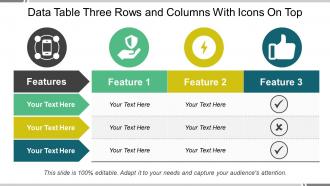
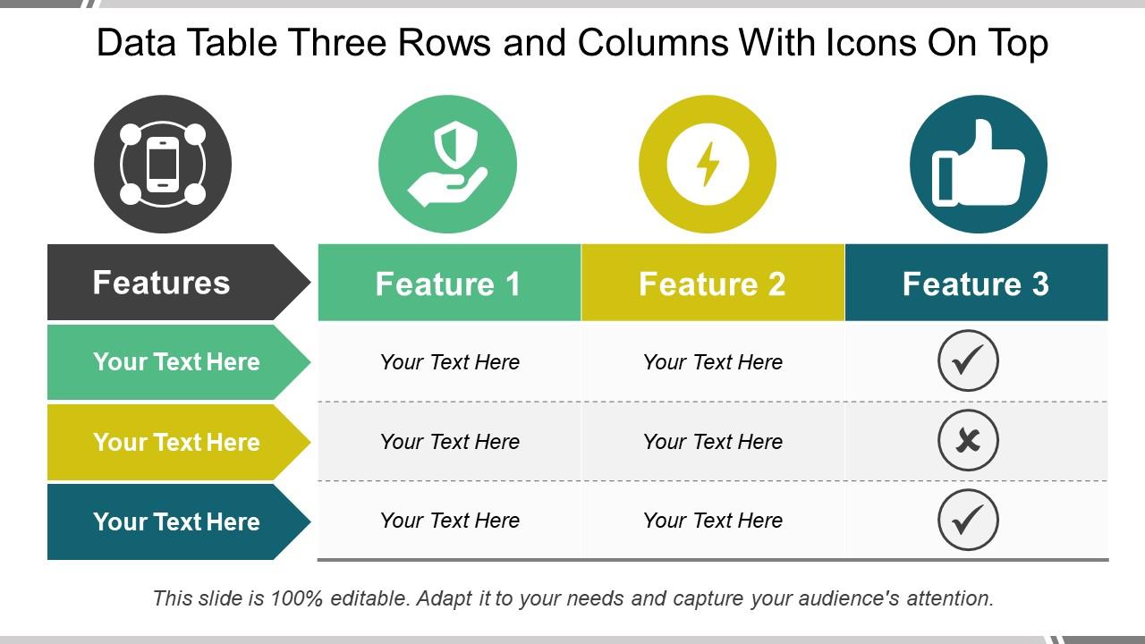
The image features a PowerPoint slide titled "Data Table Three Rows and Columns With Icons On Top," which is designed to compare three different features across a single category. The table is divided into three columns, each headed by an icon that symbolizes a particular feature. The first column has a mobile phone icon, the second a shield icon (potentially representing security), and the third a thumbs-up icon (perhaps indicating approval or a positive feature).
Each row under these icons has space for text, allowing the presenter to describe or list the specifics of each feature. The first row labeled "Features" is presumably for the titles of each feature. The subsequent rows have placeholder text "Your Text Here," indicating where detailed descriptions should be entered.
Use Cases:
This slide is versatile and can be applied across multiple industries:
1. Telecommunications:
Use: Comparing phone plan benefits.
Presenter: Marketing Manager.
Audience: Customers, Retail Partners.
2. Software Development:
Use: Showcasing software security features.
Presenter: Product Owner.
Audience: Clients, End-Users.
3. Consumer Electronics:
Use: Highlighting gadget specifications.
Presenter: Brand Representative.
Audience: Consumers, Tech Enthusiasts.
4. Healthcare:
Use: Detailing medical device features.
Presenter: Medical Sales Professional.
Audience: Healthcare Providers, Hospital Procurement Teams.
5. Automotive:
Use: Comparing vehicle safety features.
Presenter: Sales Executive.
Audience: Potential Buyers, Dealerships.
6. Education:
Use: Listing course or program attributes.
Presenter: Admissions Officer.
Audience: Prospective Students, Parents.
7. Financial Services:
Use: Outlining different investment product options.
Presenter: Financial Advisor.
Audience: Investors, Clients.
Data table three rows and columns with icons on top with all 5 slides:
Create foundations that stand firm with our Data Table Three Rows And Columns With Icons On Top. They cater for any disaster.
FAQs for Data table three rows and columns with
Honestly, less is more with icons. Only use them when they actually help - like green checkmarks for completed stuff or red X's for errors. Stick to symbols everyone knows instead of getting fancy with weird abstract ones. I learned this the hard way when I made a table that looked "creative" but nobody could figure out what anything meant lol. Size them consistently and line them up with your text properly. Oh, and definitely add tooltips since icons can be super ambiguous on their own. If you can, test it with someone else first - you'd be surprised what seems obvious to you but confuses others.
Icons work great for replacing repetitive stuff like status updates - green checkmarks for done, red X's for failed, that kind of thing. Priority levels with stars are solid too. Honestly, I've seen people go crazy with icons and it just becomes visual chaos. Stick to symbols your users already know. Short sentences mixed with longer ones that flow naturally make scanning way easier. Don't forget tooltips though - not everyone interprets icons the same way. Start by looking at what text shows up constantly in your tables and swap those out first.
Honestly, this stuff matters way more than people think. High contrast is everything - your icons need to pop against the background or users won't even see them. I'd stick with the classic red for errors, green for success thing since everyone gets that. But here's what trips people up: colorblind users can't tell red from green apart, so you need backup indicators too. Keep your color palette small or it gets chaotic fast. Oh, and definitely check how tiny icons look before you commit - what works big sometimes turns into mush when it's small.
Icons are total lifesavers for scanning data quickly - you'll spot patterns instantly instead of reading every single cell. Use different colors and shapes for categories: green checkmarks for complete tasks, red X's for failures, that kind of thing. Dense tables become way less overwhelming. Just keep your system consistent so people aren't scratching their heads wondering what some random purple triangle means. Start with symbols everyone already knows, then add your own from there. Honestly, once you get the hang of it, going back to text-only feels pretty brutal.
**Figma** or **Sketch** are solid for mockups - their icon libraries are pretty sweet and you can make reusable components. **Notion** and **Airtable** are my go-to for functional tables though, since you literally just click to add icons. Google Sheets works too if you're lazy like me and just copy-paste emojis (don't judge). If you're coding it yourself, grab **Feather Icons** or **Heroicons** - they look clean and won't make your eyes bleed. What are you actually building though? There's a big difference between prototyping something vs needing it to work for real users.
Honestly? Skip them when your table's already packed with info. Icons just become visual clutter, especially with financial data or complex analytics - like, nobody needs a little graph symbol next to actual graphs, you know? Also ditch them if they're not obvious. I've seen too many tables where you're spending more time figuring out what the weird symbols mean than actually reading the data. Super annoying. Better to nail the basics instead. Good spacing, clear fonts, group related stuff together. Way more helpful than throwing random icons everywhere.
Add proper alt text to your icons - instead of "red exclamation mark," use something like "high priority." ARIA labels help too, plus aria-describedby attributes linking icons to their data cells. God, I've seen so many tables where icons are just meaningless to screen readers! You can totally fix this though. Maybe throw a legend at the top explaining what each icon means? Always give text alternatives. Your screen reader users will actually be able to use your table, and honestly it'll be clearer for everyone else too.
Dude, definitely go with vector icons for your presentation. They'll stay sharp no matter how big you make them - super important when you're projecting onto those massive screens. Raster ones? They get pixelated and honestly just look bad. Vector files are smaller too, so your slides won't be sluggish. Oh and you can change the colors easily to match your brand stuff. I learned this the hard way after using some crappy raster icons in front of a client once. Trust me, vectors will make everything look way more polished.
Oh man, icons get tricky with cultural stuff. Red doesn't mean "bad" everywhere, and I've seen people totally confused by mailbox icons that only make sense in certain countries. Even arrows can throw people off depending on how they're used to reading text. Honestly? Test with different user groups if you can swing it. Otherwise stick to the super obvious symbols everyone recognizes. I always throw text labels next to icons anyway - seems redundant but it saves so much confusion later. Way better than having users guess what your clever little graphics mean.
Focus on task completion time and error rates first - those tell you everything. Watch if people instantly get what your icons mean without needing tooltips. That's honestly the best test. I'd also run user surveys to measure cognitive load, maybe A/B test icon tables vs text-only versions. Track click-through rates on interactive icons too. But real talk? Just sit behind someone using your table for 5 minutes. You'll catch the confusion right away - way better than any fancy metric. Start there, then add specific KPIs based on whatever your icons actually do.
Honestly, little animations and interactive stuff make such a difference in data tables. When users hover over rows or click buttons, those subtle visual cues just feel way more responsive - like the table's actually paying attention to them. Loading spinners, color changes on icons, smooth transitions when sorting... it all adds up. Without animations, tables just jump around weirdly when you filter stuff and people get lost. I'd start simple though - just add hover effects on your action buttons and highlight rows when people mouse over them. Trust me, users will actually want to dig into your data instead of bouncing immediately.
Oh god, don't skip the legends! I see people do this constantly and everyone just sits there confused. Size and style should match too - nothing worse than random tiny icons next to giant ones. Honestly, that lightbulb = insights thing? Half your audience won't get it. I'd stick to maybe 3-4 different icons max or it gets messy fast. Color-only coding is risky since some folks are colorblind. Even if you think your icons are super obvious, throw a legend somewhere visible anyway.
Make your icons at least 24px - anything smaller is just annoying to tap. I'd go with card layouts instead of traditional rows, puts the icon right at the top where people expect it. Icon-first design is key here. You can do horizontal scrolling for complex stuff, just keep that main icon column sticky so it doesn't disappear. Oh and definitely stack or hide the less important columns on smaller screens using breakpoints. Honestly though, test it with real data first - you'll spot the problems way faster than guessing what might break.
GitHub's PR tables are perfect for this - those little colored dots tell you way more at a glance than reading "merged" or "pending" over and over. Shopify does it well too with their order status icons. Gmail's star system kinda counts here (though that's maybe a stretch). The trick is keeping icons consistent so people actually know what they mean. I'd honestly just look at your current tables first - anywhere you're writing the same few status words repeatedly, that's where icons make the biggest difference. Way cleaner than walls of text.
Dude, just test your icons with real users - seriously. Watch them click around your data tables and ask what each icon means. Half the time what makes perfect sense to you will totally confuse everyone else. I once saw a team argue about a "filter" icon for literally three weeks when they could've just asked five people and been done with it. Look for hesitation, wrong clicks, squinting at tiny icons. Quick feedback sessions beat endless internal debates every time. Oh, and check if they can actually see the things - contrast matters way more than you'd think.
-
Great designs, really helpful.
-
Colors used are bright and distinctive.