


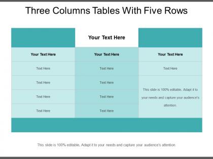
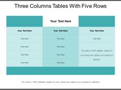
Three columns tables with five rows




Try Before you Buy Download Free Sample Product
 Impress Your
 Audience
 100%
100% Editable
 Save Hours
 of Time


Present the summary of data in an organized manner by using Three Columns Tables With Five Rows slideshow. You can group a particular data in a real-time. Use this pivot table PPT slideshow to showcase the average or total of data stored in a database. Discuss the advantages of using a table in business such as easy data analysis, an easy summary of data, quick report creation, etc. Summarize, sort and group data in an easy manner by using our readily available column table PPT visual. Keep track of budgeting and tracking trends of the company by taking the assistance of tables PPT template. Tables can create data in an instant way. Make full use of eye-catchy icons that are present in the slide to make your presentation much informative and attention-grabbing. As this PowerPoint layout is 100% customizable, you can add new data or edit the preloaded content according to the matter under consideration. Thus, compare information in fewer seconds by downloading this visually attention-grabbing rows and columns PPT Presentation.
People who downloaded this PowerPoint presentation also viewed the following :
Three columns tables with five rows with all 5 slides:
Become an insider with our Three Columns Tables With Five Rows. Get called for all important gatherings.

FAQs for Three columns tables
Make your headers super obvious - nobody wants to play guessing games with what they're looking at. Sort everything logically (size, alphabetical, whatever makes sense) and keep formatting consistent throughout. Most tables are honestly a hot mess with way too many borders and random colors. Simple gridlines work fine, maybe highlight totals if needed. Font needs to be big enough that someone in the back can actually read it. Oh and always put units in your headers! I've seen so many tables where you're like... are these dollars? Percentages? Who knows.
Honestly, color coding is a game changer for tables. Makes everything so much easier to read quickly. I like using green for good stuff, red for problem areas - you know, the obvious choices. But seriously, don't go overboard with tons of colors or it'll look like a kid's art project. Stick to maybe 2-3 colors max and be consistent with what each one means. Oh, and those alternating row colors? Total lifesaver when you're trying to read across columns without losing your place.
Okay so first thing - make your headers super clear and keep everything consistent (same units, decimal places, all that). Zebra striping is honestly a lifesaver for helping people follow rows across. Don't go crazy with columns though, keep it scannable. Left-align text, right-align numbers - basic but works. Your most important stuff needs to go in the leftmost columns since that's where everyone's eyes go first. Oh and don't forget white space! I see so many tables that are just wall-to-wall data and it's brutal. Step back when you're done - can you spot the key info right away? If not, keep tweaking.
Use tables when people need to hunt for specific numbers - like finding their team's budget or checking exact sales figures. Charts work better for showing trends and patterns quickly. I'm totally guilty of picking charts just because they look sexier, but tables are honestly more practical for detailed stuff. Got lots of categories with multiple data points? Table it is. If your audience needs to reference individual numbers, definitely go table route. But when you just want to tell the story behind the data? Chart wins. Quick test: ask yourself whether they need exact figures or just the big picture.
Don't cram everything into one massive table - nobody wants to decode that mess. Give your columns actual names instead of "Data 1" because you'll forget what it means in like two weeks. Right-align numbers, left-align text. Makes scanning way easier. Oh, and please don't go crazy with the highlighter colors - this isn't a kindergarten art project. Keep your formatting consistent throughout the whole thing. Always add a title or caption so people actually know what they're looking at. Trust me, your readers don't want to guess what your data means.
Honestly, tables are a lifesaver when you've got messy data that would look terrible in paragraph form. You know how financial reports make your eyes glaze over when they're just walls of text? Same info in a table and suddenly you can actually scan through it and spot patterns. The trick is keeping your column headers super clear - none of that jargon nonsense. Don't go overboard with too many columns either or people get overwhelmed. I always put the most crucial stuff first since that's what people will focus on anyway. Makes comparing numbers way easier than trying to dig through dense blocks of text.
Think of tables as your backup singers - they're not the main act, but they make your story way more convincing. I always drop them in right after making a big claim that needs proof. Like, don't just throw data at people randomly. First tell them what you're arguing, then BAM - here's the table that proves it. Nobody's gonna get pumped about spreadsheets (let's be real), but they do make you look like you actually know what you're talking about. The trick is framing them with something like "here's why this matters" so people aren't just staring at numbers wondering what the hell they're supposed to see.
Honestly, interactive tables are such a game changer. Instead of your audience zoning out at rows of numbers, they can actually click around and explore what matters to them. Add some hover effects or sortable columns - even basic sorting makes people feel way more engaged. I've been in too many presentations where someone just throws a data dump at you and expects you to care. When people can filter stuff themselves or dig into specifics, they actually pay attention. Plus they'll remember it better since they're actively involved. Start simple though - just sorting features will make a huge difference.
Honestly, tables are so much better when you're dealing with numbers. You can actually compare stuff across rows and columns instead of making people hunt through bullet points. Super annoying when you're trying to spot trends or whatever. Bullet points are fine for regular lists, but they're terrible for data - like, why would you do that to yourself? Tables just look more professional too, especially when you've got multiple categories. Oh and readers can scan them way faster without having to piece everything together in their head. Next time just go with a simple table format.
Honestly, less is more with tables in presentations. Keep it to 6 columns max and make your font huge - like 18pt minimum so people in the back can actually see. I've sat through way too many presentations where someone crams their entire spreadsheet onto one slide. Super annoying. Break complex stuff into multiple slides instead. Focus on the specific rows or columns you're talking about rather than showing everything at once. PowerPoint has decent table styles that'll make things look cleaner. Oh, and don't just throw up a table and expect people to figure it out - tell them exactly what they should be looking at.
Honestly, just use whatever your team's already on - Excel, Google Sheets, whatever. Fighting software is worse than having the "perfect" tool. If you want something fancier looking, Canva's pretty decent for visual stuff, though I always end up overthinking the colors. Notion and Airtable work well if you need more database-y features or lots of people collaborating. Adobe InDesign if you're feeling ambitious, but that's probably overkill unless you're doing something really formal. Clean fonts and decent spacing will make anything look professional. Don't stress too much about it.
Honestly, picking the right font for tables is huge. Too small and people just won't bother reading it - I learned this the hard way. Arial or Calibri work great, nothing smaller than 10-11pt though. Bold your headers for sure, but resist the urge to use like 5 different fonts in one table. Looks super amateur. I always stick with one font family and just play with bold vs regular to guide people through the data. Oh and here's a weird trick - back away from your screen when you're done. If you can still read it clearly, you're golden.
Ditch the boring rows and columns - that's where you start. Interactive stuff works great, like expandable sections or filters people can actually click on. Heat maps are money too, just color-code your cells and patterns pop right out. Sounds weird, but I've seen people lose their minds over those tiny sparkline charts inside table cells. Works every time. You can group things with collapsible headers or throw in mini-charts next to your numbers. Just pick one feature first though - don't go crazy and overwhelm everyone right off the bat.
Start with clean headers and consistent formatting - that's your base. Don't cram everything together like I used to (looked awful). White space is your friend. Only use 2-3 colors for highlights, and please make the font readable! Left-align text, right-align numbers. Zebra stripes work great for long tables. Here's the thing though - cut any columns that don't actually matter to your audience. Ruthless editing makes tables so much better. Oh, and test how it looks printed too, not just on screen.
Okay so three big things to nail down: proper header markup, clean structure, and good captions. Use `
-
Unique design & color.
-
I discovered this website through a google search, the services matched my needs perfectly and the pricing was very reasonable. I was thrilled with the product and the customer service. I will definitely use their slides again for my presentations and recommend them to other colleagues.