

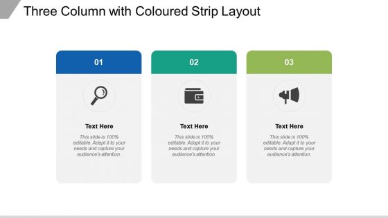
Three column with coloured strip layout





Try Before you Buy Download Free Sample Product
 Impress Your
 Audience
 100%
100% Editable
 Save Hours
 of Time


Get instantaneous approval with our Three Column With Coloured Strip Layout. Folks will immediately give the go ahead.
People who downloaded this PowerPoint presentation also viewed the following :
Three column with coloured strip layout with all 5 slides:
Folks immediately give the go ahead due to our Three Column With Coloured Strip Layout. You will get instantaneous approval.
FAQs for Three column with
Three-column layouts are honestly a game-changer for organizing messy info. Your brain already reads left to right, so it feels natural. Perfect for step-by-step processes or comparing different options without everything looking cluttered. Way better than those awful bullet point dumps that go on forever. The key thing is balancing your content across all three columns - I learned this the hard way when one of my presentations looked totally off-kilter. They're amazing for data comparisons and workflows. Just don't overthink it.
Okay so three columns basically save your readers from wanting to die when they look at your data. Big walls of text make people's brains just nope out immediately. With columns, you're giving their eyes natural places to rest and actually follow along. Put your most crucial stuff in the middle column - that's where people look first anyway. I've tried this on dashboards and honestly? Night and day difference in how people actually pay attention to what you're showing them. Way better than cramming everything into one overwhelming block. Your engagement will definitely go up once you start breaking things apart like this.
Three columns work great for dashboards or news sites where people need to juggle different info at once. Desktop's perfect for this - plenty of screen space. Mobile though? Total mess, so just stack everything vertically there. Each column needs its own job - maybe nav, main stuff, and extras on the side. I'd say test it with real people first because honestly, sometimes it just looks cluttered and confuses everyone. Works best when users are scanning around rather than reading straight through. Oh, and content-heavy platforms love this layout too.
Oh totally! Three columns work great because people's brains just process info better when it's not all smooshed together. Makes your slides look way more professional too – I learned this the hard way after giving a presentation with text blocks that looked like novels lol. You can do comparisons, processes, whatever. The eye movement flows better across three sections instead of jumping around randomly. Plus your audience won't zone out trying to decode walls of text. Honestly, once you start using it you'll wonder why you didn't before. Give it a shot!
Pick one column to be your main focus—usually the middle works best for content. Space them out with at least 20-30px gutters because nobody likes squished text. The content should flow left to right in a way that makes sense, you know? Short sentences work. Your reader's eye shouldn't jump around confused. Oh, and definitely check mobile first since three columns turn into a hot mess on phones. I always sketch out what's most important before getting into the pretty design stuff. That saves me from redesigning everything later.
Pick 2-3 colors max and use your boldest one for the main content column. The side columns should be more muted - maybe gray backgrounds or lighter tones. For fonts, stick with the same family but play around with sizes and weights. Your main headlines can be bigger than sidebar text, obviously. Here's the thing though - I see people go crazy with rainbow layouts and it just looks messy. Keep good contrast so people can actually read it. Oh, and try squinting at your layout when you're done. Sounds weird but it'll show you if your hierarchy actually works or not.
Dude, mobile-first is everything - skip this and your three columns turn into a hot mess on phones. Fixed widths will bite you too when someone zooms in or has a weird screen size. Content overflow is another headache, plus when your columns are different heights it just looks sloppy. Oh and floats? Don't even bother - the clearing issues alone aren't worth it (learned that the hard way). Flexbox or CSS Grid will save your sanity. They actually work how you'd expect them to and handle alignment without fighting you every step.
Content type totally makes or breaks three-column layouts. Your main stuff goes center, supporting bits on the sides - pretty standard. Dense text flows well in that middle column. Sidebars are perfect for nav, ads, whatever. But here's where people mess up - if your content doesn't naturally break into three chunks, you're screwed. You'll get weird empty gaps or everything crammed together. Honestly, I learned this the hard way on a project last year. Test with your actual content early, not dummy text. What looks balanced with lorem ipsum falls apart fast with real copy.
Honestly, just go with PowerPoint or Google Slides - they both have solid column tools built right in. PowerPoint's got better alignment stuff if you're picky about positioning. Google Slides is free though, and way easier if you're working with other people. Oh, and Canva's pretty cool if you want it to look really polished. Keynote works too if you're a Mac person. But seriously? Don't overthink it. Use whatever you already know how to use - I've seen amazing presentations made in basic PowerPoint and terrible ones made with fancy tools.
Look, cultural stuff really matters for three-column layouts. Western readers scan left to right, so put your main content there. But if you're targeting Arabic or Hebrew speakers? They'll look right first. Colors are tricky too - red screams "danger" here but means good luck in China. Some cultures actually like cramped, info-heavy designs while others need breathing room. I used to think this was all overrated until I saw a layout bomb because nobody considered reading patterns. Bottom line: do some basic research on your audience and test with real people from those cultures. Way better than guessing and looking clueless later.
Oh man, whitespace is everything in three-column layouts! Without enough breathing room between columns, your content just turns into this overwhelming blob. I usually start with like 20-30px between sections - gives readers a clear break so they can actually tell where one column ends and the next starts. Your eyes need somewhere to chill out too, you know? Dense text packed together is exhausting to read. I've definitely made this mistake before and had to go back and add more spacing. Just adjust based on how much content you're cramming in there and what vibe you're going for overall.
Honestly, charts look amazing when you stretch them across two columns - keeps one side free for captions or whatever. Full-width images can work but they're kinda intense sometimes, you know? I usually stick smaller visuals in the middle column and let text wrap around the sides. Oh, and definitely sketch out your big visual pieces first before adding text - learned that the hard way. The spacing thing matters too. Short answer: break up that text monotony by spreading your visuals around smartly.
Yeah, three columns on mobile is brutal - the text gets so squished nobody can read it. Stack them vertically instead, or just go single column. When you're converting, put your most important stuff at the top and work down from there. Collapsible sections work pretty well if you absolutely need all that info visible somehow. Oh, and watch out for tablet breakpoints - that's where things usually look janky during the transition. Honestly though? Start mobile-first next project. Way easier than trying to cram desktop layouts onto tiny screens after the fact.
Honestly, three-column layouts are literally everywhere once you notice them. Newspapers started it obviously, but restaurants do it too - appetizers, mains, desserts on menus. E-commerce sites love that product photo, description, reviews thing going on. Real estate websites are obsessed with the photos/details/financing combo. Healthcare sites usually go symptoms, treatment, resources which actually makes sense. Dating apps kinda do it with photos, bio, interests (ok maybe that's pushing it lol). But here's what's cool - try organizing stuff into past/present/future or problem/solution/outcome. Works great for presentations and you look way more put-together than you actually are.
Look, user feedback is everything when you're dealing with three-column layouts. People complain about finding stuff? Time to shuffle your content around. Your middle column gets the most eyeballs, so dump your main content there - whatever people actually click on. Sidebar complaints are gold though - tells you if your nav is helpful or just noise. Mobile feedback gets tricky since three columns turn into a hot mess on phones. Honestly, heatmaps and user testing will show you exactly where people scroll and click way better than guessing.
No Reviews