


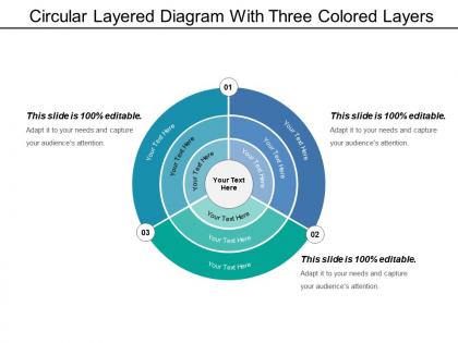
Circular layered diagram with three colored layers




Try Before you Buy Download Free Sample Product
 Impress Your
 Audience
 100%
100% Editable
 Save Hours
 of Time


Our Circular Layered Diagram With Three Colored Layers ensure gleeful faces. Everyone will have a happy experience.
People who downloaded this PowerPoint presentation also viewed the following :
Circular layered diagram with three colored layers with all 5 slides:
Exhibit your gems with our Circular Layered Diagram With Three Colored Layers. Their brilliance will be blinding.

FAQs for Circular layered diagram with
These diagrams are clutch for showing hierarchical stuff - org charts, file systems, anything with layers basically. Love using them for cyclical data too, like seasonal patterns or project lifecycles. They're way more interesting than boring tree charts, plus you can cram more info into less space. The circular thing really helps people see both the big picture and how each piece connects. Perfect when your audience needs to grasp the overall structure but also drill down into specifics. Honestly, they just make complex relationships easier to digest visually.
Dude, circular diagrams are honestly a game-changer for messy data. Your eye naturally moves from center to outside, so you get the whole picture without your brain short-circuiting. Way better than those awful bullet lists everyone loves. I actually started using them for work stuff and it's wild how much clearer everything becomes - processes, team structures, whatever. You can throw some colors on each ring too which helps a ton. Seriously, next time you're staring at confusing info, just sketch it in circles first. Sounds weird but it works.
So for circular diagrams, put your main stuff in the center first. Then add layers going outward by importance - like an onion basically. Use colors that actually contrast so people can tell the layers apart (I swear some designers forget this exists). Space everything proportionally and keep your text readable. Position labels the same way around each ring or it'll look messy. Honestly, the real test is showing it to someone else. If they squint and look confused, you probably need to simplify. I've made this mistake before - getting too fancy ruins the whole point.
Color choice will totally make or break your circular diagrams. Make sure each layer has enough contrast so people can actually tell them apart - I once used similar blues and it was a disaster! Sequential schemes work well for showing progression, but go with categorical palettes when you've got distinct groups. Oh, and definitely check if it's colorblind-friendly using something like ColorBrewer. Start with your most important layer first. Give that one the boldest color, then work outward from there.
For circular layered stuff, I'd probably go with Draw.io first - it's free and has tons of templates. Lucidchart is solid too but costs money. Canva's great if you want it to look pretty rather than super technical. PowerPoint's SmartArt can work in a pinch, though honestly it gets annoying fast if you need anything complex. Oh, and Figma's worth considering if you're already using it for other projects. I always forget how decent PowerPoint can be until I actually need something quick. Start with Draw.io though - worst case you switch later.
Honestly, I'd go with circular diagrams when you've got that nested data situation - like org charts or budgets with subcategories within subcategories. Bar charts are solid for basic comparisons, but they can't handle that layered complexity very well. The circular thing actually makes sense because your eye naturally follows from outside to inside, which matches how the hierarchy flows. I think you need at least 3 levels deep to make it worth it though. Otherwise you're just overcomplicating a simple chart. Oh, and double-check that your text doesn't get too tiny to read!
Oh, circular layered diagrams are game-changers for marketing stuff! Start with your core brand message in the middle, then build outward with audience segments and channels in the outer rings. They're amazing for mapping customer journeys too - way better than boring bullet points that make everyone's eyes glaze over. Your stakeholders will get how everything connects without you having to explain every detail. Perfect for showing hierarchy or how campaign pieces work together. Just don't go crazy with too many layers or it gets messy. Stick to 3-4 max and you're golden!
Oh man, don't cram too much text into each layer - I see people do this constantly and it's a mess. Make sure your center is big enough to actually read. Also? Pick colors that actually look different from each other. I made this mistake once and my boss literally couldn't tell the sections apart, super awkward. Put your most important stuff in the middle, then work your way out. Keep spacing consistent between rings or it'll look sloppy. And honestly, just show it to someone else before you finalize it - if they're confused, you need to simplify.
Start with your key labels on the right - that's where people look first, then go clockwise from there. Font sizes should match within each layer, but bump up the outer ones since those are your main categories. Honestly, most people totally overdo the text thing. Keep it short and snappy. For complicated stuff, throw in some numbers or icons with the words. Give your sections room to breathe too - cramped labels look awful. Oh, and here's something that actually works: show it to someone for like 5 seconds and see what sticks. That'll tell you everything.
Honestly, those circular diagrams are great for stuff that has clear layers - like org charts or how skills build on each other. Your main idea goes in the center, then each ring out gets more specific. I've been using them a lot lately for project breakdowns because they just *look* better than boring tree diagrams, you know? They work best when your outer sections naturally expand on what's inside. So if you've got data where things branch out from a core concept - taxonomies, product categories, whatever - this format will make those connections way more obvious than other layouts.
Dude, those circular diagrams are perfect for this! Start with just your main idea in the center, then add each ring as you go. It's like building suspense but with data - sounds nerdy but it actually works. Your audience follows along from simple to complicated instead of getting hit with everything at once. The whole "peeling layers" thing just clicks with people, you know? Way better than those boring bullet point slides everyone uses. Just animate each layer popping up as you explain it. Trust me, it'll keep them way more engaged than whatever you're doing now.
Oh yeah, tons of companies use these! Tech firms are always mapping out system architecture with them - like showing how the UI connects to databases and all the layers in between. Healthcare places do it for patient care workflows too. Consulting firms? They're totally obsessed (seriously, everything becomes a circle diagram with those guys). Manufacturing companies map their supply chains this way, and it actually makes sense since there's so many moving parts. Honestly, they're just way easier to follow than regular flowcharts when you're dealing with complex stuff. Worth trying next time you're presenting something messy!
Honestly, interactive circular diagrams are game-changers. People can actually click through layers instead of getting overwhelmed by everything at once. Hover effects work great - they highlight connections while dimming the irrelevant stuff. You can add clickable sections for detailed info or smooth animations that show data flowing outward. I've watched too many presentations where people just zone out staring at complicated circular charts (it's painful). But make it interactive? Suddenly they're exploring and actually getting it. Start simple with basic hover states, then maybe add drill-down features if your audience is into that sort of thing.
Honestly, circular diagrams just click better for layered stuff. You can see how everything connects back to the center without having some weird "start here" point. Linear formats stretch things out awkwardly - feels forced sometimes. Circles use space way smarter too since everything spreads outward naturally. Think target vs ladder, right? The target makes way more sense for certain data. Next time you're mapping something with layers, try the circle approach first. I bet you'll catch relationships you totally missed going linear. It's one of those things that seems obvious once you see it.
Colors matter way more than you'd think - red screams luck in China but spells trouble here. Check if your audience reads left-to-right or the opposite, then design your flow that way. Cultural symbols can backfire hard if you're not careful. I learned this the embarrassing way when my "perfectly designed" presentation bombed because of terrible color choices. Test it with someone local first if possible, or just play it safe with neutral stuff. Oh, and religious symbols? Research those beforehand or avoid entirely. Trust me on this one.
-
Amazing product with appealing content and design.
-
Very unique, user-friendly presentation interface.