

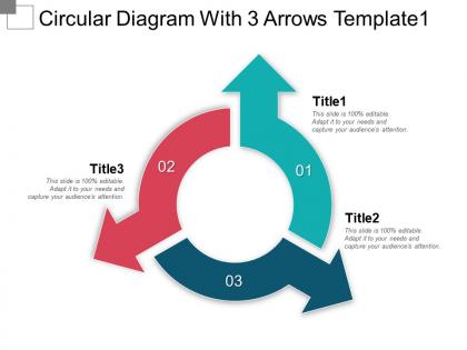
Circular diagram with 3 arrows template1 ppt sample




Try Before you Buy Download Free Sample Product
 Impress Your
 Audience
 100%
100% Editable
 Save Hours
 of Time


Deliver a quality presentation to your audience by using our Circular Diagram With 3 Arrows Template. Using the circular diagram template is a good way of presenting the information in a visual form. In such kind of templates, the data can be presented in a short and concise manner that is easy to understand. Presenting your information using these circular slides will make your information more effective and captivating. This will help you in narrating a proper step by step summary of certain processes in an organized manner. The best use of this kind of template is in those cases where to want to represent the continuing sequence of 3 tasks or stages. Where you want to depict some interconnected ideas, this slide of a circular diagram will help your audience understand the concept just at a glance. Use this to explain the workflows and other business activities. This diagram will assist you in illustrating planning and goal selection to the sales team and marketing team.
People who downloaded this PowerPoint presentation also viewed the following :
Circular diagram with 3 arrows template1 ppt sample with all 5 slides:
Give a compelling account with our Circular Diagram With 3 Arrows Template1 Ppt Sample. Everyone's eyes will be glued to you.
FAQs for Circular diagram with 3 arrows
Focus on three key things: clear hierarchy, balanced spacing, and logical flow. Your central element should be bigger and more distinct - that's your anchor. I made the mistake once of inconsistent spacing and it looked terrible, so keep gaps between segments uniform. Colors work great for grouping related stuff or showing progression. Most people read clockwise naturally, so go with that. Keep text short since curved text gets hard to read fast. Oh, and definitely test it with real content first - you'll catch sizing problems way earlier that way.
Dude, circular diagrams are a game changer. Your audience's eye just flows around them naturally instead of getting lost in boring bullet points. Perfect for showing processes that loop back on themselves or when you need to connect different pieces. I swear they make slides look so much cleaner too. People grasp the relationships between ideas way faster when you color-code the sections. Next time you've got 4-6 steps that link together, try one out. Way better than cramming everything into text blocks that nobody wants to read anyway.
Use circular diagrams for stuff that loops back - customer journeys, project cycles, budget pie charts. Your brain processes them way faster than linear formats when things are cyclical. They work great for 4-8 elements, but honestly get messy beyond that. Don't bother with them for timelines or comparisons though - bar charts are just better there. I always sketch my data both ways first to see what clicks. Sometimes what seems obvious in your head doesn't translate on paper. The circular format should make the connections feel natural, not forced.
Honestly, just go with Canva first - super easy and their templates don't suck. If you need something more complex with flowcharts and stuff, Lucidchart is solid, especially when you're working with other people. Adobe Illustrator is obviously the gold standard but it's way too much unless you're doing something really custom. Oh, and PowerPoint's SmartArt is actually not terrible if you're already using it anyway. I'd say start simple with Canva, then upgrade later if you need more bells and whistles.
Honestly, colors can totally make your diagram pop or flop. Reds and oranges are attention-grabbers - great for urgency. Blues and greens? More chill and trustworthy vibes. You'll want good contrast between sections so people don't have to squint (learned that the hard way). Here's the thing though - people unconsciously connect colors to feelings, so if you're showing a process, maybe use colors that flow logically together. Stick to 3-5 colors max. Oh, and definitely check how it looks for colorblind folks and on different screens before you call it done.
Honestly, short labels are your best friend here - like 2-4 words tops. Nobody wants to squint at a tiny pie slice trying to read a whole sentence. Pick either inside labels OR outside with those little lines, but don't mix both (looks super messy). Make sure your font's big enough that it'll still be readable if someone prints it out small. Oh, and if you've got tons of sections, try color-coding similar stuff together - it helps people see the bigger picture. I'd definitely show it to someone else first though. If they're confused about what each piece means, you'll know the labels need tweaking.
Circular diagrams are perfect for this! Put your related data sets around the circle's edge, then draw lines between them to show connections. What's cool is nothing looks more important than anything else - everything gets equal visual weight. Different colors or line thickness can show how strong relationships are. I'd start with whatever's most connected at the top and go clockwise from there. Some people try overlapping circles but honestly? That gets messy real quick. You'll probably want to play around with it a bit to see what clicks.
So with circular diagrams, you're basically fighting the fact that there's no obvious starting point like with regular layouts. What I do is put the main thing dead center or make it way bigger than everything else. Then the other stuff flows around it - smaller pieces for less important points. Size and color are your best friends here. Bold colors for key info, lighter ones for background stuff. The whole thing needs to feel balanced though, which honestly takes some trial and error. Oh, and don't forget people's eyes naturally want to follow a path, so make sure your supporting points connect logically even if they're arranged in a circle.
Oh, circular diagrams are actually great for this stuff! When you've got processes that loop back - like customer journeys or feedback cycles - they make way more sense than those straight-line flowcharts. I mean, most business processes aren't really linear anyway, right? You can spot where things get stuck and see how everything connects. Stakeholders get it immediately too, instead of thinking it's just a one-time thing. Honestly, I'd try sketching your process in a circle next time. You'll probably notice steps that repeat or connect in ways you hadn't thought about before.
Honestly, don't cram too much text into those pie charts - they get messy super quick. Make sure your segments actually match your data size-wise, otherwise it looks wonky. Colors should be consistent (colorblind people exist!). I've sat through way too many confusing presentations where this stuff was ignored. Labels or a legend are your friend. But here's the thing - half the time a boring bar chart would've worked better anyway. My boss loves circular diagrams but sometimes they're just... unnecessary? Run it by someone first to see if it makes sense.
Honestly, animations are a game-changer for circular diagrams. Instead of dumping everything on your audience at once, reveal segments one by one as you talk through them. Makes it feel more like a story, you know? I'd start with basic fade-ins - they're foolproof and look clean. Then maybe try gentle rotations to spotlight different sections. The trick is keeping things subtle though. Nobody wants flashy animations that distract from your actual content. Oh, and showing data "flowing" around the circle works really well for process diagrams. Trust me on that one.
Use circular diagrams when your data actually flows in a loop - like project workflows, customer journeys, or seasonal business cycles. They're perfect for showing how steps connect back to each other. Honestly, they make messy interconnected stuff way easier to follow than random bullet points. Product lifecycles work great too. Just don't force linear info into a circle though - I've seen people try that and it looks weird. Oh, and feedback loops are another good one. Basically if your process doesn't naturally circle back on itself, pick something else.
Honestly, user feedback is like striking gold when you're tweaking those circular diagram templates. People will straight-up tell you what's actually confusing vs what just looks pretty. They'll catch readability problems with certain colors, or point out where the flow makes zero sense - stuff you'd never notice yourself! I always set up quick feedback forms with each template. Sometimes I'll just grab a colleague and ask what's bugging them about it. The real trick is watching for patterns though. If three different people complain about the same thing, that's your answer right there. Oh, and don't overthink the feedback collection - surveys work, but honestly just asking "what sucks about this?" gets you surprisingly honest responses.
Okay so pie charts are basically for when your data adds up to 100% - like budget breakdowns or survey results. Circular diagrams? Way more flexible. You can map out processes, show how ideas connect, whatever. I swear half the presentations I see use pie charts just because they want something round-looking lol. But if you've got actual percentages that need to total 100%, stick with pie charts - they're clearer for that stuff. Otherwise circular diagrams give you tons more room to be creative with layouts and connections.
Make sure your circles match the rest of your design - same colors, fonts, line thickness, you know? They're perfect as focal points with some text or icons around them. I swear some people just throw everything into circles for no reason though lol. Connect them to your other stuff using arrows or dotted lines. Works great with flowcharts and timelines. Don't treat circles like they're separate from everything else - they need to fit your whole visual flow. Honestly? Sketch it out first. You'll spot weird layouts way faster on paper.
-
Professional and unique presentations.
-
I discovered this website through a google search, the services matched my needs perfectly and the pricing was very reasonable. I was thrilled with the product and the customer service. I will definitely use their slides again for my presentations and recommend them to other colleagues.