


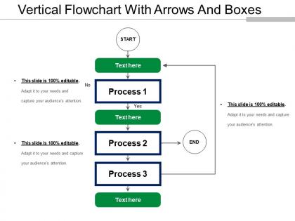
Vertical flowchart with arrows and boxes




Try Before you Buy Download Free Sample Product
 Impress Your
 Audience
 100%
100% Editable
 Save Hours
 of Time


Our Vertical Flowchart With Arrows And Boxes have the dexterity to get around hazards. They are hardly ever hassled by them.
People who downloaded this PowerPoint presentation also viewed the following :
Vertical flowchart with arrows and boxes with all 5 slides:
Our Vertical Flowchart With Arrows And Boxes have an invigorating effect. Folks feel a greater intensity of excitement.
FAQs for Vertical flowchart with
Honestly, vertical flowcharts just make way more sense. Your eyes naturally read top to bottom anyway, so why fight it? They fit better on most screens and pages too since everything's taller than it is wide. I've seen too many horizontal ones that turn into a hot mess - especially when you've got decision points everywhere. People's brains just shut off when they have to follow some crazy zigzag pattern across the page. Keep it simple and go vertical unless you're specifically trying to show stuff happening at the same time. Trust me on this one.
Honestly, vertical flowcharts are game-changers. They break down messy processes into steps that just make sense - top to bottom, like reading a book. Your brain doesn't have to work as hard following the logic. Those horizontal ones? Total nightmare - your eyes bounce everywhere trying to track what comes next. With vertical charts, spotting problems becomes way easier too. Bottlenecks jump out at you, redundant steps are obvious. I started doing all mine vertically last year and wow, what a difference. Give it a shot next time you're mapping something out.
Honestly, vertical flowcharts are clutch when you're walking people through step-by-step stuff. Everyone reads top-to-bottom naturally anyway, so it just clicks. Great for training sessions or when you're explaining complicated processes - keeps people from getting lost. They fit perfectly on slides too, which is nice because nobody wants to deal with weird zooming. I use them all the time for onboarding presentations. Actually saved my butt last week when I had to explain our new approval process to the team. Way clearer than trying to cram everything horizontally.
Start at the top and work your way down - that's the easiest approach. Use rectangles for regular steps, diamonds when there's a decision to make. Keep your text short but clear enough that someone else won't be lost. Honestly, I'm terrible at this part, but try to space everything evenly so it doesn't look like a mess. Stick to one main path unless you absolutely need to branch off. Here's what actually helps though: walk through it yourself first. If you're confused by your own flowchart, everyone else will be too.
Honestly, color coding is a game changer for flowcharts. People's eyes automatically follow the colors without getting lost in all those boxes and arrows. I usually go with red for problems, green for success stuff, blue for regular processes - you know, the basics. Different colors for each department works great too. Your brain just processes it faster when everything isn't the same boring gray. Plus it actually looks professional instead of like something from 1995. Trust me, people will follow along way better and remember what you showed them later.
Honestly, I'd just use Lucidchart or Draw.io - both are really intuitive and have solid templates. Visio's great if your company already pays for it, but it's kind of overkill for basic stuff. Miro works too, especially if you're already using it for other things. The auto-alignment features are clutch so your boxes don't look all crooked (learned that the hard way). Grab a template, throw in your brand colors, and you're good to go. Takes like 10 minutes max.
Honestly, just map out your steps from top to bottom - it's way clearer than those messy sideways ones. Put them where your team actually hangs out: stick 'em in Slack, your project tools, wherever people work. New hires love these things because they don't have to guess what comes next. Start with whatever process you do most often (probably something boring but necessary). They're great for catching those weird bottlenecks nobody talks about. I swear, once you get one working, you'll want to flowchart everything. Just don't go overboard at first.
Honestly, vertical flowcharts are clutch for keeping projects on track. Map out each phase top to bottom and you'll instantly see what has to happen before the next step kicks off. They're perfect when you need to walk stakeholders through timelines without losing them in the weeds. I've found they help catch bottlenecks way earlier than you'd expect. Plus everyone stays on the same page about sequencing, which... trust me, is harder than it sounds. Start with your major milestones first, then fill in details later. Way less overwhelming that way.
Curved arrows are your best friend here - they loop back from later steps to earlier ones. Make them stand out with dashed lines or different colors so they don't blend into your main flow. I like curving them way out to the sides, honestly looks cleaner that way. Label what actually triggers each loop or people get confused. The tricky part is connecting outputs back to inputs without making everything look like spaghetti. Definitely sketch it rough first - saved me so many headaches when I was doing process maps for work.
Ugh, people always cram way too much text into each box - drives me crazy! Keep it short and sweet. Also don't mix up your symbols, that's like flowchart 101. Diamonds = decisions, rectangles = processes, ovals for start/end. Super cluttered charts are the worst. Make sure everything flows top to bottom without random jumps everywhere. Oh and actually walk through it yourself first - I can't tell you how many times I've caught weird logic gaps that way. Consistent shapes throughout or you'll just confuse everyone who looks at it.
So basically, if your audience knows flowchart symbols already, they'll zip right through your chart without getting stuck on what stuff means. Diamonds = decisions, rectangles = processes, arrows show direction—pretty standard. But if they don't know this stuff? You'll either need a legend or just stick to the most obvious shapes. Honestly, I'd avoid getting weird with fancy symbols unless you're sure people will get it. The simpler you keep things, the more people can actually follow along. Maybe do a quick check beforehand about what your audience knows, then adjust how complex you make it.
Okay so first thing - break everything down into tiny steps, like one action per box. Write stuff like "Review document" not "Document review process is conducted" (honestly that second one makes me want to take a nap). Use rectangles for actions, diamonds for decisions - keeps it clean. Don't squish everything together either, give it room to breathe. I always color-code different departments because it actually helps people follow along. Oh, and here's the real test: show it to someone who knows nothing about the process. If they're lost, you gotta simplify more.
Honestly, vertical flowcharts are a game-changer for strategic planning. Start with your big goal at the top, then break it down step by step until you hit actual tasks. What I love about them is how they show all the connections - like, you can actually see where things might get stuck or fall apart. My old team used to struggle connecting our strategy to what we were doing day-to-day (super common problem btw). These flowcharts basically map your decision-making process so everyone gets how the big picture flows into the nitty-gritty work. You'll spot bottlenecks way easier too.
Honestly, short annotations are everything - just stick to action verbs like "Review" or "Send notification." Max 3-5 words that answer "what happens here?" I've watched so many people write these novel-length descriptions that nobody bothers reading anyway. Keep your formatting consistent throughout - same fonts, same caps style, all that stuff. For tricky decision points, throw some quick criteria underneath in smaller text. Trust me, you'll be glad you did this when you're presenting to your boss months later and actually remember what each box means. Short sentences work better than rambling ones.
Dude, flowcharts are seriously perfect for onboarding new people. Instead of handing someone a massive manual (which nobody reads anyway), you can show them exactly how things work step by step. Map out your approval process, customer service stuff, whatever - they'll actually understand the flow from beginning to end. People remember visual stuff way better than walls of text. I'd probably start with your most common processes and use them during training those first couple weeks. It's like giving them a roadmap instead of just throwing them into the deep end, you know?
-
Excellent Designs.
-
Best way of representation of the topic.