


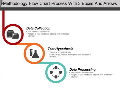
Methodology flow chart process with 3 boxes and arrows





Try Before you Buy Download Free Sample Product
 Impress Your
 Audience
 100%
100% Editable
 Save Hours
 of Time


Our Methodology Flow Chart Process With 3 Boxes And Arrows keep the graph climbing. They ensure a constant growth.
People who downloaded this PowerPoint presentation also viewed the following :
Methodology flow chart process with 3 boxes and arrows with all 5 slides:
Interpret the decree with our Methodology Flow Chart Process With 3 Boxes And Arrows. Explain the Court's directive in detail.
FAQs for Methodology flow chart process with 3
Start with your research question right at the top, then break down the major chunks - how you're collecting data, picking your sample, analysis methods, all that stuff. Those diamond decision points are super helpful when your methodology might go different directions. Honestly, timelines can be clutch if they matter for your process. Show how data moves between steps too. Someone should be able to trace your whole research journey just from the chart. If you're scratching your head reading your own flowchart, everyone else will be lost too. Keep it clean and logical.
Honestly, a methodology flowchart is a lifesaver for explaining your research process. Instead of writing paragraphs that put people to sleep, you get this visual map showing each step and how they connect. Super helpful when you hit decision points too - like should I go with interviews or surveys here? The chart makes those branching paths obvious. Plus (and this might sound weird) but making one actually helped me spot some gaps in my own logic. Your readers will thank you for it instead of trying to decode walls of text about your methods.
Manufacturing and healthcare are probably your best bets - they're obsessed with these things. Software dev teams use them constantly too, especially for deployment stuff. Basically anywhere one mistake costs serious money. Oh, and anything heavily regulated like pharma or finance - they document everything with flow charts to keep auditors happy. I'd honestly start with whatever process breaks most often at your company. New employee training becomes way easier once you map out the critical workflows. Financial services might be overkill unless you're dealing with compliance headaches.
Honestly, it's all about who you're talking to. New team members? Go nuts with details - every step, every decision. But executives? Just hit the big milestones and results. I always start way too detailed (can't help myself) then cut everything that doesn't actually matter. Like, would someone genuinely be lost without this step? Or am I just overthinking it again? Best trick is finding someone who's never seen the process before and walking them through it. You'll know pretty quickly if you've hit that sweet spot or if you're still drowning them in unnecessary stuff.
Stick to basic shapes - rectangles for steps, diamonds for decisions, circles for start/end. Use consistent colors but don't go crazy, maybe 3-4 max. Arrows should actually make sense and guide people through logically. Keep text short in each box and give everything room to breathe with whitespace. If you're dealing with different teams or departments, swimlanes work great. The real test? Someone should be able to squint at it and follow the main flow in like 10 seconds. I've seen way too many that look like a hot mess - you don't want that. Make it scannable first, pretty second.
Honestly, digital tools are a game changer for flowcharts compared to doing them by hand. I'd start with something simple like Google Drawings or Miro - they let you drag shapes around and the connecting lines move automatically when you update stuff. Lucidchart's pretty solid too if you want more features. The coolest part is real-time sharing with your team, so no more emailing versions back and forth (which was always a mess). Some tools even sync with project management apps, though I haven't tried that myself yet. Just pick something basic first and see what works for you.
Ugh, the worst thing you can do is make it super complicated right off the bat. I see people cramming every tiny detail in there and it just becomes a mess. Start simple! Also, you gotta add decision points for when stuff inevitably goes wrong - trust me on this one. Another thing that drives me crazy is when people write vague labels like "analyze data." What kind of analysis?? Be specific. Oh, and test it with someone else first because what makes sense in your head might be total gibberish to everyone else. Keep your symbols consistent too, otherwise it looks sloppy.
Ok so these flow charts are like having a map for your whole project - saves you from wandering around confused later. They help you catch problems early and figure out who's doing what. New people joining your team? Just show them the chart instead of explaining everything from scratch (trust me, this alone is worth it). When stuff goes wrong - which it always does - you can pinpoint exactly where things fell apart. My advice? Start basic with the big steps first. You can always add more detail once you get the hang of it.
Rectangles are your basic process steps, diamonds show decision points, and circles mark start/end spots. Colors usually mean something too - blue for inputs, green for processes, red for big decisions or stops. Honestly, some teams go nuts with rainbow charts that just make everything worse. Stick to whatever your organization uses consistently. Short sentences work better than long ones here. When you're making these charts, don't forget the legend - it's basically your cheat sheet. People should be able to scan the whole thing and get the workflow instantly without scratching their heads.
Get everyone together for a kickoff - virtual or in-person, doesn't matter. Sticky notes or a digital board work great since people can add their steps at the same time. Yeah, it'll look chaotic but that's totally fine! Have each person explain their part while others jump in with questions. Don't let anyone hog the conversation though - maybe switch who's running each section? I'd document everything live, then send it around for feedback before finalizing. Trust me, this beats trying to piece it together from separate conversations later.
Make your flow chart super clean - rectangles for steps, diamonds for decisions. Go top-to-bottom or left-to-right so people can actually follow it. I swear, some charts look like someone threw shapes at a wall! Colors help group stuff together, just don't make it look like a rainbow exploded. Add a legend if you're using weird symbols. Walk through it with someone first - seriously, this saves so much headache later. If they can't follow it, nobody will. Oh, and consistent labels matter way more than you'd think.
Oh totally, your methodology chart should change as you go - that's actually how you know you're doing it right. At the beginning you'll tweak stuff based on what you find or what people tell you. Then halfway through you might hit roadblocks or realize some parts need way more detail. I swear I've worked on projects where the final chart looked nothing like what we started with. Document your changes though (boring but necessary) because you'll need to explain the decisions later. Also version control is your friend here - trust me on this one.
Honestly, I'd start by figuring out where you already get feedback in your process. Then just add decision diamonds that loop back to earlier steps when people want changes. Super helpful to color-code those feedback paths - I usually go with red or orange so they actually stand out. Another trick is creating parallel feedback tracks that run alongside your main flow. Shows that review is happening throughout, not just dumped at the end. Oh, and place these after major deliverables where stakeholders would naturally want to weigh in anyway.
Honestly, flow charts are a lifesaver for onboarding. New people can actually see the process instead of drowning in boring documentation. I like walking them through each decision point and explaining why we do things that way - saves so much time later. They can reference the charts on their own too, which cuts down on all those "wait, what do I do next?" questions. During training, you can run through different scenarios and have them trace the paths. Start simple though - don't throw everything at them right away. Add the complex stuff once they've got the basics down.
So basically, a methodology flow chart maps out your *process* - like all the steps and "what if" scenarios you might hit. A timeline just shows *when* stuff needs to get done. I always do the flow chart first to figure out my approach, then build the timeline from there. The flow chart is super helpful when you're explaining your process to other people or if someone new joins the team. Timeline's more like your calendar with deadlines. Think of it this way - flow chart = your game plan, timeline = your schedule. Does that make sense?
-
Use of different colors is good. It's simple and attractive.
-
Nice and innovative design.