

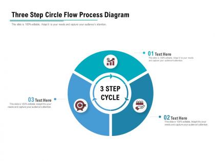
Three step circle flow process diagram




Try Before you Buy Download Free Sample Product
 Impress Your
 Audience
 100%
100% Editable
 Save Hours
 of Time


Our Three Step Circle Flow Process Diagram contain breathtaking designs. They are an aesthetic delight.
People who downloaded this PowerPoint presentation also viewed the following :
Three step circle flow process diagram with all 5 slides:
Our Three Step Circle Flow Process Diagram contain excellent graphics. Designed to enhance clarity of communication.

FAQs for Three step circle
So basically you need three main parts - input, processing, and output stages. They're all connected in this circular flow where the output loops back to feed into the input again. Honestly, every business consultant I've ever met is obsessed with drawing these diagrams. Make sure each step is clearly labeled so people know what's actually happening and what moves between stages. The whole point is showing that processes aren't just straight lines - they're interconnected. Just figure out what kicks off your process, what changes it, and what you end up with.
Honestly, those three-step circle diagrams are so much better than regular flowcharts. Your brain doesn't get overwhelmed trying to follow some crazy complex map. Each step connects naturally to the next one, and people actually pay attention instead of zoning out. Plus the circular thing makes sense - most business stuff repeats anyway, right? I was showing one to my boss last week and she got it immediately. Way clearer than those messy process docs we usually make. You should definitely try it next time you need to explain something complicated.
Use these when you've got processes that actually loop back to the start - like customer feedback cycles or product development stuff. They're way cleaner than trying to force everything into a straight line flowchart. Honestly, they make presentations look so much more polished. Just make sure the circular thing actually matters to your point, not because you happen to have three steps. I see people use them wrong all the time. They're great for strategy presentations or when you're explaining iterative workflows to your team.
Honestly, circle diagrams just click better because real processes aren't linear - they loop back on themselves. You can actually see how one stage feeds into the next, plus all those feedback loops that mess things up. Most stakeholders get confused by traditional flowcharts anyway. Your team will catch bottlenecks way faster since they can literally see where things get stuck in the cycle. I'd map out whatever process you're working on as a circle next time. You'll probably find connections you totally missed - I always do. Makes explaining cyclical stuff so much easier.
Honestly, most teams already have some version of plan-do-review happening anyway - you just gotta spot it. Look at your current workflow and see where it breaks into three chunks. Manufacturing might go "Design → Produce → Quality Check" while marketing could be "Research → Create → Analyze." Whatever works for your industry. The main thing is making sure step three actually leads back to step one, otherwise you're just doing a straight line instead of a circle. Oh and don't overthink it - if the steps flow logically, you're probably on the right track.
Hey! So for circle flow diagrams, I usually just go with Draw.io or Lucidchart - they're both pretty straightforward and have decent templates. PowerPoint works too if you don't want to learn something new (honestly sometimes the simple route is best). Canva's good if you care about making it look really nice, and Miro's cool for team stuff. I'd probably start with Draw.io since it's free - you can always switch later if it doesn't do what you need. Oh, and the three-step ones are way easier than the complicated multi-layer ones, so you should be fine with any of these.
So basically, instead of just going step 1 → 2 → 3 and calling it done, you're looping info from step 3 back to step 1. Makes the whole thing way smarter over time. It's like having a built-in reality check that catches problems before they get worse. Honestly, most people collect feedback but then... never actually use it? Don't be that person. Set up regular check-ins where you actually look at what's bombing and what's working. Short ones work fine. The difference it makes is pretty wild once you get into the habit of it.
Don't overcomplicate each step with tons of text - that's the biggest killer. Keep descriptions super short, like 5-7 words tops. Your arrows need to be crystal clear too, otherwise people get lost. I always go clockwise since it feels more natural to read that way. Here's something I learned the hard way - resist cramming mini-steps inside the circles. Seriously defeats the whole point. Test your flowchart on someone else before you're done. If they squint at it or ask questions about the sequence, you've gotta simplify more. Trust me on this one.
Get your stakeholders in a room from day one and have them map out those three steps together. Workshop style works best - let them draw stuff or move sticky notes around. People get way more invested when they're hands-on, trust me. Don't build the whole diagram first then ask what they think (learned that the hard way). Instead, make them help create it - have them figure out inputs, outputs, connections between steps. A 90-minute session usually does the trick. They'll actually understand it because they built it themselves, plus you'll catch things you'd miss on your own.
Honestly, visuals make circle processes so much easier to follow. People can actually *see* how each step connects instead of trying to picture it from bullet points. It's like having a map vs getting verbal directions - way less mental work. The circular format really drives home that it's not just step 1, 2, 3 and done. It keeps cycling back on itself. I swear, present it both ways next time and you'll see which one people actually get. Plus nobody wants to sit through another text-heavy slide anyway. The visual just clicks faster in people's brains.
So you sketch out your current process in three main chunks, then look for where stuff gets jammed up or duplicated. The circle thing is actually pretty clever - instead of thinking step-by-step, you map everything as one continuous loop. Makes you see how each phase connects and feeds back into the whole system. I was skeptical at first but it really does help spot bottlenecks way faster than other methods I've tried. You'll start noticing where work piles up between handoffs. The key is visualizing that flow rather than just listing tasks linearly.
Oh man, those three-step circle diagrams are everywhere once you start noticing them. Toyota basically built their whole thing around Plan-Do-Check cycles and crushed it. Software teams love them for development workflows too. Even hospitals use them for patient stuff - which is kinda wild but makes sense, right? The whole point is they make messy processes way easier to follow. Break everything into three parts, show how it loops back around. I swear it's like magic sometimes. Next time you're stuck on improving something at work, just sketch out those three circles first. Way better than diving into some crazy complicated framework that nobody actually uses.
Honestly, those three-step circle diagrams work so much better than those giant flowcharts that make everyone's eyes glaze over. New people can actually follow them! Walk them through each step and show where their role fits in the cycle. Visual learners especially love seeing how everything connects back together. I've noticed trainees keep them handy for quick reference later - way better than digging through some 50-page manual when they're confused. Breaking complex stuff into three chunks just makes sense for training. Shows the big picture without overwhelming anyone.
Oh totally, cultural stuff plays a huge role here. Western people usually start at the top and go clockwise, but that's not how everyone thinks. Some cultures go counterclockwise or pick totally different starting points based on their writing systems. Red means "stop" to us but could mean good luck elsewhere - colors are tricky like that. Even circular concepts get interpreted differently depending on how cultures view time cycles. Honestly, I'd just test these with a few different people first. Maybe add some numbered steps or arrows so the flow's obvious no matter what someone's background is.
You'll want to focus on three things. Visual storytelling is huge - guide people through each step and show how it loops back. Don't just describe what's obvious though. Pull out the real patterns and where things get stuck. That's honestly where most people mess up. Also, make it relevant to what your audience actually does day-to-day or they'll zone out completely. Practice your flow beforehand so you're not jumping around randomly between steps. I'd start with something simple that everyone gets, then move into the complex stuff. Oh, and use short sentences mixed with longer ones - keeps people engaged.
No Reviews