


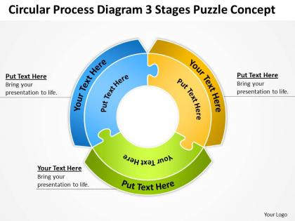
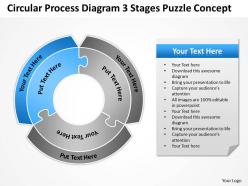
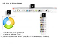
Business Process Flow Chart Circular Diagram 3 Stages Puzzle Concept Powerpoint Templates




Try Before you Buy Download Free Sample Product
 Impress Your
 Audience
 100%
100% Editable
 Save Hours
 of Time


Create stunning presentations with our Business Process Flow Chart Circular Diagram 3 Stages Puzzle Concept Powerpoint Templates to make a mark in your career world. The exclusive quality and of our products will global character empower you in conveying your exceptional vision.
People who downloaded this PowerPoint presentation also viewed the following :
Business Process Flow Chart Circular Diagram 3 Stages Puzzle Concept Powerpoint Templates with all 8 slides:
Our Business Process Flow Chart Circular Diagram 3 Stages Puzzle Concept Powerpoint Templates are like an oasis in a desert. Quench the thirst and hunger of your audience.
FAQs for Business Process Flow Chart Circular Diagram 3 Stages Puzzle
OK so basically you need start/end ovals, rectangles for the actual steps, and diamonds for decisions. Arrows connect everything obviously. If different departments are involved, definitely use swimlanes - seriously saves your sanity later when people get confused about who does what. Include stuff like delays and approvals too. Make your labels super specific, not vague garbage. The whole point is anyone should be able to follow it without bugging you with questions every five minutes. Oh and start simple first - you can always add more detail later instead of overwhelming everyone right away.
Honestly, flowcharts are a game-changer for this stuff. Map out your whole process step by step - you'll be shocked at how much redundant crap you find. Bottlenecks become super obvious when everything's laid out visually. Same with those annoying handoffs that don't actually need to happen. I always find at least three places where people are entering the same info twice (drives me nuts). Way better than trying to keep track mentally. Oh, and don't map what you think happens - map what actually happens day-to-day. That's where the real time-wasters hide.
So for flowcharts, most people use Visio, Lucidchart, or Draw.io (they renamed it diagrams.net but whatever). Visio's what everyone knows but you need a license. I'm obsessed with Lucidchart honestly - works great for team stuff since it's all web-based. Draw.io won't cost you anything and does way more than you'd expect. There's also Miro if you want something more brainstorm-y, or just stick with PowerPoint if you're being basic about it. Sometimes I still just use a whiteboard though lol. Try Draw.io first if money's tight, otherwise test Lucidchart's free trial.
So process flow charts show the big picture - your entire customer onboarding journey with all the decision points and who's responsible for what. Workflow diagrams are way more granular. They focus on the nitty-gritty task sequence and timing. Picture it like this: the process chart is your roadmap, while workflows are the turn-by-turn directions for each stop. I'd go with process charts when you're looking at optimizing a whole business function. Workflows are better for documenting exactly how your team tackles specific tasks. Makes sense?
Oh dude, you should definitely use those standard flowchart symbols. Like rectangles for processes, diamonds for decisions - that whole thing. Anyone can look at your chart and get it right away without you having to explain what each random shape means. Honestly saves so much time when you're working with other teams. Your diagrams look way cleaner too. I learned this the hard way after making some messy charts that confused everyone lol. The consistency actually helps you catch problems faster since you're not deciphering weird symbols. Just stick with the basic ISO ones and you'll notice a huge difference.
Yeah, definitely use flow charts for new hires! Way better than handing someone a massive manual on day one. New people can actually see how each step connects and spot where things usually go sideways. Plus they're perfect for quick reference - I still keep some taped to my desk from when I started here. Decision points become super obvious when they're mapped out visually. Honestly, most training would be better with more pictures and less text. Start with your basic processes and just walk through them step by step during onboarding.
Dude, you absolutely have to talk to the people actually doing this stuff day-to-day. They're the ones who'll spot all the weird workarounds and bottlenecks you'd totally miss otherwise. I've seen way too many flowcharts that look amazing but completely ignore reality. Get different perspectives too - your managers will give you the 30,000 foot view while the front-line people know where things actually break down. Oh, and don't forget to run your draft by them before you call it done. Trust me on this one.
Get your team involved first - they know what's actually happening versus whatever's written down. I made this mistake once and created this gorgeous flowchart that literally no one used lol. Map your current process, then figure out what needs fixing. Version control everything with dates so you don't lose track of changes. Try the new process with just a few people before going company-wide. Oh, and set up regular check-ins because things change constantly. Your flowchart needs to be something people actually reference, not just another file buried in shared drives somewhere.
Dude, flow charts are honestly a game changer. Everyone's literally looking at the same picture, so no more of those awkward "wait, what happens after this step?" moments in meetings. You can actually see how your piece fits with everyone else's work - like, the handoffs become super obvious. I've noticed bottlenecks jump out way faster when it's all mapped visually instead of people trying to explain stuff out loud. Makes team discussions way more productive too. Oh, and they're ridiculously easy to make - even a rough sketch works. Try it next project and you'll see what I mean.
Honestly, think of it like a roadmap for your project - shows what steps happen when and who does what. You'll catch bottlenecks before they bite you in the ass, which is huge. Timeline estimates get way more realistic too. When your boss asks "so what's the status?" you've got this visual thing to point at instead of scrambling. Dependencies become super clear to everyone involved. I'd start mapping your current project's main processes - you'll probably spot issues right away that you didn't even know were lurking there.
You gotta match the detail level to who's actually looking at it. Executives just want the big picture - major steps and decision points, not every tiny approval box. Middle managers need enough detail to spot where things get stuck or handed off between teams. But front-line people? They need everything spelled out since they're the ones actually doing the work. I've seen way too many useless high-level charts given to people who needed step-by-step instructions. Ask yourself: what decisions does each group make? If someone can't use your flowchart to do their actual job, you need more detail.
Get the people who actually do the work to walk through it with you - they'll spot problems you totally missed. Watch the process happen in real life too, not just what people say happens (there's always some weird gap there). I'd also check it against whatever procedures already exist, plus any system logs if you have them. Oh and compliance stuff if that matters for your thing. Honestly, the biggest mistake is trusting just one person's version. Multiple perspectives will save you headaches later when someone goes "wait, that's not how we do it."
Definitely go with diamond shapes for decisions - everyone knows what those mean. Put a clear yes/no question inside each one, and label your paths so people aren't guessing which way to go. I honestly can't stand flowcharts where you're like "wait, which arrow means yes??" Keep your questions short but specific enough that there's no confusion. Try to make everything flow top to bottom or left to right naturally. Oh, and actually walk through it yourself with a couple examples before you're done - you'd be surprised how often the logic breaks down somewhere.
Don't overcomplicate it - that's the death of any good flowchart. Talk to the people who actually do the work first, seriously. They'll spot stuff you'd never think of. Skip the vague boxes like "process data" because what does that even mean? Be specific about decision points and don't forget error handling (trust me on this one). Every step needs someone who owns it, otherwise things just sit there. I always do a messy first version, then get feedback from real users who'll actually follow it. Short sentences work better than long ones. Test it out before you call it done.
So flow charts are actually super helpful for business plans - you'll catch bottlenecks and redundancies way easier when everything's mapped out visually. It's like suddenly seeing where processes get stuck or handoffs go wrong. Your team gets clearer on their roles too since they can see how their piece fits the whole puzzle. Honestly, I was skeptical at first, but automation opportunities become so obvious once you diagram things out. Start with whatever process drives you crazy the most. You'll probably smack your forehead at the inefficiencies you spot right away.
-
Attractive design and informative presentation.
-
Top Quality presentations that are easily editable.