


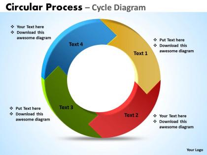
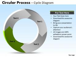
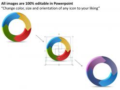
Circular process cycle diagram 4 stages powerpoint slides templates




Try Before you Buy Download Free Sample Product
 Impress Your
 Audience
 100%
100% Editable
 Save Hours
 of Time


Our circular process cycle diagram 4 stages powerpoint Slides templates will pass the acid test. They will stay true to their word.
People who downloaded this PowerPoint presentation also viewed the following :
Circular process cycle diagram 4 stages powerpoint slides templates with all 9 slides:
Bite the bullet with our circular process cycle diagram 4 stages powerpoint Slides templates. Your sharp ideas will pierce through.


FAQs for Circular process cycle diagram 4 stages
You basically need four separate stages with arrows connecting them in a circle - nothing too fancy. Labels should be short but clear, and most templates give you room underneath for extra details. Honestly, these work for pretty much any process that repeats itself. Make your arrows bold enough so people can actually see the flow happening. I'd grab a template with good contrast because nobody wants to squint at your presentation. Oh, and don't overthink the stage names - just make them descriptive enough that someone could follow along without you explaining every single step.
Honestly, those 4-stage circular templates are lifesavers for breaking down complicated stuff. Your audience won't get lost in a mess of text or confusing charts. Each step gets its own clear section with the same formatting throughout. I've watched so many presentations where people just zone out halfway through - it's painful! Circular designs work great because they show how everything connects and loops back. Oh, and definitely use different colors or icons for each stage. Makes it way easier to follow and people actually remember what you said afterward.
Manufacturing teams love these things - perfect for showing quality control loops or production workflows. Healthcare uses them for patient care cycles too. Tech companies? Development sprints and user feedback loops. Oh, and marketing teams are obsessed with using them for campaign cycles (honestly, marketers put everything in a circle these days). Consulting firms also use them for project methodologies. The main thing is your process has to actually repeat or build on itself. If you're showing stakeholders any kind of ongoing workflow that cycles back around, these templates work great across pretty much any industry.
High contrast is your best friend here - dark blues with light grays work great, or go bold with orange, green, purple, blue. Don't use similar shades that blend together (I learned this the hard way). Your audience will get confused trying to follow the flow. Stick to 3-4 colors tops. Be consistent with each stage color throughout your whole deck. Oh, and definitely test on a projector first - colors always look weirdly different than your laptop screen. Trust me on that one.
Keep your text short - nobody's reading novels on each step. Stick with the same colors and icons across all four stages so it flows nicely. Your arrows need to be thick enough that people in the back row can actually see them (learned this the hard way). Stage titles should be 2-3 words tops, then bullet points underneath for the details. Don't go crazy with animations. Maybe reveal one stage at a time instead of having everything fly around like confetti. The whole point is helping people follow along without making their heads spin from visual chaos.
For your circular diagram, make each piece appear one at a time when you click. Use simple entrance animations like "Fade In" or "Fly In" for the circles. Then add some emphasis stuff like "Pulse" to highlight whatever stage you're talking about - trust me, this sequential thing really works for keeping people focused. Animate the connecting arrows too so they can see the flow. Just avoid those bouncy effects that make everyone seasick lol. Keep everything smooth and consistent timing-wise. Set it all to "On Click" so you're in control of the pace instead of it just running automatically.
Here's the thing - people zone out fast if you cram too much text into each section. Make sure your arrows or numbers clearly show the flow direction. Oh, and don't make all four stages identical sizes unless they actually carry equal weight (this always trips people up). Skip the flashy animations - they're more distracting than helpful. Test readability from way back in the room. Use big text with high contrast colors. Honestly, I'd throw in a quick overview slide first before showing the actual circular diagram. Your audience will thank you later.
So basically, circular diagrams loop back on themselves - perfect for stuff that repeats like quarterly reviews or product cycles. Linear ones go A to B to C with a clear endpoint. I'd go circular when you're showing ongoing processes or anything that screams "this keeps happening." Linear works better for project timelines or step-by-step instructions. Oh, and circular ones definitely have more visual appeal if that matters to your audience. Really depends on whether your process actually ends or just keeps cycling through the same stages over and over.
Oh yeah, tons of options for making those circular processes look way better! SmartArt's already in PowerPoint and people totally sleep on it - honestly perfect for quick flows. Lucidchart's my go-to for anything more complex, super easy to import. Power BI will make your data pop compared to those sad default charts (trust me on this one). Miro's solid if your team wants to brainstorm the design together first. Visio works too but feels kinda clunky? I'd mess around with SmartArt since it's right there, then graduate to Lucidchart when you need fancier stuff.
So for circular process slides, I'd totally add clickable stuff first - like action buttons on each stage that let people jump around to detailed sections. Then they can bounce back to the main cycle whenever. Triggers are clutch for this! Set up click-to-reveal animations where stages light up or expand when someone clicks. Hover effects make everything feel way more interactive too. Pop-up text boxes work great for deeper explanations, or you could even embed short videos. My advice? Start basic with simple navigation between stages first, then get fancy with animations later once everything's working smoothly.
Honestly, visuals make or break these circular diagrams. People just won't read blocks of text – I learned this the hard way in presentations. Good icons work like shortcuts, letting your audience instantly get what each step means. Plus they create this natural flow where your eye moves smoothly around the circle. The trick is picking icons that actually match your process steps (sounds obvious but you'd be surprised how often people mess this up). Keep the style consistent throughout. When done right, someone should understand your whole process just by glancing at it. That's the goal anyway.
User feedback is honestly game-changing for template design. People will tell you straight up if your color scheme looks terrible on their projector or if the text is too small for bigger rooms. The flow between slides? They'll let you know if it's confusing as hell. Plus they catch weird stuff you'd never think about - like when icons don't match the vibe at all. I'd set up something simple after downloads, maybe just a quick survey. Way better than guessing what actually works in real presentations, you know?
Honestly, templates are a lifesaver. They look way more professional than anything I could make from scratch - and I'm definitely not winning any design awards anytime soon! The spacing and colors actually work together instead of looking like a rainbow exploded. Built-in best practices mean your flow won't be confusing. You can still tweak colors and text to match your brand. Best part? You'll spend time on content instead of fighting with PowerPoint's weird formatting issues. Just grab one that fits your message and fill in your details.
Okay so first give them the big picture, then walk through each stage one by one. Explain what's happening, who does what, and what kicks off the next phase. Those circular templates are perfect - they show how stage 4 loops back to stage 1, which people actually get excited about seeing. Use the same language throughout so you're not confusing anyone. Don't speed through anything; give real examples for each stage. Oh and make sure they could actually go do this themselves after hearing your presentation. That's honestly the best test of whether you explained it well.
Toyota's probably the most famous example - they use those circular diagrams for their Plan-Do-Check-Act improvement cycles. Airbnb does something similar, mapping their whole user journey as a circle from discovery through booking to hosting and reviews. Pretty smart actually, since it shows how everything connects back. McKinsey and other consulting firms love these circular frameworks too when they're walking clients through problem-solving processes. The main thing is showing how each step flows into the next one. You should try it with some process at work that keeps repeating - I bet you'll catch stuff you didn't notice before.
-
Appreciate the research and its presentable format.
-
Very unique, user-friendly presentation interface.