


Flowchart for research methodology with design and development


Try Before you Buy Download Free Sample Product
 Impress Your
 Audience
Editable
of Time


Our Flowchart For Research Methodology With Design And Development are topically designed to provide an attractive backdrop to any subject. Use them to look like a presentation pro.
People who downloaded this PowerPoint presentation also viewed the following :
Content of this Powerpoint Presentation
How you communicate your ideas matters the most, and it depends upon the data you are presenting and the audience you are talking to. While you are in the dilemma of selecting the right method to initiate conversation, flowcharts are somewhere a sigh of relief.
Flowcharts provide the necessary flow to represent your methodology when discussing your freshly made research. They simplify your complex process into digestible steps. They are the universal communication tool that helps the audience understand the topic at a glance.
Slideteam’s ready-made flowchart PPTs are exclusively designed to support logical decision-making. To clarify the process further, you can check our procurement Flowchart Template Bundles.
Why Do You Need to Use Flowcharts for Research Methodology?
Explaining the complex process used in your research design and development can be challenging, but not when you utilize sequential steps to break down the entire process.
Flowcharts, when used correctly, can help you inform the research approach regarding a certain topic and clarify how effectively you addressed your research objectives. When documenting your proposal, flowcharts are a great tool that promotes standardization, as they can provide a uniform framework. Additionally, you can avoid any potential biases or limitations of the study as you are depicting yourself as an authentic researcher who is well-versed with the sources of biases and can mitigate them.
Now that you know how crucial flowcharts are, why not try to embrace your proposal PPT?
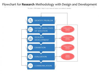
Template 1: Flowchart for Research Methodology

Use this PPT Template to elaborate on your research design process in six digestible steps. The content includes identifying problems, defining solution objectives, design and development, exhibition, evaluation, and communication. This will highlight that you have followed scientific principles while conducting research. Employ this presentation to ensure that you have taken the necessary steps while maintaining the integrity of facts.
Nothing Wrong with Going Step-by-Step!
Flowcharts are eternally useful in visualizing a process, which empowers researchers to stimulate meaningful discussions. This research methodology flowchart slide can contribute to a professional design process presentation. It can quickly add to the analysis of your research design journey. You can download this slide and customize it according to your methodology design.
Need to visualize the process of running payroll? Explore our ready-to-download PPT Template.
Flowchart for research methodology with design and development with all 2 slides:
Use our Flowchart For Research Methodology With Design And Development to effectively help you save your valuable time. They are readymade to fit into any presentation structure.

FAQs for Flowchart for research methodology with
Start with your problem statement up top, then add research questions and objectives below that. Map out how you're collecting data and picking your sample size. Analysis techniques come next - honestly, this part can get messy so keep it simple. Add ethical considerations and timelines somewhere in there (reviewers eat that stuff up even though everyone forgets). Show decision points where things might change based on what you find. End with validation and reporting methods. Make it visual enough that someone could glance at it and actually follow your whole process without getting lost.
Dude, flowcharts are game-changers for research design. Instead of having this messy wall of text describing your methodology, you get this clean visual map that actually makes sense. I always make mine super early in the process - saves me so much headache later. You'll catch weird gaps or places where you're basically doing the same thing twice. Also way easier when you're presenting to people who zone out during long explanations. They can literally follow the arrows and get it. Shows you exactly where you might hit roadblocks too, which is clutch for planning.
Honestly, the worst thing you can do is overcomplicate it with a million boxes and arrows everywhere. I've seen flowcharts that look like spaghetti - total nightmare to follow. Keep things straightforward and label your decision points clearly. Don't use fancy jargon either, write it so anyone could understand. The logical flow matters too - each step should actually make sense leading to the next one. Oh, and definitely have someone outside your field walk through it first. They'll spot confusing parts you missed since you're too close to the material.
So parallel branches work great for this! Put your research question at the top, then split into quantitative, qualitative, and mixed methods paths. Each branch gets its own steps - surveys for quant, interviews for qual, you know the drill. I like throwing in decision diamonds where methods might overlap or you'd pick one over another. Color coding is honestly a lifesaver here, makes it way easier to follow each path. Just don't go overboard with details or it'll look like a hot mess. Keep it clean but comprehensive.
Lucidchart and draw.io are your best bets - they're made for this stuff and have all the symbols you need. If your school has Microsoft licenses, Visio works well too. PowerPoint can work in a pinch, though it gets messy with complex stuff. Oh, and if you're working with a team, Miro's pretty sweet because everyone can jump in and edit together. I'd honestly just start with draw.io since it won't cost you anything. You can always upgrade later if it doesn't cut it.
Honestly, visuals are a game-changer for research stuff because they turn brain-melting complexity into something people can actually follow. I like using different shapes - diamonds for decisions, rectangles for regular processes, circles for start/finish points. Color coding works great too. Blue for data collection, green for analysis, red for when things might go sideways (there's always something, right?). Icons help people get what's happening without reading every word. The trick is making sure there's a clear path from beginning to end so nobody gets completely lost trying to figure out your process.
Dude, flowcharts are honestly clutch for research projects. They turn all that confusing methodology stuff into something people can actually understand without zoning out. Your stakeholders get a visual map instead of dense paragraphs - way easier to follow. Plus they can spot problems early or ask better questions about specific steps. I throw mine into presentations, proposals, whatever. Sometimes even quick email updates. Make one at the start and keep showing it to people. Seriously saves you from so many "wait, what are we doing again?" conversations down the road.
So basically start with your research question at the top, then split into two tracks - interviews on one side, surveys on the other. The cool part is adding spots where they actually talk to each other, you know? Like maybe survey results help shape what you ask in interviews, or interview insights guide your next survey questions. I always throw in some feedback loops too because honestly, mixed methods is rarely just a straight line. Different colors help distinguish the methods visually - makes it way clearer. The whole point is showing how each method either builds on the other or backs up what you're finding.
Make your labels short but specific - like "Collect survey data" not just "Data collection." Anyone should instantly get what's happening at each step. Start every process box with an action word to stay consistent. Honestly, the biggest mistake I see? Text that's way too small or crammed together. Give your words space to breathe! Decision points work best as simple yes/no questions. Oh, and if you've got some complex methodology thing to explain, just add a quick note outside the main flow rather than cluttering up the actual boxes.
Definitely test it with people from totally different backgrounds first - they'll spot confusing stuff you'd never see. Skip the jargon and keep language super simple. Make your main paths obvious with clear arrows and consistent colors/shapes. I literally grab someone from accounting or whatever to walk through mine because they catch things I'm blind to. Brief explanations help at tricky decision points too. Honestly, the biggest test? Someone should be able to follow it without you hovering over their shoulder explaining everything.
Honestly, track completion rates first - like how many people actually make it to the end without giving up. Time matters too - is your flowchart making research faster or just adding steps? I'd also check if people are screwing up less compared to before. User feedback is gold though, even just a basic "did this help?" survey works better than overthinking it. Oh and see if your team's actually using the thing vs. doing their own random approach. Pick maybe 2-3 metrics that fit your situation and don't go crazy with data collection.
Getting feedback early is a game-changer - you're way too close to your own work to spot the obvious gaps. Other people will catch where your flowchart suddenly jumps around or makes zero sense. They'll ask those "wait, what?" questions that expose assumptions you didn't even realize you were making. Honestly, some of the best feedback I've gotten was from people outside my field who weren't afraid to sound clueless. Ask them to literally walk through each step and see where they get lost. You can still fix things easily at this stage, but later? Good luck with that.
Flowcharts are honestly a game-changer for grant apps. I always include them to show the whole study process - recruitment, randomization, data analysis, all of it. Way better than trying to explain complex designs in paragraph form. Reviewers actually prefer visual stuff because they don't have to dig through dense text to understand your methodology. Just make sure you include decision points and timelines in there. Oh, and double-check that it matches your written methods section perfectly. Any inconsistencies will definitely catch their attention in a bad way.
Systematic reviews are your best bet - PRISMA flowcharts are basically the gold standard for showing study selection. Clinical trials in NEJM or Lancet always have really clean participant flow diagrams too. Mixed-methods studies get more complex but show how qual and quant phases connect, which is super helpful. Honestly, just browse methodology sections of highly-cited papers in your field. Top-tier journals from the last few years will have the best examples. I usually screenshot ones that nail complex processes clearly - makes great templates later. Oh, and don't sleep on meta-analyses, they're flowchart heaven.
Dude, flowcharts are a game changer for catching research problems. You can spot missing steps or weird logic loops instantly instead of re-reading your methodology for the hundredth time. It's like getting that overhead view of your whole process - super helpful when you're too deep in the weeds. Plus when you need to pivot (which, let's be honest, happens constantly), you can sketch out new approaches without rewriting everything. I actually started doing this after my advisor suggested it last year. Just try making one for whatever you're working on now. You'll probably find gaps you didn't even know existed.
-
Easily Understandable slides.
-
Excellent design and quick turnaround.
-
Excellent template with unique design.
-
Presentation Design is very nice, good work with the content as well.