


Procurement Flow Chart Powerpoint Ppt Template Bundles




Try Before you Buy Download Free Sample Product
 Impress Your
 Audience
 100%
100% Editable
 Save Hours
 of Time


Our Procurement Flow Chart Powerpoint Ppt Template Bundles are topically designed to provide an attractive backdrop to any subject. Use them to look like a presentation pro.
People who downloaded this PowerPoint presentation also viewed the following :
Procurement Flow Chart Powerpoint Ppt Template Bundles with all 17 slides:
Use our Procurement Flow Chart Powerpoint Ppt Template Bundles to effectively help you save your valuable time. They are readymade to fit into any presentation structure.






FAQs for Procurement Flow Chart Powerpoint
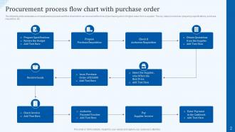
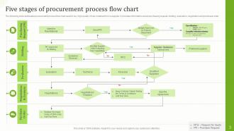
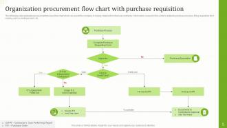
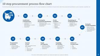
So you need to cover the basics: figuring out what you're buying, getting budget approval, picking vendors (RFP if it's big), negotiating contracts, creating purchase orders, receiving the stuff, then processing invoices and payments. Most companies make this way more complicated than it needs to be, honestly. Set up clear approval gates for different spending levels - like who can approve what amounts. Map out who's responsible for each step and what kicks off the next one. Oh, and definitely look at your current process first. You'll probably find some weird redundant steps you can cut out or automate.
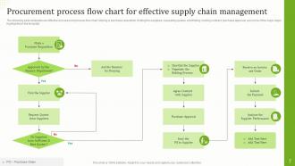
Honestly, procurement flow charts are a total lifesaver. They map out every step so you can actually see where things get stuck or go sideways. No more wondering who needs to approve what or how long stuff should take - it's all right there. Your whole team can look at the same chart instead of everyone doing their own thing (which, let's be real, happens way too often). The key is starting with how you currently do things, then figuring out what's driving you crazy. Oh, and they make tracking orders so much simpler. It's like finally having directions instead of wandering around lost.
Honestly, tech makes the biggest difference by automating all those manual handoffs that slow everything down. Instead of chasing paper forms or digging through email chains, you can track approvals and purchase orders digitally. AI catches issues before they blow up, and ERP integration means you're not entering the same data twice (which is honestly such a time-saver). Cloud platforms let everyone update workflows from wherever they are. But here's the real game-changer - you'll actually see where things get stuck and how long processes take. I'd start by looking at your current digital tools against your flow chart to find quick automation wins.
Honestly, procurement flow charts are lifesavers for staying compliant and catching problems early. You map out every approval step and checkpoint so nothing gets missed. They show exactly what documentation you need and when - super helpful for spotting red flags like vendor conflicts or budget issues before they blow up. The best part? Your whole team can see what's happening at each stage, which cuts down on those "oh crap, we forgot to get approval" disasters. I've seen too many projects get derailed because someone skipped a step. These charts basically keep everyone on the same page and following company policies without the usual headaches.
Oh man, biggest thing is don't overcomplicate it! I've seen flowcharts that look like someone threw spaghetti at a wall. Skip the internal jargon too - other departments will have no clue what you're talking about. Make sure you loop in all the key people for review, otherwise you'll be doing this twice. Actually show the decision points and when approvals are needed. Here's the thing though - most people forget about the messy parts where stuff gets sent back for changes. That happens constantly! Test it on someone fresh. If they're confused, you need to simplify.
Honestly, most "stakeholder engagement" is just spam emails nobody reads. What you actually need is to figure out who makes decisions vs. who just needs updates. Then build real checkpoints - like after you gather requirements or narrow down vendors - where decision-makers can actually weigh in before it's too late. I'd set up working sessions where people collaborate on what matters for evaluation. Short ones though, or you'll lose them. Be super clear about what input you need and when. Map out those moments where they can genuinely influence the direction, not just hear status updates.
Honestly, processing time at each stage is your goldmine - it'll show you exactly where stuff gets stuck. Track cycle time from request to delivery, approval bottlenecks, vendor response times. Cost per transaction matters too, obviously. The visual format makes patterns super obvious, which is nice because spreadsheets make my eyes glaze over. You can also map rejection rates and compliance percentages. Start by timing your current process with real data. I'd bet you'll spot your biggest time-wasters immediately - usually it's some random approval step that shouldn't take three weeks.
Dude, public sector procurement is a total nightmare compared to private - you've got like 5 approval layers, mandatory bidding processes, formal committees evaluating everything. Private companies? They can literally skip whatever steps they want and fast-track urgent stuff. Public sector charts look like someone threw spaghetti at a wall (but hey, transparency costs time I guess). Timeline-wise you're looking at months vs weeks. My advice - map out all the regulatory BS first if it's public sector, then figure out your flow around those constraints. Makes life way easier.
Honestly, I'd go with Lucidchart or Visio for procurement flowcharts. Lucidchart is way easier to use and has decent collaboration features - plus their templates are actually helpful. Visio's more powerful but kinda overkill unless you're doing really complex stuff. Draw.io is free and surprisingly good too, though I always forget about it. Start with Lucidchart's free trial, grab one of their procurement templates, and tweak it for your process. You'll probably have something decent in like 45 minutes.
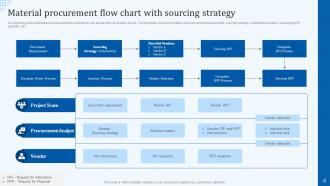
So flow charts are basically your GPS for procurement - they show every step from "we need this thing" to actually managing the contract. Map out what you're doing now first. I guarantee you'll find at least one step where you're like "seriously, why do we even do this?" Those visual maps make bottlenecks super obvious. Then you can redesign stuff to build better supplier relationships and add checkpoints for the big strategic decisions. It's way easier to spot where you're bleeding time and money when it's all laid out visually.
Honestly, I'd say check it every quarter and update right away when stuff changes. Put reminders in your calendar or you'll totally forget. Ask the people who actually use it daily - they spot problems management misses. Outdated charts are worse than having none at all, which sounds dramatic but it's true. Date everything and save old versions somewhere. Oh, and make sure everyone can actually find the new version when you update it. That last part trips up more people than you'd think.
Flow charts are honestly a game-changer for training new people. Way better than handing them some boring 50-page manual, you know? During onboarding, just walk them through the visual steps - it's so much clearer than trying to explain everything out loud. When they're stuck later, they can glance at the chart instead of bugging everyone with questions. Oh, and definitely have them practice with fake scenarios using the chart. That's what really makes it click. Trust me, they'll feel way more confident once they've traced through the process a few times themselves.
Honestly, just keep it simple with your shapes - rectangles for processes, diamonds for decisions. Same colors for similar stuff so it doesn't look like a rainbow threw up on your screen. Make sure your arrows actually point somewhere logical instead of zigzagging all over the place. Short text in each box is key, nobody wants to read a novel in there. Oh, and leave some breathing room between everything or it'll look cramped as hell. Test it on someone fresh - if they're confused, you know it needs work. White space is your friend here, trust me.
So your company culture totally changes how procurement works in practice. Hierarchical places? You're stuck with like 5 approval layers for everything. Flatter orgs just streamline it down to maybe 2-3 decision makers max. Risk tolerance is huge too - some companies will background-check vendors for months while others are like "eh, they seem legit." Your industry rules matter obviously, but honestly I think mapping out how your team actually makes decisions (not the official process) should be step one. Then build around that reality instead of fighting it.
Honestly, skipping a standardized procurement process is asking for trouble. Every department starts doing purchases their own way - different vendor checks, missed approvals, the works. Tracking your budget becomes impossible when everyone's freelancing it. You'll end up with random duplicate vendors and people buying whatever they want. Finance will NOT be happy about the surprise costs, trust me on that one. My advice? Document whatever messy process you have now, then figure out which parts need standardizing first. Start there and work your way up.
-
Editable, diversified, compatible with MS PPT and Google Slides, and on top of that finest graphics!! I mean in the words of the famous Ross Geller, “What more do you want!”
-
The design is clean-cut, modern, and sleek, keeping the users' needs in mind. The multiple uses make this product worth every penny!