


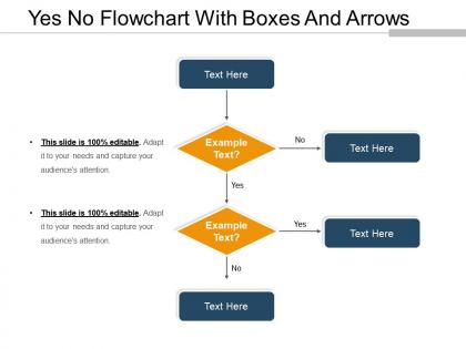
Yes no flowchart with boxes and arrows




Try Before you Buy Download Free Sample Product
 Impress Your
 Audience
 100%
100% Editable
 Save Hours
 of Time


Decide on disputes with our Yes No Flowchart With Boxes And Arrows. Arrive at conclusions acceptable to all.
People who downloaded this PowerPoint presentation also viewed the following :
Yes no flowchart with boxes and arrows with all 5 slides:
Our Yes No Flowchart With Boxes And Arrows provide the links in your chain of thought. Once intertwined they enhance the strength of your words.
FAQs for Yes no flowchart with
You'll want the basic shapes first - ovals for start/end points, rectangles for processes, diamonds for decisions. Arrows show the flow between everything. Labels are huge though! I swear, half the flowcharts I see look like someone's doodles because they forgot to actually write what each step does. Keep your text short and action-focused. Each decision diamond needs clear yes/no paths coming out of it. Try not to have lines crossing all over the place - makes it messy. Use the same symbols consistently, and honestly? Walk through it yourself when you're done. If you can't follow your own flowchart, nobody else will either.
Okay so flowcharts are actually game-changers for team stuff. Instead of those nightmare email threads where everyone's confused about what comes next, you get this visual map everyone can follow. Decision points, outcomes, the whole thing laid out clearly. I used to think they were kinda dorky but honestly? They make planning meetings so much better - you can point right at the problem spot and be like "see, this is where we always get stuck." Short sentences work great too. Your team will get aligned way faster, especially during project kickoffs. Give it a shot next time.
Honestly, I'd start with Draw.io (they renamed it to diagrams.net for some reason). It's totally free and has decent templates. Lucidchart is another solid choice - super easy for collaboration if you're working with a team. Visio still exists if your company's already paying for Microsoft stuff, but it feels pretty dated now. Oh, and if you want something that actually looks good, Figma's surprisingly decent for flowcharts. Canva too, though that might be overkill. I'd just try the free one first and upgrade later if you need fancier features.
Okay so flowcharts are for when you need to map out step-by-step processes - like troubleshooting or workflows where there's a clear beginning and end. Mind maps are totally different. They start with one central idea and branch out in all directions, which is perfect for brainstorming or when you're trying to see how different concepts connect. I honestly use mind maps way more than I probably should. But here's the thing - if you're thinking "what's the next step?" go with a flowchart. If it's more like "what other stuff relates to this?" then mind mapping is your friend.
Honestly, the worst thing you can do is overcomplicate it. Keep each step super simple - use rectangles for processes, diamonds for decisions, ovals for start/end points. Standard stuff. But here's what drives me crazy: people always design the "perfect scenario" flowchart and totally forget about when things go wrong. Include your error cases! Nobody ever does this and then wonders why their process falls apart. Also, don't let your arrows cross all over the place - it looks like spaghetti. Walk through it with someone else afterward to spot the confusing parts you'll inevitably miss.
Honestly, flowcharts are clutch for fixing broken processes. Map out what you're actually doing step-by-step - not what you think you're doing. You'll catch all those bottlenecks and redundant steps that slow everything down. Plus those random workarounds people do because "that's just how Sarah trained me three years ago." I'd tackle your most chaotic process first. Once it's all laid out visually, the problems jump right out at you. Then you can redesign the whole thing and cut out the nonsense. Trust me, you'll find stuff that'll make you go "why do we even do this step?"
Honestly, colors and shapes make such a huge difference in flowcharts. Use rectangles for processes, diamonds for decisions, ovals for start/end - that sort of thing. Colors help you group related stuff together or show critical paths. I swear, nothing's worse than those messy black-and-white flowcharts that look like someone threw boxes at a wall. Just be consistent with whatever system you pick. Like if blue means "user does something" and diamonds mean decisions, don't randomly switch it up halfway through. Makes scanning so much easier when people aren't constantly trying to figure out what each shape means.
Honestly, flowcharts are a game changer when you're stuck on something complicated. They make you break everything down step by step instead of just spinning your wheels. I love how you can actually see where each decision takes you - like having a map for your brain, you know? Super useful for catching holes in your thinking too. My coworker showed me this trick last month and now I sketch them out for pretty much everything tricky. Way easier than trying to explain messy logic to people verbally.
Know your audience first - execs want the big picture while tech teams need all the nitty-gritty details. Figure out if it's for training, documentation, or just quick reference too. Space constraints are huge - poster, screen, or printout all need different approaches. I've made this mistake before: cramming everything into one giant flowchart that nobody can actually read. Such a waste of time. Better to start with the main process, then break complex parts into separate diagrams. Your flowchart should tell one clear story at the right detail level. Don't try to be everything to everyone in a single chart.
Dude, flowcharts are honestly game-changers for this stuff. When you map everything out visually, bottlenecks just jump out at you. Like, you'll suddenly see why Sarah's approval step always creates a massive backup, or where three different processes are all trying to squeeze through one person. It's wild how obvious the problems become once they're on paper. My boss loves these things, probably too much honestly. But you can literally point to the exact spots where work piles up or people sit around waiting. Then it's way easier to figure out workarounds or maybe run some tasks simultaneously instead of one after another.
For flowchart labels, just use simple action verbs like "Review application" or "Send email." Decision points should be yes/no questions - "Approved?" works great. Keep everything consistent format-wise. Honestly, I've seen people way overthink this stuff when simple language is what you want. Anyone should glance at a box and instantly get it, no head-scratching required. Skip the jargon if you can help it. Oh, and definitely walk through your finished flowchart with a coworker - they'll catch confusing labels you totally missed. Works every time.
Honestly, treat your flowchart like the actual backbone of your talk, not just pretty visuals. Walk through it step by step - it'll guide people through complicated stuff naturally. Building each piece progressively works great, though I've watched people go overboard with crazy animations that just distract everyone. For Q&A, flowcharts are perfect since you can jump around to any part easily. Also, definitely prep a stripped-down version beforehand. Trust me on this one - you'll always run short on time, and having something simple ready saves your butt. Interactive scenarios work well too if you've got engaged audiences.
Honestly, the hardest part is deciding how much detail to include without creating a total mess. Like, do you show every single decision or keep it broad? There's no right answer and it's annoying. Complex stuff always has weird exceptions that mess up your clean design. Oh, and everyone wants to see the process differently - your boss cares about different things than the people actually doing the work. Start with the basic flow first. You can always add more later, but only if it actually helps whoever's reading it. Much easier that way.
Honestly, just switch to something like Miro or Lucidchart where everyone can edit at once. Google Drawings works too if you're keeping it simple. The best part? Hop on a video call while you're all working on it - sounds weird but you can actually see where everyone's clicking and making changes. Way less confusing than trying to coordinate over Slack or whatever. Set some basic rules about who handles which sections so people aren't stepping on each other. Oh, and use those comment features for feedback instead of trying to explain stuff in meetings later. Start with a basic template that won't overwhelm anyone and go from there.
Healthcare and manufacturing are probably the biggest winners here. You're talking about life-or-death processes in hospitals where missing a step could be catastrophic. Manufacturing uses them for quality control - I mean, imagine trying to build cars without process maps, right? Software teams are obsessed with them too for user flows and debugging. Finance and legal departments rely on them heavily for compliance stuff. The thing is, all these industries deal with complex processes where screwing up costs serious money. My advice? Pick your most critical process and just start mapping it out visually.
-
Top Quality presentations that are easily editable.
-
Good research work and creative work done on every template.