

Flow chart template





Try Before you Buy Download Free Sample Product
 Impress Your
 Audience
 100%
100% Editable
 Save Hours
 of Time


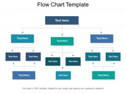
Give your presentation the perfect boost with our Flow Chart PPT template. This professionally designed Flow Diagram PPT model is fairly easy to use. This versatile PowerPoint flow diagram is well-detailed to suit even the more complex procedures. Every aspect of this Flow Process PPT theme has been tastefully selected to ensure effective communication. The central heading of this flow chart diagram branches into three secondary level offshoots. Two of these offshoots further branches into two tertiary steps. The central block has three tertiary steps for varied subtypes. This flow diagram based PowerPoint template is ideal for showcasing your research methodology and their results concisely. All aspects of this flow chart PPT are fully customizable to suit the user’s unique requirements. You can conveniently shift between a wide range of fonts, color schemes, images, graphs, and charts to make the best out of your module. This PPT slide theme can be completely edited within the PowerPoint interface.
People who downloaded this PowerPoint presentation also viewed the following :
Flow chart template with all 5 slides:
Our Flow Chart Template emit passion. Your commitment will radiate in all directions.
FAQs for
Okay so first things first - you definitely need start/end points, decision diamonds, process rectangles, and arrows showing the flow. Those are like the bare minimum. Use consistent shapes and colors throughout (trust me, mismatched stuff looks messy). I'm a big fan of adding legends because not everyone gets flowchart symbols right away. Keep your text short inside each shape. Decision branches should have clear yes/no labels. Oh and leave plenty of white space - cramped flowcharts are the worst to read. Start simple and add complexity later if you need it.
So basically your brain loves visual patterns, right? When you color-code flowcharts, people can scan them super fast without reading every detail. Blue for processes, red for decisions, green for outcomes - that kind of thing. It's honestly like how you remember where stuff is in your kitchen partly by what the containers look like. Your users will follow complex workflows way more easily. Oh and definitely stay consistent across all your charts - I learned that one the hard way when I mixed up my color scheme once and confused everyone.
Manufacturing and healthcare folks absolutely love these things - makes sense since one mistake can be costly. Software teams use them constantly too. Finance and logistics are right behind them because of all the compliance stuff they deal with. Really though, if you've got regulations breathing down your neck, you'll want process docs. Even retail or consulting can benefit when teams keep missing steps or hitting the same roadblocks. My advice? Pick whatever process is currently driving everyone crazy and start there. Once people see how much clearer things get, they'll be asking for more.
So basically, ovals are for start/end points, rectangles show your actual process steps, and diamonds are where you make decisions. Parallelograms handle input/output stuff - like when you're entering data or printing reports. Oh, and circles? Those just connect different sections together. I made the same mistake you probably did - just used rectangles for everything! But once you nail down these shapes, people can actually follow your flowchart without you having to explain it. Makes collaboration way smoother.
Honestly, customizable features are a game-changer because you can make the flowchart actually *yours* instead of using some boring template that screams "generic download." I always start with matching my company colors - super easy win there. When you can tweak fonts, shapes, and layouts to fit your style, you end up way more invested in the whole thing. Adding your own icons and changing connector styles means you'll actually spend time perfecting it rather than just dumping content and walking away. Trust me, it makes a huge difference in how much you care about the final result.
Dude, just go digital - trust me on this one. I wasted so much time with paper flowcharts, constantly erasing and redrawing when something changed. With digital templates you can edit stuff instantly, copy whole sections, and share them right away. The auto-alignment features are honestly a lifesaver because my freehand shapes look terrible. Real-time collaboration is clutch too - your whole team can jump in and make edits without that weird version control nightmare where everyone's working on different copies. Lucidchart's pretty solid, or even Google Drawings works if you want something free.
Grab any basic flowchart template and swap out the generic stuff for your actual project steps. The decision diamonds are honestly game-changers - way better than hiding approval gates in some boring doc nobody reads. Customize the boxes to show who owns what, then add swim lanes for different teams. Different colors help too if you've got multiple workstreams running. I always throw mine in Slack or wherever so the whole team can see it. Makes spotting bottlenecks so much easier when everyone's looking at the same visual roadmap instead of guessing.
Dude, user feedback is everything when you're making flowchart templates. People will tell you straight up what's confusing or broken. Like, I've seen tiny complaints about symbol placement completely change how someone designs their whole template. You'll discover which decision points are missing or if your logic flow makes zero sense. Short feedback works best - nobody wants to fill out a novel-length survey. Set up something quick right in the interface. Users will actually point out stuff you never noticed, plus they'll show you real scenarios your template can't handle. Super valuable.
Honestly, icons are a game changer for flowcharts. People can spot decision points or processes instantly without reading every single box. Way less overwhelming than staring at a bunch of plain rectangles, you know? I always use diamonds for decisions, gears for processes, arrows for direction - the usual suspects. Just stay consistent or it'll look messy. Your brain processes visual cues so much faster than text anyway. Makes the whole flowchart feel less like work and more approachable. Actually saves time too since you're not decoding what each step means.
So I've tried a bunch of these - Visio's what most companies use if they have Office 365, but it's honestly pretty clunky for basic stuff. Lucidchart is way easier and works great when you're collaborating with people since it's all web-based. Draw.io (they renamed it to diagrams.net but whatever) is totally free and does almost everything the paid ones do. I probably use it more than I should lol. You could even just use PowerPoint or Google Drawings for simple ones. But yeah, start with Draw.io - worst case you're out zero dollars and it'll handle whatever you throw at it.
Design your flowcharts with clear visual hierarchy - that's the big one. Keep shapes simple and ditch the jargon (seriously, nobody wants to decode engineer-speak). I'd add optional tooltips or annotations so beginners get help without annoying experienced users. Test them with real people at different skill levels. You'll spot the problem areas fast when you watch someone actually struggle through it. Oh, and create those "training wheels" layers - advanced folks can skip them, but newbies will thank you. Multiple entry points help too since people approach problems differently.
Honestly, the biggest thing is just don't overthink it. Too many branches and decision points will make people's heads spin instead of actually helping them out. Stick with the basic shapes everyone knows - rectangles for steps, diamonds for yes/no stuff. Random shapes look sloppy. Also, walk through your own flowchart before sharing it! I can't tell you how many times I've seen ones where the logic completely falls apart halfway through. Every path should actually go somewhere that makes sense. Keep your text short but clear enough that someone won't need to bug you with follow-up questions later.
Dude, flowchart templates are seriously underrated in classrooms! Students can map out math problems, scientific processes, even essay outlines - the visual aspect just clicks for so many kids. I started with basic templates where they'd chart something familiar first, then moved to trickier stuff. Works great for cause-and-effect relationships too. Honestly, it's wild how much easier abstract concepts become when students can see the flow. Your kids can tackle decision trees, project planning, whatever. The key is starting simple though - don't throw them into complex charts right away or you'll lose half the class.
Dude, flowchart templates are actually game-changers for decisions. You stop just winging it and get this clear visual map of all your options and outcomes. Honestly, it's like having guardrails for your scattered brain - saves me so much mental energy when I'm overthinking stuff. The whole thing forces you to work through scenarios step by step, so you won't miss obvious things or make those impulsive choices we all regret later. Your team can follow the same logic too, which is pretty clutch. Seriously, try one next time you're facing something complex. You'll notice the difference right away.
Honestly, the coolest stuff I'm seeing is interactive flowcharts you can actually click through - way better than those boring static ones. Real-time collaboration is everywhere now too. There's this crazy AI thing where you just describe what you want and it builds the whole flowchart for you (though sometimes it gets weird with complex processes). Mobile design is pretty much expected at this point since we're all on our phones constantly. Oh, and integration with project management tools is clutch - your flowcharts actually connect to real work instead of just sitting there looking pretty. Definitely grab templates with live editing if your team's remote.
-
Very unique and reliable designs.
-
Awesome presentation, really professional and easy to edit.