

Process flow chart 6 stages 70




Try Before you Buy Download Free Sample Product
 Impress Your
 Audience
 100%
100% Editable
 Save Hours
 of Time


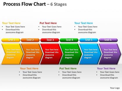
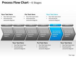
Get the most essential process flow chart 6 stages 70 PPT design for your business. The design works really well to brocade the flow charts and the relevant business processes. A graphical presentation actually helps to improve the processes, project it to the teams properly and make people identify various elements of the process. With such a design your audience can definitely understand the inter-relationship among different steps. In fact sometimes it is even more effective to visualize something than verbally listening to it. The flow charts have got such an essence that it offers you the gist of the process flow in a single look. There are chances that your business processes are a subject to regulatory and quality management requirements. So just account your procedures for all the accounting processes and other relevant operations. In addition to all this, a flow chart works really well to enhance the process demonstration.You have an exquisite new design to offer. Add some brocade with our Process Flow Chart 6 Stages 70.
People who downloaded this PowerPoint presentation also viewed the following :
Process flow chart 6 stages 70 with all 10 slides:
In business you have to be always ready to attack. Professionally created readymade Process Flow Chart 6 Stages 70 are a handy tool for those emergency presentations.




FAQs for Process flow chart
You need clear start/end points, decision diamonds, and process boxes - basic stuff. Arrows should actually flow logically (I swear some people just throw them everywhere). Label everything properly too, otherwise it looks like ancient Egyptian writing or something. Keep your symbols consistent throughout. Map out those 6 stages first, then figure out how they connect. Each step has to be specific enough that someone could follow without texting you back with a million questions. Top to bottom or left to right flow works best - don't get fancy with it.
Honestly, flow charts are clutch for this stuff. Everyone gets the same visual roadmap so there's no confusion about who's doing what. No more endless email chains trying to explain steps - you just point and say "we're at step 3, Sarah handles step 4." Game changer for avoiding those awkward "wait, is this my job?" moments. The 6-stage thing makes handoffs between teams super obvious too. I started using them last month and our status meetings got way shorter. You should definitely try it on your next project - though fair warning, people might actually expect you to be organized now lol.
So basically: figure out your scope first, mark where it starts and ends, then map each step in order. Add any decision points or branches next. Walk through it with someone who actually does the work - trust me on this one, what you assume happens vs reality are totally different things. Most people jump straight into drawing and skip the scope part, but you'll just end up starting over. Keep it simple at first with basic boxes and arrows. You can make it look pretty later once you've got all the steps right.
Honestly, map out your stakeholders first or you'll regret it later. You'll catch all the handoffs and decision points that actually happen instead of guessing. Trust me on this - I've watched so many charts completely fall apart because someone forgot the compliance team does a review (or whoever). Stakeholders also know about those random edge cases that'll mess up your whole process if you don't account for them. Just list everyone who touches it, even briefly. Then run your draft by them before finalizing anything.
Honestly, Lucidchart and Visio are your best bets. Lucidchart's web-based so it's great for team stuff, and Visio works perfectly if you're already using Microsoft everything. There's also Draw.io (diagrams.net now I think?) which is totally free but actually pretty decent. I mean, you could even use PowerPoint in a pinch - not great for complex stuff but it'll do. Miro and Figma work too if your team's already on those. My advice? Start with the free ones first, see what you actually need, then maybe upgrade later if you have to.
So first things first - talk to the people actually doing the work. They'll spot stuff you totally missed. Keep your language simple and stick with standard symbols (nobody wants to decode your creative flowchart art, trust me). Walk through each step like you're explaining it to someone new. Short, clear boxes work best. Different scenarios will show you where things get confusing - test a few weird cases. Oh, and definitely have colleagues try following your chart once it's done. I learned this the hard way, but their feedback catches those blind spots every time.
Look, feedback is what saves your flowchart from being totally useless. The people who actually do the work every day? They'll catch stuff you never thought of - weird bottlenecks, steps you forgot, or things that just don't make sense in real life. I swear, half the charts I've seen look amazing until someone tries using them and it's a disaster. Get input early when you're drafting, test it out, then check back after it's been running for a bit. Use what they tell you to fix timing issues and decision points. Oh, and always circle back to show people how you used their suggestions - they appreciate that.
You'll see bottlenecks right away once everything's mapped out visually. Look for spots where multiple inputs squeeze into one process - that's usually where things get messy. Also check if one stage takes forever compared to the others. Honestly, it's just like sitting in traffic and figuring out why cars are backing up. Measure the time and volume at each step (this part's kind of tedious but worth it). Then you can zero in on whatever's causing the jam. Once you know which step is the problem, fixing it becomes way more straightforward.
So I'd totally map those 6 stages right into your project phases - works like magic. With Agile, throw them into sprint planning or when you're doing user story stuff. Waterfall's actually perfect since everything flows in order anyway. Honestly? The visualization part is what gets people - suddenly everyone understands what's happening (finally). Stakeholder meetings become way less painful when you can actually show where things are stuck. Oh, and don't overthink it - just pick one process first and see how it meshes with whatever you're already doing.
Dude, the worst thing you can do is overcomplicate it right off the bat. Start simple! Also, don't just wing it - spend time planning first or you'll be redoing everything later (learned that the hard way). Be super specific too - none of that "handle the request" nonsense. What does "handle" even mean? Add decision points for when stuff inevitably breaks. Oh, and definitely run it by the people who actually do this work daily. They'll spot the gaps you totally missed. Test with your team first, then tweak it.
Dude, color coding will save your life on that flow chart. I'd go with blue for planning, green for execution, red for review - keeps it simple. You can even use different colors for which departments handle what. Just don't go crazy with like 8 different colors because then it looks like a rainbow exploded. Stick to 3-4 max. Red's perfect for problems or stops, green for completed stuff - people get that instinctively. Oh, and definitely add a legend so nobody's guessing what purple means or whatever. Trust me, it'll make the whole thing so much cleaner.
Okay so for process charts, stick with the basic shapes everyone knows - rectangles for steps, diamonds for decisions, circles for start/end. Color coding really helps people follow along, maybe use different colors for your 6 stages? Just don't go crazy with it lol. I've seen some that hurt your eyes. Make sure the arrows clearly show which way things flow, and please use readable fonts - I can't tell you how many charts I've squinted at trying to read 8pt text. Oh, and test it on someone fresh first! They'll spot the confusing parts you missed.
Oh totally, cultural stuff makes a huge difference with flowcharts. So like, Western people naturally read left-to-right, but if you're working with Arabic or Hebrew speakers they'll expect right-to-left flow. Colors are tricky too - red doesn't mean "stop" everywhere. Some cultures want way more detail while others prefer bare minimum text. I got burned on this with our Tokyo team last year, oops. Also think about whether your audience makes decisions top-down or more collaboratively - that'll change how you structure those 6 stages. Just test it with your actual users first and tweak from there.
Yeah, for sure! Break those 6 stages into smaller pieces that fit your sprints - like 1-2 weeks each. Don't think of it as step 1, then step 2, etc. You'll cycle through mini versions of each stage every sprint instead. Some stages might overlap or you could skip ones that aren't needed yet. That's kinda the whole point of agile anyway - staying flexible. I'd start by figuring out which of your current stages can repeat or happen at the same time. Oh, and don't stress if it feels messy at first. Just adjust as you go and see what works.
Track three main things: cycle time, bottlenecks, and error rates at each stage. Resource utilization matters too if you're fighting for budget or headcount. Don't get caught up making pretty charts that miss what's actually happening - I've watched teams waste weeks on that. Handoff efficiency between stages is clutch, plus your overall completion rates. The magic happens when you can show solid before/after comparisons. Honestly, start by measuring everything for like 2-3 weeks first. That gives you real baseline data instead of guessing.
-
Great quality product.
-
Very unique and reliable designs.