


As is to be process template ppt inspiration




Try Before you Buy Download Free Sample Product
 Impress Your
 Audience
 100%
100% Editable
 Save Hours
 of Time


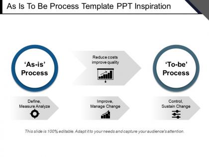
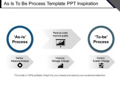
Sometimes all you need is an easy to comprehend and beautiful to look at and easy to demonstrate PPT slide design for your complex business processes. As is to be process template PPT inspiration is a slide design of a generic process model. Creating a perfectly fitting slide design is not an easy task. Therefore, ready-to-use substitute always proves to be a better substitute. This is why we bring to you our pre-made process diagram PPT presentation graphics template. Either use this slide as a part of your pre-designed deck or use it solely. You can make use of this business process PPT slide infographic regardless of your industry or business type and presentation theme. From illustrating the steps of the process of displaying its marketing activities, the slide proves suitable for a variety of purposes. Whether you have to demonstrate your action plans for the next project or explain the steps of your business efforts, the process PPT slide is fully dependable. Build firmer bonds with the audience through our As Is To Be Process Template Ppt Inspiration. It helps you connect better.
People who downloaded this PowerPoint presentation also viewed the following :
As is to be process template ppt inspiration with all 5 slides:
Establish firmer control with our As Is To Be Process Template Ppt Inspiration. They help consolidate your gains.
FAQs for As is to be process
You need clear start/end points and defined steps for each part of the process. Decision points are huge too - mark who handles what at each stage. Arrows showing flow direction help tons, plus any inputs/outputs along the way. If multiple departments are involved, swimlanes will save your sanity later, trust me. The trick is being detailed enough that someone can actually follow it without drowning in unnecessary info. I always start simple first. Add complexity only where it genuinely helps. Honestly, keeping things readable beats being overly thorough every time.
So process mapping shows you how work actually moves through your company. It's way messier than most people expect! You'll catch bottlenecks and redundant steps. Plus all those annoying waiting periods for approvals. Getting the actual workers involved in making these maps is key - they know where the real problems are. Teams finally see beyond just their own little corner, which honestly can be pretty eye-opening. My advice? Start with whatever process makes everyone groan the loudest. That's your biggest opportunity right there.
Honestly, most people just use Visio, Lucidchart, or Miro. Visio's solid if you've already got Microsoft stuff. Lucidchart is my go-to for team collaboration since it's all cloud-based. Miro's technically a whiteboard tool but works great for brainstorming flows together. Don't overthink it though - I've seen people do amazing work with PowerPoint or literally just sticky notes on a wall. Google Drawings works fine for basic stuff too. My coworker swears by the sticky note method, actually drives me crazy but whatever works! Start with whatever your team already has. The tool doesn't matter nearly as much as just getting your process mapped out clearly.
First things first - figure out where your process actually starts and ends. What triggers it? When is it really done? Pick one specific outcome to map. Trust me, trying to capture everything at once just creates a giant mess nobody wants to deal with later. Think about who's gonna use this thing too - training newbies needs way more detail than spotting workflow problems. I always skip sub-processes that could be their own separate maps. Saves so much headache. If you can't describe what you're mapping in two sentences, you've probably bitten off too much. Better to start small and add later.
Don't dive straight into tiny details - people zone out before they get the big picture. Go broad first. And seriously, don't try mapping this stuff solo in your office. I made that mistake once and it was useless. Pull in the people actually doing the work because what you assume happens vs reality? Two totally different things. Those handoffs between teams are always messier than you think. Here's the thing - map what's really happening now, not your dream process. You can fix it later, but first you need to know what you're working with.
Get them involved from day one - stakeholders should help you figure out which processes to tackle first and what they actually want to achieve. During mapping sessions, have the process owners and end-users walk through everything with you. They know where stuff breaks down better than anyone. Honestly, the people who feel heard early become your biggest advocates later. Don't forget to loop in folks from other departments too, since those handoffs between teams are usually where things go sideways. Make them feel like partners in this, not just people you're checking boxes with. Regular touchpoints keep everyone engaged.
Honestly, I'd start with just 2-3 metrics instead of going crazy trying to track everything. Cycle time is huge - basically how long stuff takes from start to finish. Throughput matters too (how many units you're cranking out). Quality stuff like defect rates will save you headaches later. Oh, and cost per unit - that one's obvious but easy to overlook when you're in the weeds. Resource utilization is good if your team's sitting around too much. Pick the ones that'll actually fix your biggest headaches first. You can always add more later.
So process mapping basically lets you see where everything gets jammed up in your workflow. Draw out each step and you'll spot the bottlenecks fast - like where tasks pile up or certain steps drag on forever. Honestly, it's kinda like watching traffic from above, suddenly the problem areas are super obvious. Look for dumb stuff like too many approvals or people just sitting around waiting for decisions. Once you've got it all mapped out, time how long each step actually takes vs. how long it should. Then hit the worst time-wasters first.
Honestly, digital tools blow those old whiteboard sessions out of the water. Real-time editing with your team using stuff like Lucidchart or Miro - game changer. What's really nice is how they connect to your actual systems, so you're not just making educated guesses about your processes. Some even throw AI suggestions at you (though half of those are probably garbage, let's be real). Start with draw.io since it's free. You can always upgrade later if you actually stick with it.
Process maps are honestly a lifesaver for compliance stuff. They show auditors exactly how you do things, which is what they're looking for anyway. Map out your riskiest processes first - that's usually where problems pop up. You can spot where controls should go and prove you're actually following procedures. When new regs come out (ugh, always happening), gap analyses become so much easier. The visual thing is huge too. Auditors get it right away instead of reading through boring policy docs. I'd say start small with your biggest headache processes and work from there.
Honestly, skip the boring theory stuff at first. Jump straight into hands-on workshops where they map something simple they already know - way more effective. Cover basic symbols and flow logic, then break them into small groups for practice. Don't dump all the advanced techniques on them at once (learned that the hard way). Pick one mapping method to start. Give them real examples from your actual workplace, not some random case study. Have everyone present their maps - gets them comfortable with the whole thing. Oh, and follow up within a few weeks with real projects or they'll forget everything.
At minimum, check them yearly. But honestly? Do it way more often than that. New software rolls out, people quit, customers start complaining - boom, time to update your maps. I'd go with quarterly reviews for anything customer-facing or cross-departmental. Those get messy fast. Put a recurring reminder in your calendar right now - I'm serious about this part. When deadlines pile up, process reviews are always the first thing that gets ditched. Then you're stuck with maps that don't match what actually happens anymore, which is pretty much useless.
Honestly, process mapping is a game-changer because it gets your whole team looking at the exact same picture of how work actually moves around. No more "I thought Sarah was doing that" moments. You can literally point at the diagram when something goes wrong or needs fixing. Short sentences work great here. The visual aspect makes bottlenecks super obvious - like, embarrassingly obvious sometimes. Plus you'll see exactly where tasks get handed off and who owns what. I swear it's like putting on glasses for the first time. Map out whatever's been confusing your team lately and you'll probably solve half your problems just by drawing it out.
So high-level maps are basically the bird's eye view - "receive order," "ship order," that kind of stuff. Perfect for getting executives on the same page without boring them to death. Detailed maps? They break down every single decision and handoff. Can get messy fast if you're not careful lol. I'd start with high-level when you're pitching ideas or kicking off projects. Save the detailed ones for when you're actually rebuilding something or need to train people step-by-step. Oh, and definitely do high-level first - way easier to drill down later than trying to build up from chaos.
Honestly, once you map stuff out visually, problems literally smack you in the face. No more guessing where things get stuck or duplicated - you just see it. Your team stops arguing about what "actually" happens because everyone's staring at the same diagram. Decisions happen faster too. Plus (and this might sound weird) you'll notice improvement spots that were totally invisible before. When you need buy-in from higher-ups, showing them a visual before/after is so much cleaner than trying to explain it. Just pick one messy process to start with - seriously, you'll be shocked what jumps out once it's on paper.
-
The Designed Graphic are very professional and classic.
-
Excellent Designs.