Manufacturing Process Flow Chart Of Various Operation

Rating:
100%
Manufacturing Process Flow Chart Of Various Operation
Slide 1 of 6
Favourites Favourites

Try Before you Buy Download Free Sample Product

Audience Impress Your
Audience
Editable 100%
Editable
Time Save Hours
of Time
The Biggest Sale is ending soon in
0
0
:
0
0
:
0
0
Rating:
100%
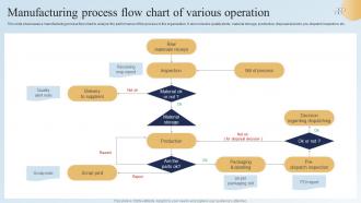
This slide showcases a manufacturing process flow chart to analyze the performance of the process in the organization. It also includes quality alerts, material storage, production, disposal decision, pre-dispatch inspection, etc. Introducing our premium set of slides with Manufacturing Process Flow Chart Of Various Operation. Ellicudate the one stage and present information using this PPT slide. This is a completely adaptable PowerPoint template design that can be used to interpret topics like Bill Of Process, Decision Regarding Dispatching, Material Storage. So download instantly and tailor it with your information.

People who downloaded this PowerPoint presentation also viewed the following :

FAQs for Manufacturing Process Flow Chart

Start with your main process steps - that's your foundation. Add decision points for quality checks and approvals, plus rework loops (because yeah, stuff breaks). Input materials and equipment for each stage matter too. Wait times are huge - seriously, map those out or they'll kill your timeline later. Mark your start/end points clearly and use arrows for material flow. Oh, and track your key specs and metrics throughout. I'd sketch the basic flow first, then pile on details once you've got the bones right. Way easier than trying to do everything at once.

So basically, flow charts let you see where stuff gets backed up in your process. Think of it like looking at traffic from above instead of sitting in it - you'll instantly spot the slowest steps where everything piles up. Those are your bottlenecks right there. When multiple things feed into one step, or when one part takes way longer than the rest, it becomes super obvious on the chart. Honestly, it beats guessing at what's wrong. Once you find those choke points, you can actually fix what matters instead of wasting time on steps that aren't the real problem.

So basically rectangles are your process steps - stuff like "weld components" or whatever. Diamonds mean decisions, like when you hit a quality check. Ovals = start and stop points. Oh and circles are for inspections or measurements. Arrows just show which way things flow, pretty obvious. Some teams do their own weird variations but honestly these are the standard ones everyone uses. I'd say master these four and you can figure out most manufacturing flowcharts without scratching your head.

So for multiple processes, I'd go with swimlanes - they're honestly the cleanest way to do it. Each process gets its own lane (vertical or horizontal, whatever works), then you connect them with arrows showing how they interact. Color-coding is another solid option if you don't want lanes. Just assign each sub-process a different color. Oh, and nested boxes work too for grouping related stuff together. The key is making sure your legend is crystal clear so people aren't guessing what everything means. I always start with the main flow first, then add the sub-processes on top.

Dude, color-coding is a game changer for flowcharts. Assign different colors to departments or process types - like blue for production, red for quality checks, green for approved stuff. Makes everything so much easier to scan quickly. Your team will actually be able to spot bottlenecks and track where things hand off between departments without squinting at tiny text for twenty minutes. I learned this the hard way after making way too many confusing black-and-white charts. Just keep the colors consistent across all your docs so people don't have to relearn your system every time.

Flow charts work great for this stuff because you can actually see where your process gets jammed up. Like, suddenly it's obvious which steps are pointless or where everything bottlenecks. Map out what you're doing now first - honestly, most people skip this part and wonder why nothing improves. Then redesign it without the messy bits. The visual thing really helps when you're trying to convince your team something needs fixing. Way easier than explaining it in some boring meeting. Maybe try mapping just one annoying process you deal with and see what jumps out at you.

Honestly, Visio's your best bet if you want something robust - has all the manufacturing symbols already loaded. Lucidchart's pretty sweet for team collaboration though, and their templates don't suck. Draw.io works fine for basic stuff and won't cost you anything (I've used it plenty). SmartDraw and ConceptDraw PRO are worth checking out if you're mapping really complex processes. My advice? Start with whatever software your company already pays for. You can always switch later if it doesn't cut it. No point spending money on new tools until you know what you actually need.

So it really depends on what you're trying to show. Lean manufacturing flowcharts should focus on waste elimination and continuous flow - basically highlight what adds value vs what doesn't. Traditional ones need more quality checkpoints and inventory buffers between steps. I'd actually walk your floor first and map what's really happening, not what's supposed to happen. Makes a huge difference. Keep lean charts simple and clean visually - they work better that way. Use different colors or symbols to show the approaches. Oh, and batch processing stages are key for traditional manufacturing flowcharts too.

Talk to your operators, supervisors, and quality folks right from the start - before you even sketch anything out. They know all the weird edge cases that happen when stuff breaks down. Share your rough draft with them early so they can spot what you missed. This part always saves my butt because there's inevitably some random step that only happens during night shift or something. Have them walk through the final version to make sure it actually reflects what goes on out there. Getting everyone involved from the beginning makes rolling it out so much easier later.

Don't overcomplicate things right off the bat - that's the biggest mistake I see. You'll create this insanely detailed chart that looks like spaghetti and confuses everyone. Talk to the people actually doing the work first! Seriously, so many managers skip this step and miss obvious bottlenecks. Your decision points need to be crystal clear too, and don't forget about what happens when things go wrong. I learned this the hard way on my last project. Start simple with major steps, get feedback from operators, then build from there. Way easier than trying to fix a overly complex mess later.

Update it whenever something actually changes - new equipment, different procedures, that kind of stuff. Quarterly reviews are probably the bare minimum, but honestly? Do it right when changes happen or you'll totally forget the specifics later. Nobody's gonna trust a chart that's obviously out of date. Fast-paced operations might need monthly updates, while more stable processes can probably go six months. Oh, and definitely set a calendar reminder - I always forget this stuff otherwise. Make sure whoever's tweaking processes knows to give you a heads up immediately.

Honestly, flow charts are a total lifesaver for training new people in manufacturing. Complex processes become way easier to understand when they're visual instead of buried in some boring manual nobody wants to read. New hires can literally trace through each step, see where quality checks happen, and spot safety protocols without getting overwhelmed. I've noticed people pick things up maybe 40% faster this way - though that might vary depending on your team. They're also great for catching knowledge gaps during training sessions. Start with your most critical processes first, then use them as hands-on training tools where people can walk through different scenarios.

So basically, track your numbers before and after - stuff like how fast things move through, defect rates, cycle times. The big thing though? Whether people actually follow the chart. I've seen too many perfect flowcharts that just collect dust because nobody uses them. Get feedback from the folks doing the work - they'll tell you real quick if your chart matches what actually happens. Short sentences work here. Check your KPIs after a few months, and if you're not seeing better efficiency or quality, time to go back to the drawing board.

Get the actual operators in a room with supervisors and quality people first. Map it out together - I learned the hard way that doing this alone at your desk means you'll miss obvious stuff. Have everyone walk through their steps while you document it visually. Decision points matter, so do delays and handoffs between teams. Honestly, the handoffs are where most problems hide anyway. Circle back with the team once you've got a draft to catch what you missed. Making it collaborative from the start saves you tons of headache later.

Honestly, flow charts are like your safety net when regulators show up. They document every single step so you can actually prove you're doing things right. Map out your control points, quality checks, all that stuff directly in the process. I've watched companies get totally hammered during inspections just because they couldn't clearly show their procedures - what a mess. Your flow chart helps you spot where regulations matter most, keeps training consistent across teams, and catches compliance issues before they cost you big time. Just keep it current and easy to find.

Ratings and Reviews

100% of 100
Review Form
Write a review
Most Relevant Reviews
  1. 100%

    by Chester Kim

    The website is jam-packed with fantastic and creative templates for a variety of business concepts. They are easy to use and customize.
  2. 100%

    by Dean Dixon

    SlideTeam is my one-stop destination for templates. Highly recommended!

2 Item(s)

per page: