

Process Flow Chart In Manufacturing Company




Try Before you Buy Download Free Sample Product
 Impress Your
 Audience
 100%
100% Editable
 Save Hours
 of Time


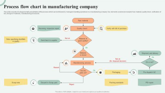
This slide consists of a diagrammatic presentation of the process which can be followed by managers handling operations in a manufacturing company. Key elements covered are receipt of raw material, quality check, verification of bill, storage of materials, manufacturing process etc.
People who downloaded this PowerPoint presentation also viewed the following :
Process Flow Chart In Manufacturing Company with all 6 slides:
Use our Process Flow Chart In Manufacturing Company to effectively help you save your valuable time. They are readymade to fit into any presentation structure.





FAQs for Process Flow Chart
Just sketch it out on paper first - trust me, you'll spot missing steps way faster that way. Use rectangles for regular steps and diamonds for decisions. Make sure your decision points actually have yes/no paths that make sense. Keep the text in each box super short because honestly, no one's gonna read a paragraph crammed in there. Connect everything with arrows so the flow is obvious. Try not to have lines crossing all over the place - it looks messy as hell. Oh, and be consistent with your formatting throughout. The whole thing should tell someone exactly what to do from start to finish.
Honestly, flowcharts are game-changers for team projects. Everyone's looking at the same map, so no more "wait, whose job was that?" disasters when deadlines hit. New team members can actually see what's going on instead of guessing. The best part? When you sit down to map out a process together, all these weird assumptions come crawling out of the woodwork. I learned this the hard way on a project last year - we thought we were all on the same page until we drew it out. Trust me, do this at your next kickoff meeting. Makes discussing problems so much easier when you can just point to the actual step that's broken.
Honestly, I'd go with Lucidchart or Visio if you want something legit - they're built for this and have every template you could want. But try Draw.io first since it's totally free and actually pretty decent. Google Drawings is okay if you're already using their stuff, though it's kinda bare-bones. Miro's cool for team stuff where everyone needs to edit together. My buddy at work swears by it. Start with the free ones and see what you're missing before dropping cash on the fancy tools.
Pick your start and end points first - that's the key. Where does it actually kick off for the customer? Where does it wrap up? Don't go crazy mapping every little subprocess or you'll end up with a total mess that nobody can follow. Been there, done that. Focus on the main flow that actually creates value. I look for handoffs between teams or systems to set my boundaries. Make it wide enough to catch the important decision points and bottlenecks, but keep it narrow enough that you can actually use the thing to fix problems or train someone new.
Honestly, the two biggest things I see people mess up: making flowcharts way too complicated, and skipping steps that feel "obvious" to write down. Don't use vague boxes like "process data" - say what actually happens. Oh, and everyone maps out the perfect scenario but forgets what happens when stuff breaks or goes sideways. Those decision points matter! Keep your symbols the same throughout (sounds basic but people mix them up constantly). Best trick though? Have someone else try to follow it. If they're lost, you probably need to add steps or simplify.
Look for spots where multiple flows merge into one step - that's where stuff backs up. Decision points are red flags too. Honestly, the visual aspect is what makes flowcharts so much better than reading boring process docs. Time each step if you can and write the durations right on there. Any activity taking way longer than the rest? Bingo, there's your problem. Queue symbols are another dead giveaway. Once you see the timing laid out visually, you'll know exactly where to dive in and fix things first.
Honestly, color-coding and shapes make such a difference in flowcharts! I learned this the hard way after creating some truly terrible ones early on. Use rectangles for regular actions, diamonds for decision points, and ovals for start/end. Different colors can show departments or group related stuff together. Just don't go overboard - I stick to maybe 3-4 colors tops or it gets messy fast. The biggest thing? Stay consistent once you pick your system. Your coworkers will actually be able to follow along instead of getting lost in a maze of random boxes.
Dude, flowcharts are seriously underrated for training new people. Instead of dumping a huge manual on someone's desk, you can map out processes visually - way less overwhelming. New hires can actually reference them later without bugging you every five minutes (which honestly saves your sanity too). Visual learners eat this stuff up. The cool thing is you spot the tricky decision points right away when you're drawing them out. I'd start with whatever process you explain most often. You'll be shocked how much faster people catch on when they can see the whole flow laid out.
Dude, flowcharts are everywhere in manufacturing, healthcare, finance, and tech. Manufacturing teams use them for production lines. Hospitals map out patient care with them. Banks? They're obsessed with compliance flowcharts - probably have one for making coffee at this point. Software developers are totally dependent on them for user flows and debugging. Makes sense though - these industries can't afford screwups. One wrong step costs serious money or puts people at risk. They need everything documented and standardized. Honestly, whenever I'm stuck on a messy process, I just sketch out a quick flowchart first. Shows you exactly where things are getting bottlenecked.
Honestly? Set up quarterly reviews minimum - though if your stuff changes fast, maybe more often. Calendar reminders are your friend here, and you gotta assign someone specific to own it. Otherwise it'll just get forgotten when everyone's busy. When you're changing any process, make updating the flowchart part of the conversation right away. Don't let it be an afterthought. Version control saves your sanity too - date everything and keep a basic change log. The real trick is picking someone who actually gives a damn about keeping things current. Can't just hope people remember.
Honestly, flowcharts are like having a map of your whole process laid out where you can actually see it. Way better than trying to remember every step in your head. You'll spot bottlenecks and redundant stuff pretty quickly when it's all visual like that. I always start with mapping the current mess, then sketch out what it could look like after improvements. The visual thing is clutch when you're trying to get other people on board too - they can see exactly what's broken and why your fix makes sense. Makes the whole continuous improvement thing way less abstract.
So basically, high-level flowcharts are like the bird's eye view - just your main steps and big decisions. Detailed ones dive into every tiny action and subprocess. Way more thorough but honestly they can turn into a hot mess if you're not organized about it. I'd definitely start with the high-level version first to get everyone on board, then you can dig into all the specifics later when you actually need to build or fix something. Makes the whole thing less overwhelming that way.
Track your main metrics before and after implementing the flowchart - cycle time, error rates, resource usage, customer satisfaction. Honestly, you'll be shocked at how many redundant steps become obvious once everything's mapped out visually. I'd start with just 2-3 metrics that actually matter to your team's goals rather than overwhelming yourself. Set up monthly dashboards to watch for bottlenecks and those annoying approval loops that drag everything down. The flowchart becomes your baseline for comparison. Regular check-ins help you spot what's still broken.
Honestly, going digital with your flowchart is a game changer. You can edit stuff without redrawing everything, share it instantly with your team, and collaborate from wherever. Hand-drawn ones on whiteboards are fine but kinda limiting, you know? Digital versions let you hyperlink things, embed them in docs, and make copies super easily. They definitely look way more polished when you're presenting too - stakeholders eat that stuff up. I'd start with Lucidchart or even Google Drawings (which is free btw) before jumping into anything fancy. Trust me, once you make the switch you won't go back to markers and erasers.
Get stakeholders to actually walk through their workflow with you first - don't even touch a pen yet. Once you've got a draft, have them mark it up and point out what's wrong or missing. They always spot things you'd never think of, honestly. Set up a session where you can edit the thing together in real time instead of doing the endless email back-and-forth dance (ugh). Oh, and circle back after you implement it too. Processes change constantly, so your flowchart needs to match what's actually happening, not some perfect world version.
-
“I've always gotten excellent slides from them and the customer service is up to the mark.”
-
SlideTeam has helped me take my presentation to the next level. Everyone at the office is impressed! I’ll be using their designs for a long-long time.